Colors and themes
Nine recipes for team colors: a league's palette at a glance, one color per row of your data, readable text on team-colored cells, seaborn, colors that clash, a league-wide colormap, PyPalettes colormaps, morethemes styles, and the fallback colors to watch for. The data is one season each from the NFL (nflverse), the NBA (hoopR and the stats-API shot file the SportsDataverse publishes on GitHub) and the NHL (fastRhockey), all through sportsdataverse-py.
import matplotlib.pyplot as plt
import numpy as np
import polars as pl
import seaborn as sns
import sportsdataverse.nba as nba
import sportsdataverse.nfl as nfl
import sportsdataverse.nhl as nhl
from matplotlib.colors import ListedColormap, to_rgb

import sdvplot

NFL_SEASON = 2025  # nflverse names a season by the year it starts
SEASON = 2026  # the 2025-26 NBA and NHL season, named by the year it ends
HOOPR = "Data: hoopR (ESPN) via sportsdataverse-py"
FASTRHOCKEY = "Data: fastRhockey via sportsdataverse-py"

nba_box = nba.load_nba_team_boxscore(seasons=[SEASON]).filter(pl.col("season_type") == 2)
nhl_box = nhl.load_nhl_team_box(seasons=[SEASON]).filter(pl.col("game_id") // 10_000 % 100 == 2)
nba_box.height, nhl_box.height
(2470, 2624)
1. See a league's palette
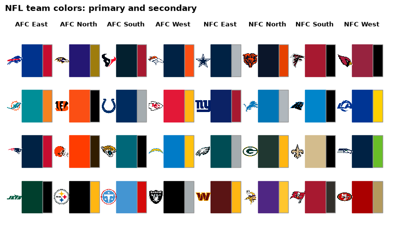
palette(league) is a plain {team: "#hex"} dict, which="secondary" the other color. Laid out by division,
with each team's logo, it is a quick check of what a chart will look like:
divisions = nfl.load_nfl_teams().select(team="team_abbr", division="team_division")
primary, secondary = sdvplot.palette("nfl"), sdvplot.palette("nfl", which="secondary")
teams = divisions.filter(pl.col("team").is_in(list(primary))).sort("division", "team")

fig, ax = plt.subplots(figsize=(10, 5.5))
for col, (division, group) in enumerate(teams.group_by("division", maintain_order=True)):
    ax.text(col * 1.25 + 0.55, 4.25, division[0], ha="center", fontsize=9, fontweight="bold")
    for row, team in enumerate(group["team"]):
        y = 3 - row
        ax.add_patch(plt.Rectangle((col * 1.25 + 0.3, y + 0.15), 0.55, 0.7, color=primary[team]))
        ax.add_patch(plt.Rectangle((col * 1.25 + 0.85, y + 0.15), 0.25, 0.7, color=secondary[team], ec="#999999"))
        sdvplot.add_logos(ax, [col * 1.25 + 0.1], [y + 0.5], [team], league="nfl", height=0.08)
ax.set_xlim(-0.15, 10)
ax.set_ylim(-0.1, 4.5)
ax.axis("off")
ax.set_title("NFL team colors: primary and secondary", loc="left", fontweight="bold")
plt.show()
2. One color per row of your data
team_colors returns one color per value, in the container it was given: a polars Series in gives a Series
out, ready for with_columns. Values in any id system work, and a team that does not resolve gets None.
There are two colors per team; ask for any other and you get a ValueError that says which exist.
top = (
    nhl_box.group_by("team_abbrev")
    .agg(gf=pl.col("goals").mean())
    .sort(["gf", "team_abbrev"], descending=[True, False])
    .head(5)
)
top = top.with_columns(
    primary=sdvplot.team_colors(top["team_abbrev"], "nhl"),
    secondary=sdvplot.team_colors(top["team_abbrev"], "nhl", which="secondary"),
)
try:
    sdvplot.team_colors(top["team_abbrev"], "nhl", which="alternate")
except ValueError as e:
    print(e)
top
which must be one of ['primary', 'secondary'], got 'alternate'
| team_abbrev | gf | primary | secondary |
|---|---|---|---|
| COL | 3.682927 | #860038 | #005ea3 |
| CAR | 3.609756 | #e30426 | #000000 |
| PIT | 3.573171 | #000000 | #fdb71a |
| TBL | 3.536585 | #003e7e | #ffffff |
| BUF | 3.512195 | #00468b | #fdb71a |
3. Readable text on team-colored cells
Text on a team color needs the right ink: white on navy, black on gold. great_tables' data_color picks it
for you (autocolor_text, on by default), so fill a team column from palette and let it choose. sdvplot's
own team-colored outputs do the same: gt_theme_sdv_team, gt_tiers and surface() choose a readable ink
for each fill.
from great_tables import GT

west_ids = sdvplot.teams("nba").filter(pl.col("conference") == "Western Conference").select("team_id")
west = (
    nba_box.with_columns(pl.col("team_id").cast(pl.Int64).cast(pl.Utf8))
    .join(west_ids, on="team_id")
    .group_by("team_abbreviation", "team_display_name")
    .agg(wins=pl.col("team_winner").sum(), diff=(pl.col("team_score") - pl.col("opponent_team_score")).mean())
    .sort(["wins", "team_abbreviation"], descending=[True, False])
)
colors = sdvplot.palette("nba", teams=west["team_abbreviation"])
(
    GT(west)
    .tab_header("Western Conference, 2025-26", "Each team's cell in its primary color")
    .cols_label(team_abbreviation="", team_display_name="Team", wins="W", diff="Point diff.")
    .fmt_number("diff", decimals=1, force_sign=True)
    .data_color("team_abbreviation", palette=list(colors.values()), domain=list(colors))
    .tab_source_note(HOOPR)
)
4. A seaborn palette
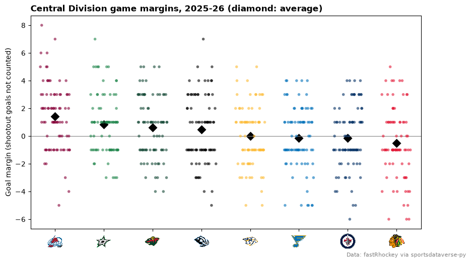
seaborn takes the palette dict for hue; key it by the same values as the hue column. Every regular-season
goal margin of the Central Division, with each team's average:
CENTRAL = ["CHI", "COL", "DAL", "MIN", "NSH", "STL", "UTA", "WPG"]
central = nhl_box.filter(pl.col("team_abbrev").is_in(CENTRAL)).with_columns(
    margin=pl.col("goals") - pl.col("goals_against")
)
means = central.group_by("team_abbrev").agg(pl.col("margin").mean())
order = means.sort(["margin", "team_abbrev"], descending=[True, False])["team_abbrev"]
palette = sdvplot.palette("nhl", teams=central["team_abbrev"])

np.random.seed(2026)  # seaborn jitters from numpy's global random state: a seed keeps the chart the same each run
fig, ax = plt.subplots(figsize=(10, 5.5))
sns.stripplot(central.to_pandas(), x="team_abbrev", y="margin", hue="team_abbrev", order=order.to_list(),
              palette=palette, jitter=0.3, alpha=0.6, size=4, legend=False, ax=ax)  # fmt: skip
sns.pointplot(central.to_pandas(), x="team_abbrev", y="margin", order=order.to_list(), color="black",
              linestyle="none", markers="D", errorbar=None, ax=ax)  # fmt: skip
ax.axhline(0, color="grey", linewidth=0.8)
ax.set_xlabel("")
ax.set_ylabel("Goal margin (shootout goals not counted)")
ax.set_title("Central Division game margins, 2025-26 (diamond: average)", loc="left", fontweight="bold")
sdvplot.axis_logos(ax, "x", league="nhl", height=0.08)
fig.text(0.99, 0.01, FASTRHOCKEY, ha="right", fontsize=8, color="grey")
plt.show()
5. When two teams' colors clash
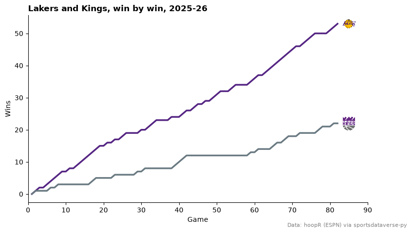
Some rivals share a color: the Lakers' and Kings' primaries are both purple. Measure the gap between two colors (a plain RGB distance does the job) and fall back to one team's secondary when it is too small.
def distance(a: str, b: str) -> float:
    return sum((x - y) ** 2 for x, y in zip(to_rgb(a), to_rgb(b), strict=True)) ** 0.5


lal, sac = sdvplot.team_colors(["LAL", "SAC"], "nba")
print(f"primaries {lal} vs {sac}: distance {distance(lal, sac):.2f}")
if distance(lal, sac) < 0.25:
    sac = sdvplot.team_colors("SAC", "nba", which="secondary")
    print(f"using the Kings' secondary {sac}: distance {distance(lal, sac):.2f}")

race = (
    nba_box.filter(pl.col("team_abbreviation").is_in(["LAL", "SAC"]))
    .sort("game_date")
    .with_columns(
        game_no=pl.int_range(1, pl.len() + 1).over("team_abbreviation"),
        wins=pl.col("team_winner").cast(pl.Int32).cum_sum().over("team_abbreviation"),
    )
)
fig, ax = plt.subplots(figsize=(9, 5))
for team, color in {"LAL": lal, "SAC": sac}.items():
    run = race.filter(pl.col("team_abbreviation") == team)
    ax.plot(run["game_no"], run["wins"], color=color, linewidth=2.5)
    sdvplot.add_logos(ax, [run["game_no"][-1] + 3], [run["wins"][-1]], [team], league="nba", height=0.09)
ax.set_xlim(0, 90)
ax.set_xlabel("Game")
ax.set_ylabel("Wins")
ax.spines[["top", "right"]].set_visible(False)
ax.set_title("Lakers and Kings, win by win, 2025-26", loc="left", fontweight="bold")
fig.text(0.99, 0.01, HOOPR, ha="right", fontsize=8, color="grey")
plt.show()
primaries #552583 vs #5a2d81: distance 0.04
using the Kings' secondary #6a7a82: distance 0.34
A secondary is not always safe either: the Celtics' is white, which vanishes on a white chart. Check it the same way against the background.
6. A league-wide colormap
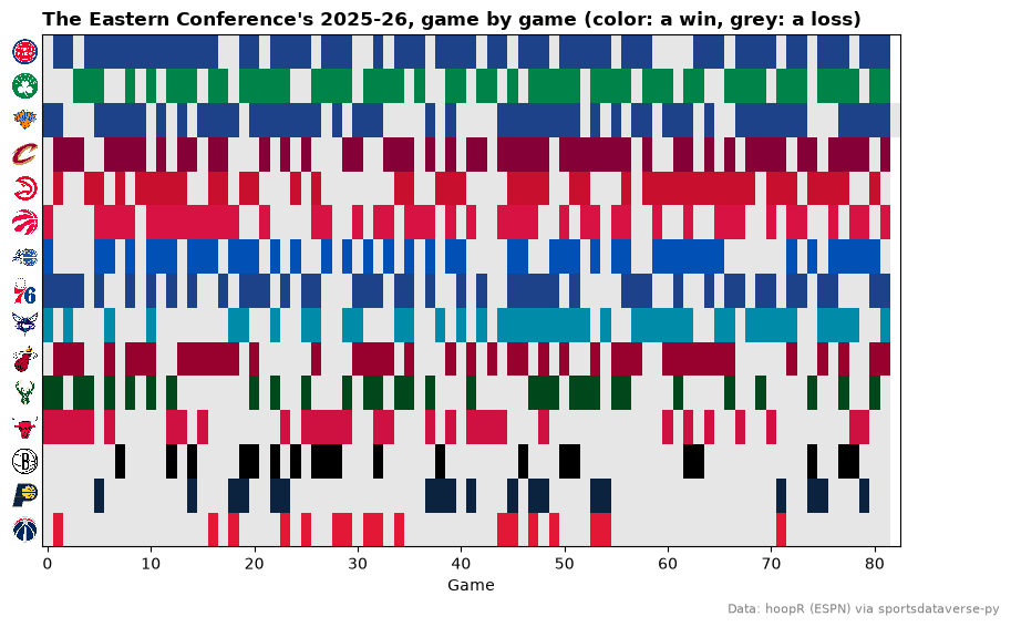
For an image (imshow) or anything else that maps numbers to colors, build a ListedColormap from the
palette, one entry per team. Here every Eastern Conference game is one cell, in the team's color for a win
and light grey for a loss: each team's season as a barcode, best record on top.
east_ids = sdvplot.teams("nba").filter(pl.col("conference") == "Eastern Conference").select("team_id")
east = (
    nba_box.with_columns(pl.col("team_id").cast(pl.Int64).cast(pl.Utf8))
    .join(east_ids, on="team_id")
    .sort("game_date")
    .with_columns(game_no=pl.int_range(pl.len()).over("team_abbreviation"))
)
order = (
    east.group_by("team_abbreviation")
    .agg(pl.col("team_winner").sum())
    .sort(["team_winner", "team_abbreviation"], descending=[True, False])
)["team_abbreviation"].to_list()
cmap = ListedColormap(sdvplot.team_colors(order, "nba") + ["#e6e6e6"])  # one color per team, then a loss

grid = [[float("nan")] * (east["game_no"].max() + 1) for _ in order]
for team, game_no, won in east.select("team_abbreviation", "game_no", "team_winner").iter_rows():
    row = order.index(team)
    grid[row][game_no] = row if won else len(order)

fig, ax = plt.subplots(figsize=(10, 6))
ax.imshow(grid, cmap=cmap, vmin=-0.5, vmax=len(order) + 0.5, aspect="auto", interpolation="nearest")
ax.set_yticks(range(len(order)), order)
ax.tick_params(axis="y", length=0)
sdvplot.axis_logos(ax, "y", league="nba", height=0.055)
ax.set_xlabel("Game")
ax.set_title("The Eastern Conference's 2025-26, game by game (color: a win, grey: a loss)", loc="left",
             fontweight="bold")  # fmt: skip
fig.text(0.99, 0.01, HOOPR, ha="right", fontsize=8, color="grey")
plt.show()
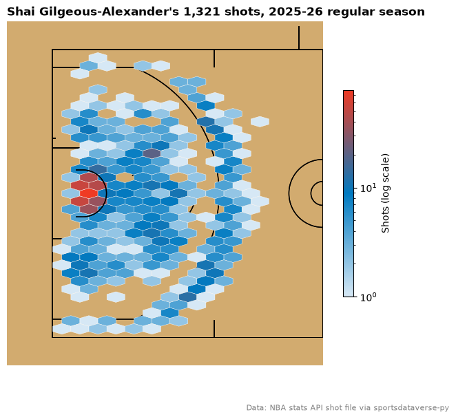
7. A colormap from a team's colors with PyPalettes
PyPalettes' create_cmap turns a list of colors into a matplotlib colormap; built from a pale tint and a
team's two colors, it shades a density chart in that team. Shai Gilgeous-Alexander's shots, from the stats-API
shot file the SportsDataverse publishes as a GitHub release (no stats.nba.com call), moved onto sportypy's
court with court_coords:
from pypalettes import create_cmap

shots = nba.load_nba_stats_shots(seasons=SEASON - 1)  # this loader takes the season's start year
sga = sdvplot.court_coords(shots.filter((pl.col("person_id") == 1628983) & (pl.col("season_type_id") == "2")))
okc_primary, okc_secondary = sdvplot.team_colors("OKC", "nba"), sdvplot.team_colors("OKC", "nba", "secondary")
cmap = create_cmap(["#d6e8f5", okc_primary, okc_secondary], cmap_type="continuous")

fig, ax = plt.subplots(figsize=(7.5, 6.5))
sdvplot.surface("nba", ax=ax, display_range="defense")
hb = ax.hexbin(sga["court_x"], sga["court_y"], gridsize=(15, 18), extent=(-47, 0, -25, 25), mincnt=1,
               bins="log", cmap=cmap, linewidths=0.3, edgecolors="white", zorder=20)  # fmt: skip
fig.colorbar(hb, ax=ax, shrink=0.6, label="Shots (log scale)")
ax.set_title(f"Shai Gilgeous-Alexander's {sga.height:,} shots, 2025-26 regular season", loc="left", fontweight="bold")
fig.text(0.99, 0.01, "Data: NBA stats API shot file via sportsdataverse-py", ha="right", fontsize=8, color="grey")
plt.show()
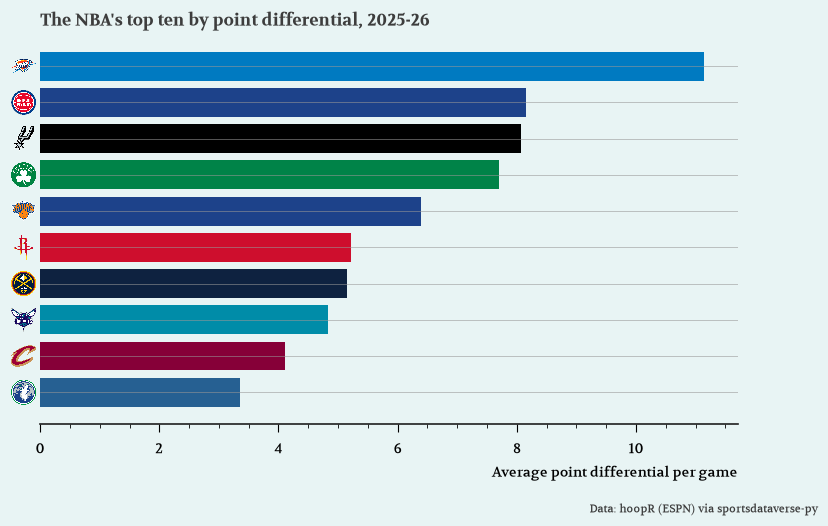
8. A matplotlib theme from morethemes, with team colors on top
morethemes styles the whole figure: background, grid and a Google font that set_theme downloads and
registers. set_theme changes matplotlib's global settings, so call it inside plt.rc_context() to style one
chart and restore your defaults afterwards. Team colors and logos draw over the theme as usual.
import morethemes as mt

net = (
    nba_box.group_by("team_abbreviation")
    .agg(games=pl.len(), diff=(pl.col("team_score") - pl.col("opponent_team_score")).mean())
    .filter(pl.col("games") > 10)
    .sort(["diff", "team_abbreviation"], descending=[True, False])
    .head(10)
    .reverse()
)
with plt.rc_context():
    mt.set_theme("economist")
    fig, ax = plt.subplots(figsize=(9, 5.5))
    ax.barh(net["team_abbreviation"], net["diff"], color=sdvplot.team_colors(net["team_abbreviation"], "nba"))
    sdvplot.axis_logos(ax, "y", league="nba", height=0.07)
    ax.set_xlabel("Average point differential per game")
    ax.set_title("The NBA's top ten by point differential, 2025-26", loc="left", fontweight="bold")
    fig.subplots_adjust(bottom=0.17)
    fig.text(0.99, 0.01, HOOPR, ha="right", fontsize=8)
    plt.show()
9. Spot fallback colors, and supply your own
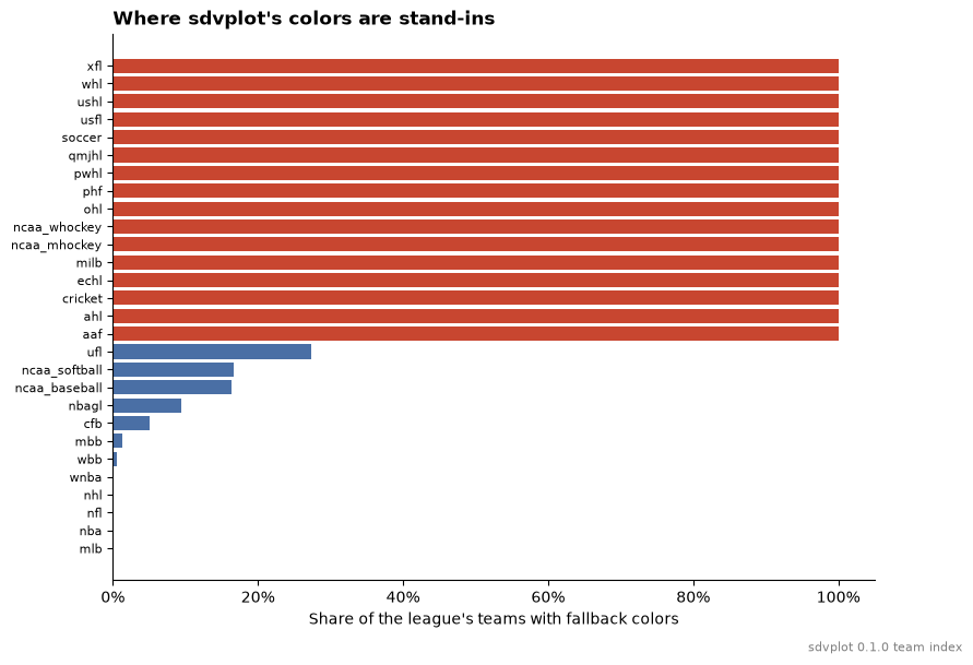
Not every league has official colors in the index. Where none exist, color_source is "fallback" and the
color only keeps teams apart. Check it before you call a color a team's own; for a published chart, override
the fallbacks with the clubs' real colors in your own dict.
share = (
    sdvplot.teams()
    .group_by("league")
    .agg(teams=pl.len(), fallback=(pl.col("color_source") == "fallback").mean())
    .sort("fallback", "league")
)
fig, ax = plt.subplots(figsize=(9, 6.5))
ax.barh(share["league"], share["fallback"], color=["#c84630" if f == 1 else "#4a6fa5" for f in share["fallback"]])
ax.xaxis.set_major_formatter(lambda v, _: f"{v:.0%}")
ax.set_xlabel("Share of the league's teams with fallback colors")
ax.tick_params(axis="y", labelsize=8)
ax.spines[["top", "right"]].set_visible(False)
ax.set_title("Where sdvplot's colors are stand-ins", loc="left", fontweight="bold")
fig.text(0.99, 0.01, f"sdvplot {sdvplot.__version__} team index", ha="right", fontsize=8, color="grey")
plt.show()

city = sdvplot.teams("soccer").filter(pl.col("team_id") == "382")  # ESPN's id for Manchester City
print(city.select("name", "color_primary", "color_source").row(0))
print(sdvplot.palette("soccer", teams=["382"]) | {"382": "#6CABDD"})  # your own color wins
('Manchester City', '#59a14f', 'fallback')
{'382': '#6CABDD'}
Run it yourself
Download the notebook (outputs cleared) or open it on GitHub.