Interactive charts
Eleven recipes for team logos on web charts: Plotly, Altair, Bokeh and HoloViews scatters and bars with hover
details, logos on axes where the library allows it, a Folium map of team locations, self-contained HTML, and
static PNG exports for social posts. Every adapter shares the add_logos(target, x, y, teams, league=...)
call. The data is one season each from the NFL (nflverse), MLB (ESPN), the WNBA and NBA (wehoop and hoopR),
the NHL (fastRhockey), and men's college basketball and college football (hoopR and cfbfastR), all through
sportsdataverse-py.
import tempfile
from pathlib import Path

import altair as alt
import folium
import holoviews as hv
import plotly.graph_objects as go
import polars as pl
import sportsdataverse.cfb as cfb
import sportsdataverse.mbb as mbb
import sportsdataverse.mlb as mlb
import sportsdataverse.nba as nba
import sportsdataverse.nfl as nfl
import sportsdataverse.nhl as nhl
import sportsdataverse.wnba as wnba
from bokeh.io import output_notebook, show
from bokeh.models import ColumnDataSource, HoverTool
from bokeh.plotting import figure
from IPython.display import Image, display

import sdvplot

output_notebook(hide_banner=True)
hv.extension("bokeh", logo=False)
NFL_SEASON = CFB_SEASON = 2025  # football names a season by the year it starts
SEASON = 2026  # the 2026 MLB and WNBA seasons, and the 2025-26 NBA, NHL and college basketball season
output_notebook and hv.extension load BokehJS once for the whole notebook. The shared tables, each one
small: NFL EPA per play, MLB final standings from ESPN, WNBA and NHL scoring per game (more than ten games
drops the WNBA All-Star Game's teams), NBA three-point attempts and the Big 12's adjusted efficiency.
nfl_weeks = nfl.load_nfl_team_stats([NFL_SEASON]).filter(pl.col("season_type") == "REG")
plays = pl.col("attempts") + pl.col("sacks_suffered") + pl.col("carries")
epa = pl.col("passing_epa") + pl.col("rushing_epa")
nfl_epa = (
    nfl_weeks.group_by("team")
    .agg(off_epa=epa.sum() / plays.sum())
    .join(nfl_weeks.group_by(team=pl.col("opponent_team")).agg(def_epa=epa.sum() / plays.sum()), on="team")
    .sort("team")
)

mlb_standings = (
    mlb.espn_mlb_standings(season=SEASON)
    .with_columns(
        rs=pl.col("points_for") / pl.col("games_played"), ra=pl.col("points_against") / pl.col("games_played")
    )
    .sort("team_abbreviation")
)

wnba_teams = (
    wnba.load_wnba_team_boxscore(seasons=[SEASON])
    .filter(pl.col("season_type") == 2)
    .group_by("team_abbreviation")
    .agg(games=pl.len(), scored=pl.col("team_score").mean(), allowed=pl.col("opponent_team_score").mean())
    .filter(pl.col("games") > 10)
    .sort("team_abbreviation")
)

nhl_teams = (
    nhl.load_nhl_team_box(seasons=[SEASON])
    .filter(pl.col("game_id") // 10_000 % 100 == 2)
    .group_by("team_abbrev")
    .agg(gf=pl.col("goals").mean(), ga=pl.col("goals_against").mean(), sv=pl.col("save_pctg").mean())
    .sort("team_abbrev")
)

nba_threes = (
    nba.load_nba_team_boxscore(seasons=[SEASON])
    .filter(pl.col("season_type") == 2)
    .group_by("team_id", "team_abbreviation")
    .agg(
        games=pl.len(),
        fg3a=pl.col("three_point_field_goals_attempted").mean(),
        fg3_pct=pl.col("three_point_field_goals_made").sum() / pl.col("three_point_field_goals_attempted").sum(),
    )
    .filter(pl.col("games") > 10)
    .with_columns(pl.col("team_id").cast(pl.Int64).cast(pl.Utf8))
    .sort("team_abbreviation")
)

big12 = (
    mbb.load_mbb_ratings(SEASON)
    .join(
        sdvplot.teams("mbb").filter(pl.col("conference") == "Big 12 Conference").select("team_id", "name"),
        on="team_id",
    )
    .sort("team_id")
)
mlb_standings["games_played"].max(), nfl_epa.height, wnba_teams.height, nhl_teams.height, big12.height
(162.0, 32, 15, 32, 16)
1. Plotly: logos as markers, with hover details
Plotly draws the logos as layout images, which have no hover, so put the hover text on a transparent marker
trace at the same points. Call add_logos after the traces: it works out the axis ranges (with room for the
logos) and pins them, and the logos then zoom with the data. A reversed range set before the call is kept.
fig = go.Figure(
    go.Scatter(
        x=nfl_epa["off_epa"],
        y=nfl_epa["def_epa"],
        mode="markers",
        marker={"size": 30, "opacity": 0},
        customdata=nfl_epa["team"],
        hovertemplate="%{customdata}<br>Offense %{x:+.3f} EPA/play<br>Defense %{y:+.3f}<extra></extra>",
    )
)
pad = 0.03
fig.update_yaxes(range=[nfl_epa["def_epa"].max() + pad, nfl_epa["def_epa"].min() - pad])  # good defense up
fig.update_xaxes(range=[nfl_epa["off_epa"].min() - pad, nfl_epa["off_epa"].max() + pad])
sdvplot.add_logos(fig, nfl_epa["off_epa"], nfl_epa["def_epa"], nfl_epa["team"], league="nfl", height=0.08)
fig.update_layout(
    title=f"NFL offense vs defense, {NFL_SEASON}<br><sup>Data: nflverse via sportsdataverse-py</sup>",
    xaxis_title="Offense: EPA per play",
    yaxis_title="Defense: EPA per play allowed",
    template="plotly_white",
    width=850,
    height=560,
)
fig
2. Plotly: logos on a category axis
axis_logos replaces the category labels with logos under the axis and grows the margin to fit. ESPN's
abbreviations (ATH, CHW, WSH) resolve as they are. Every MLB team's run differential:
ranked = mlb_standings.sort(["point_differential", "team_abbreviation"], descending=[True, False])
fig = go.Figure(
    go.Bar(
        x=ranked["team_abbreviation"],
        y=ranked["point_differential"],
        marker_color=sdvplot.team_colors(ranked["team_abbreviation"], "mlb"),
        customdata=ranked["team_display_name"],
        hovertemplate="%{customdata}<br>Run differential %{y:+d}<extra></extra>",
    )
)
sdvplot.axis_logos(fig, "x", league="mlb", height=0.05)
fig.update_layout(
    title=f"MLB run differential, {SEASON} regular season<br><sup>Data: ESPN via sportsdataverse-py</sup>",
    yaxis_title="Runs scored minus runs allowed",
    template="plotly_white",
    width=900,
    height=480,
)
fig
3. Altair: logos with tooltips
add_logos returns a new layered chart: the base chart plus an image layer that reuses its encodings. Put the
tooltip on the base marks (nearly transparent, so they still catch the pointer). Reverse the y scale in the
base chart; the logo layer follows it.
base = (
    alt.Chart(wnba_teams)
    .mark_circle(size=900, opacity=0.01)
    .encode(
        x=alt.X("scored:Q", scale=alt.Scale(zero=False, padding=30), title="Points scored per game"),
        y=alt.Y("allowed:Q", scale=alt.Scale(zero=False, reverse=True, padding=30), title="Points allowed per game"),
        tooltip=[
            alt.Tooltip("team_abbreviation:N", title="Team"),
            alt.Tooltip("scored:Q", format=".1f"),
            alt.Tooltip("allowed:Q", format=".1f"),
        ],
    )
    .properties(width=620, height=420)
)
chart = sdvplot.add_logos(
    base, wnba_teams["scored"], wnba_teams["allowed"], wnba_teams["team_abbreviation"], league="wnba", height=0.1
)
chart.properties(title=alt.Title(f"WNBA scoring, {SEASON}", subtitle="Data: wehoop (ESPN) via sportsdataverse-py"))
4. Altair: logos on a discrete axis
axis_logos blanks the axis labels that became logos and draws the logos as a layer just outside the plot.
Keep the data's order with sort=None. The Western Conference's three-point volume, with accuracy in the
tooltip:
west_ids = sdvplot.teams("nba").filter(pl.col("conference") == "Western Conference").select("team_id")
west = nba_threes.join(west_ids, on="team_id").sort(["fg3a", "team_abbreviation"], descending=[True, False])
colors = sdvplot.palette("nba", teams=west["team_abbreviation"])
bars = (
    alt.Chart(west)
    .mark_bar()
    .encode(
        x=alt.X("team_abbreviation:N", sort=None, title=None),
        y=alt.Y("fg3a:Q", title="Three-point attempts per game"),
        color=alt.Color(
            "team_abbreviation:N", scale=alt.Scale(domain=list(colors), range=list(colors.values())), legend=None
        ),  # fmt: skip
        tooltip=[alt.Tooltip("fg3a:Q", format=".1f"), alt.Tooltip("fg3_pct:Q", format=".1%", title="3P%")],
    )
    .properties(width=640, height=320, title="Western Conference three-point volume, 2025-26")
)
sdvplot.axis_logos(bars, "x", league="nba", height=0.09)
5. Bokeh: logos with a hover tool
Bokeh sizes logos in screen pixels, as a fraction of frame_height, so they stay the same size when you zoom.
A transparent scatter renderer carries the HoverTool. NHL goals for and against per game:
source = ColumnDataSource(nhl_teams.to_pandas())
p = figure(
    frame_width=620,
    frame_height=420,
    title="NHL goals for vs against per game, 2025-26 (data: fastRhockey via sportsdataverse-py)",
    x_axis_label="Goals for per game",
    y_axis_label="Goals against per game (reversed)",
)
dots = p.scatter("gf", "ga", source=source, size=28, alpha=0)
p.add_tools(
    HoverTool(
        renderers=[dots],
        tooltips=[("Team", "@team_abbrev"), ("For", "@gf{0.00}"), ("Against", "@ga{0.00}"), ("SV%", "@sv{0.000}")],
    )
)
p.y_range.flipped = True
p.x_range.range_padding = p.y_range.range_padding = 0.15  # room for the logos at the edges
sdvplot.add_logos(p, nhl_teams["gf"], nhl_teams["ga"], nhl_teams["team_abbrev"], league="nhl", height=0.07)
show(p)
6. Bokeh has no axis logos: put them inside the plot
Bokeh glyphs cannot sit outside the plot frame, so axis_logos raises on Bokeh (and HoloViews) with a
TypeError that says what to do instead: draw the logos with add_logos at a y just below the bars.
top = nhl_teams.sort(["gf", "team_abbrev"], descending=[True, False]).head(12)
teams = top["team_abbrev"].to_list()
p = figure(x_range=teams, frame_width=700, frame_height=360, title="NHL goals per game, 2025-26 (top 12)")
p.vbar(x=teams, top=top["gf"].to_list(), width=0.7, color=sdvplot.team_colors(teams, "nhl"))
try:
    sdvplot.axis_logos(p, "x", league="nhl")
except TypeError as e:
    print(e)
p.y_range.start = -0.45
sdvplot.add_logos(p, teams, [-0.22] * len(teams), teams, league="nhl", height=0.1)
p.xaxis.major_label_text_font_size = "0pt"  # the logos are the labels now
p.xgrid.grid_line_color = None
show(p)
Bokeh has no axis logos yet: draw them inside the plot with add_logos (e.g. at a y just below the bars), or use matplotlib, Plotly or Altair for axis logos
7. HoloViews: logos on an element
On HoloViews (Bokeh backend) add_logos returns a copy of the element with a plot hook that draws the logos
when it renders; give the element a frame_height so the logos have a size to scale from. The Big 12:
points = hv.Scatter(big12.to_pandas(), "adj_o", ["adj_d", "name", "adj_em"]).opts(
    frame_width=600,
    frame_height=420,
    size=28,
    alpha=0,
    tools=["hover"],
    invert_yaxis=True,
    xlabel="Adjusted offense (points per 100)",
    ylabel="Adjusted defense (points allowed per 100)",
    title="Big 12 adjusted efficiency, 2025-26 (data: hoopR via sportsdataverse-py)",
)
sdvplot.add_logos(points, big12["adj_o"], big12["adj_d"], big12["team_id"], league="mbb", height=0.08)
8. Folium: a map of team locations
On a Folium map, x is longitude and y is latitude; each logo is a marker with the team's name as its tooltip. cfbfastR's team info carries every stadium's coordinates, and its ESPN team ids resolve once cast from the integer column to strings. The SEC:
sec = cfb.load_cfb_team_info([CFB_SEASON]).filter(pl.col("conference") == "SEC")
m = folium.Map(location=[33.3, -88.5], zoom_start=5, height=520)
sdvplot.add_logos(
    m, sec["longitude"], sec["latitude"], sec["team_id"].cast(pl.Utf8), league="cfb", season=CFB_SEASON, height=0.08
)
m
9. Share a chart that works offline
By default the web adapters link each logo by URL, which keeps the HTML small but needs the network when it is
opened. embed=True inlines every image as a data URI: a larger file that renders anywhere, including in
static exports.
out = Path(tempfile.mkdtemp())
for embed in (False, True):
    fig = go.Figure(go.Scatter(x=mlb_standings["rs"], y=mlb_standings["ra"], mode="markers", marker={"opacity": 0}))
    sdvplot.add_logos(
        fig, mlb_standings["rs"], mlb_standings["ra"], mlb_standings["team_abbreviation"], league="mlb",
        height=0.08, embed=embed,
    )  # fmt: skip
    path = out / f"mlb_embed_{embed}.html"
    fig.write_html(path, include_plotlyjs="cdn")
    print(f"embed={embed}: {path.stat().st_size / 1024:,.0f} KB")
embed=False: 20 KB
embed=True: 1,606 KB
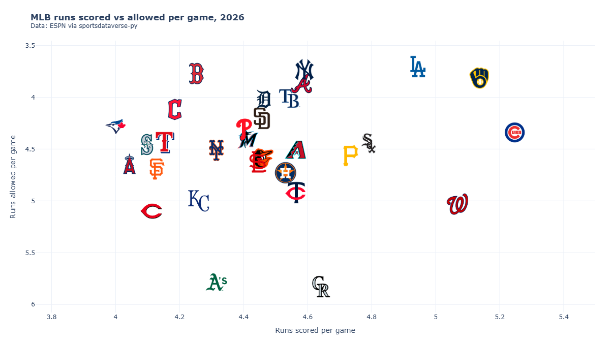
10. Export a Plotly chart as a PNG for social
fig.write_image renders through kaleido (and a headless Chrome). Build the figure with embed=True so the
renderer does not have to fetch each logo, and set the canvas to a social size: 1200 x 675 px here.
fig = go.Figure(go.Scatter(x=mlb_standings["rs"], y=mlb_standings["ra"], mode="markers", marker={"opacity": 0}))
pad = 0.25
fig.update_xaxes(range=[mlb_standings["rs"].min() - pad, mlb_standings["rs"].max() + pad])
fig.update_yaxes(range=[mlb_standings["ra"].max() + pad, mlb_standings["ra"].min() - pad])  # fewer allowed is up
sdvplot.add_logos(
    fig, mlb_standings["rs"], mlb_standings["ra"], mlb_standings["team_abbreviation"], league="mlb",
    height=0.085, embed=True,
)  # fmt: skip
fig.update_layout(
    title=f"<b>MLB runs scored vs allowed per game, {SEASON}</b><br><sup>Data: ESPN via sportsdataverse-py</sup>",
    xaxis_title="Runs scored per game",
    yaxis_title="Runs allowed per game",
    template="plotly_white",
    margin={"l": 70, "r": 30, "t": 80, "b": 60},
)
png = out / "mlb_runs.png"
fig.write_image(png, width=1200, height=675)
display(Image(filename=png, width=800))
11. Export an Altair chart as a PNG
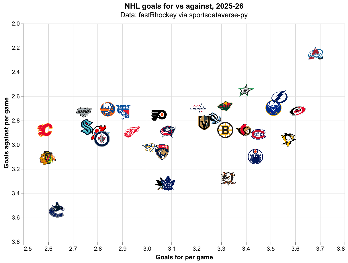
chart.save("x.png") renders through vl-convert, no browser needed. The image layer must carry the pictures
themselves, so again use embed=True; scale_factor sets the pixel density.
base = (
    alt.Chart(nhl_teams)
    .mark_circle(opacity=0)
    .encode(
        x=alt.X("gf:Q", scale=alt.Scale(zero=False, padding=30), title="Goals for per game"),
        y=alt.Y("ga:Q", scale=alt.Scale(zero=False, reverse=True, padding=30), title="Goals against per game"),
    )
    .properties(width=560, height=380)
)
chart = sdvplot.add_logos(
    base, nhl_teams["gf"], nhl_teams["ga"], nhl_teams["team_abbrev"], league="nhl", height=0.08, embed=True
).properties(title=alt.Title("NHL goals for vs against, 2025-26", subtitle="Data: fastRhockey via sportsdataverse-py"))
png = out / "nhl_goals.png"
chart.save(png, scale_factor=2)
display(Image(filename=png, width=700))
Run it yourself
Download the notebook (outputs cleared) or open it on GitHub.