Logos in matplotlib
Twelve short recipes for putting team logos, headshots and other images on matplotlib charts: points, bar ends, axes, line ends, titles and tier lists, plus the sizing, overlap, era and export questions that come up along the way. Each recipe answers one "how do I ...?" with real data from one season: NFL team stats from nflverse, NBA and men's college basketball from hoopR, and NHL from fastRhockey, all read from GitHub release files by sportsdataverse-py.
import tempfile
from pathlib import Path

import matplotlib.pyplot as plt
import polars as pl
import sportsdataverse.mbb as mbb
import sportsdataverse.nba as nba
import sportsdataverse.nfl as nfl
import sportsdataverse.nhl as nhl
from IPython.display import Image, display
from matplotlib import patheffects

import sdvplot
from sdvplot.matplotlib import add_images, team_tiers, title_image

NFL_SEASON = 2025  # nflverse names a season by the year it starts
SEASON = 2026  # the 2025-26 NBA, NHL and college basketball season, named by the year it ends
NFLVERSE = "Data: nflverse via sportsdataverse-py"
HOOPR = "Data: hoopR (ESPN) via sportsdataverse-py"
FASTRHOCKEY = "Data: fastRhockey via sportsdataverse-py"
The recipes share four small tables, each loaded once. NFL offense and defense EPA per play come from nflverse's weekly team stats (passes, sacks and runs). For the NBA, ESPN's team box score gives point differential per game; keeping teams with more than ten games drops the All-Star Game's three teams. The NHL team box score is one row per team per game, and the college ratings carry ESPN team ids, which is all sdvplot needs.
def epa_per_play(stats: pl.DataFrame) -> pl.DataFrame:
    plays = pl.col("attempts") + pl.col("sacks_suffered") + pl.col("carries")
    epa = pl.col("passing_epa") + pl.col("rushing_epa")
    offense = stats.group_by("team").agg(off_epa=epa.sum() / plays.sum())
    defense = stats.group_by(team=pl.col("opponent_team")).agg(def_epa=epa.sum() / plays.sum())
    return offense.join(defense, on="team").sort("team")


nfl_weeks = nfl.load_nfl_team_stats([NFL_SEASON]).filter(pl.col("season_type") == "REG")
nfl_epa = epa_per_play(nfl_weeks)

nba_box = nba.load_nba_team_boxscore(seasons=[SEASON]).filter(pl.col("season_type") == 2)
nba_teams = (
    nba_box.group_by("team_abbreviation")
    .agg(games=pl.len(), diff=(pl.col("team_score") - pl.col("opponent_team_score")).mean())
    .filter(pl.col("games") > 10)
    .sort("team_abbreviation")
)

nhl_games = nhl.load_nhl_team_box(seasons=[SEASON]).filter(pl.col("game_id") // 10_000 % 100 == 2)

mbb_ratings = (
    mbb.load_mbb_ratings(SEASON)
    .join(sdvplot.teams("mbb").select("team_id", "conference"), on="team_id")
    .sort("team_id")
)
nfl_epa.height, nba_teams.height, nhl_games["team_abbrev"].n_unique(), mbb_ratings.height
(32, 30, 32, 365)
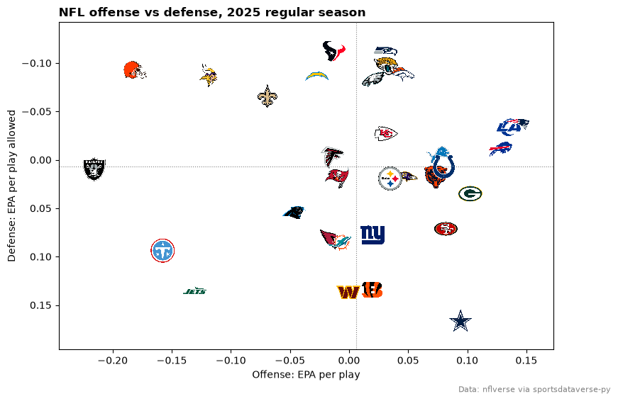
1. Use logos as scatter points
add_logos draws each team's logo centered on its (x, y). It does not move the axis limits, so set them
first (here from the data, with a margin for the logos).
fig, ax = plt.subplots(figsize=(9, 6))
ax.set_xlim(nfl_epa["off_epa"].min() - 0.03, nfl_epa["off_epa"].max() + 0.03)
ax.set_ylim(nfl_epa["def_epa"].max() + 0.03, nfl_epa["def_epa"].min() - 0.03)  # inverted: good defense is up
ax.axvline(nfl_epa["off_epa"].mean(), color="grey", linewidth=0.8, linestyle=":")
ax.axhline(nfl_epa["def_epa"].mean(), color="grey", linewidth=0.8, linestyle=":")
sdvplot.add_logos(ax, nfl_epa["off_epa"], nfl_epa["def_epa"], nfl_epa["team"], league="nfl", height=0.08)
ax.set_xlabel("Offense: EPA per play")
ax.set_ylabel("Defense: EPA per play allowed")
ax.set_title(f"NFL offense vs defense, {NFL_SEASON} regular season", loc="left", fontweight="bold")
fig.text(0.99, 0.01, NFLVERSE, ha="right", fontsize=8, color="grey")
plt.show()
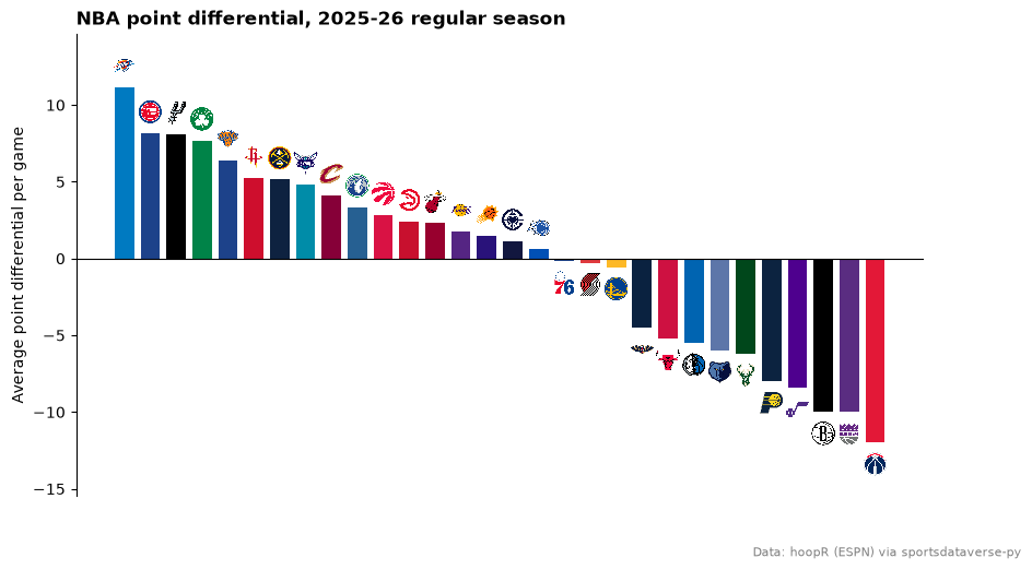
2. Put a logo at the end of each bar
Place each logo just past its bar's end: above a positive bar, below a negative one. Bar colors come from
team_colors, which returns one color per team in the order given.
ranked = nba_teams.sort(["diff", "team_abbreviation"], descending=[True, False])
x = list(range(ranked.height))
ends = [d + 1.4 if d >= 0 else d - 1.4 for d in ranked["diff"]]

fig, ax = plt.subplots(figsize=(10, 5.5))
ax.bar(x, ranked["diff"], color=sdvplot.team_colors(ranked["team_abbreviation"], "nba"), width=0.75)
ax.axhline(0, color="black", linewidth=0.8)
ax.set_ylim(ranked["diff"].min() - 3.5, ranked["diff"].max() + 3.5)
sdvplot.add_logos(ax, x, ends, ranked["team_abbreviation"], league="nba", height=0.055)
ax.set_xticks([])
ax.set_ylabel("Average point differential per game")
ax.spines[["top", "right", "bottom"]].set_visible(False)
ax.set_title("NBA point differential, 2025-26 regular season", loc="left", fontweight="bold")
fig.text(0.99, 0.01, HOOPR, ha="right", fontsize=8, color="grey")
plt.show()
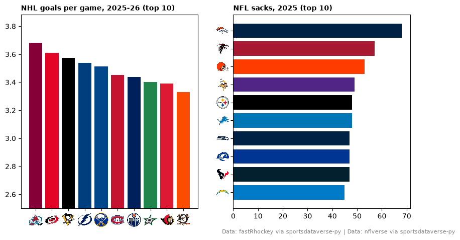
3. Swap axis labels for logos (x and y)
axis_logos replaces the tick labels of a team axis with logos. It reads the labels when called, so draw
the chart first; the labels just need to be team values resolve understands (here the data's own NHL and
NFL abbreviations).
nhl_scoring = (
    nhl_games.group_by("team_abbrev")
    .agg(gpg=pl.col("goals").mean())
    .sort(["gpg", "team_abbrev"], descending=[True, False])
    .head(10)
)
nfl_sacks = nfl_weeks.group_by("team").agg(pl.col("def_sacks").sum()).sort("def_sacks", "team").tail(10)

fig, (left, right) = plt.subplots(1, 2, figsize=(10, 5))
colors = sdvplot.team_colors(nhl_scoring["team_abbrev"], "nhl")
left.bar(nhl_scoring["team_abbrev"], nhl_scoring["gpg"], color=colors)
left.set_ylim(2.5, nhl_scoring["gpg"].max() + 0.2)
left.set_title("NHL goals per game, 2025-26 (top 10)", loc="left", fontsize=10, fontweight="bold")
sdvplot.axis_logos(left, "x", league="nhl", height=0.08)

right.barh(nfl_sacks["team"], nfl_sacks["def_sacks"], color=sdvplot.team_colors(nfl_sacks["team"], "nfl"))
right.set_title(f"NFL sacks, {NFL_SEASON} (top 10)", loc="left", fontsize=10, fontweight="bold")
sdvplot.axis_logos(right, "y", league="nfl", height=0.07)
fig.text(0.99, 0.01, f"{FASTRHOCKEY} | {NFLVERSE}", ha="right", fontsize=8, color="grey")
plt.show()
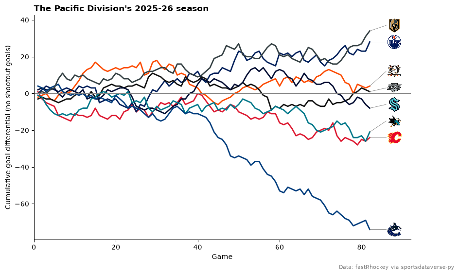
4. Label each line's last point with a logo
A logo at the end of a line replaces a legend. Leave room on the right with set_xlim, then put each logo a
little past the team's last point. Teams that finish close together would stack their logos, so walk up the
finishing order and keep each logo at least one logo-height above the one below, with a thin leader line back
to its point. The Pacific Division's season, as cumulative goal differential:
PACIFIC = ["ANA", "CGY", "EDM", "LAK", "SEA", "SJS", "VAN", "VGK"]
runs = (
    nhl_games.filter(pl.col("team_abbrev").is_in(PACIFIC))
    .sort("game_date")
    .with_columns(
        game_no=pl.int_range(1, pl.len() + 1).over("team_abbrev"),
        goal_diff=(pl.col("goals") - pl.col("goals_against")).cum_sum().over("team_abbrev"),
    )
)
last = runs.group_by("team_abbrev").agg(pl.all().sort_by("game_no").last()).sort("goal_diff", "team_abbrev")
gap = 9  # goals: about one logo height on this axis
spots = []
for y in last["goal_diff"]:
    spots.append(max(y, spots[-1] + gap) if spots else y)
end = last["game_no"].max()

fig, ax = plt.subplots(figsize=(10, 6))
for team in PACIFIC:
    run = runs.filter(pl.col("team_abbrev") == team)
    ax.plot(run["game_no"], run["goal_diff"], color=sdvplot.team_colors(team, "nhl"), linewidth=2)
for y, spot in zip(last["goal_diff"], spots, strict=True):
    ax.plot([end, end + 4], [y, spot], color="grey", linewidth=0.6)
ax.axhline(0, color="grey", linewidth=0.8)
ax.set_xlim(0, end + 10)
sdvplot.add_logos(ax, [end + 6] * last.height, spots, last["team_abbrev"], league="nhl", height=0.07)
ax.set_xlabel("Game")
ax.set_ylabel("Cumulative goal differential (no shootout goals)")
ax.spines[["top", "right"]].set_visible(False)
ax.set_title("The Pacific Division's 2025-26 season", loc="left", fontweight="bold")
fig.text(0.99, 0.01, FASTRHOCKEY, ha="right", fontsize=8, color="grey")
plt.show()
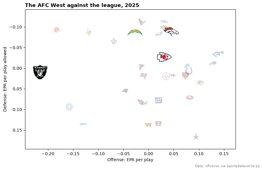
5. Size and fade logos to highlight a group
height is a fraction of the Axes height, so a logo keeps its size relative to the plot whatever the figure
size; alpha fades it. Two calls: the league faded and small, then the AFC West large and opaque.
AFC_WEST = ["DEN", "KC", "LAC", "LV"]
focus = nfl_epa.filter(pl.col("team").is_in(AFC_WEST))
rest = nfl_epa.filter(~pl.col("team").is_in(AFC_WEST))

fig, ax = plt.subplots(figsize=(9, 6))
ax.set_xlim(nfl_epa["off_epa"].min() - 0.03, nfl_epa["off_epa"].max() + 0.03)
ax.set_ylim(nfl_epa["def_epa"].max() + 0.03, nfl_epa["def_epa"].min() - 0.03)
sdvplot.add_logos(ax, rest["off_epa"], rest["def_epa"], rest["team"], league="nfl", height=0.06, alpha=0.25)
sdvplot.add_logos(ax, focus["off_epa"], focus["def_epa"], focus["team"], league="nfl", height=0.12)
ax.set_xlabel("Offense: EPA per play")
ax.set_ylabel("Defense: EPA per play allowed")
ax.set_title(f"The AFC West against the league, {NFL_SEASON}", loc="left", fontweight="bold")
fig.text(0.99, 0.01, NFLVERSE, ha="right", fontsize=8, color="grey")
plt.show()
6. Keep overlapping logos readable
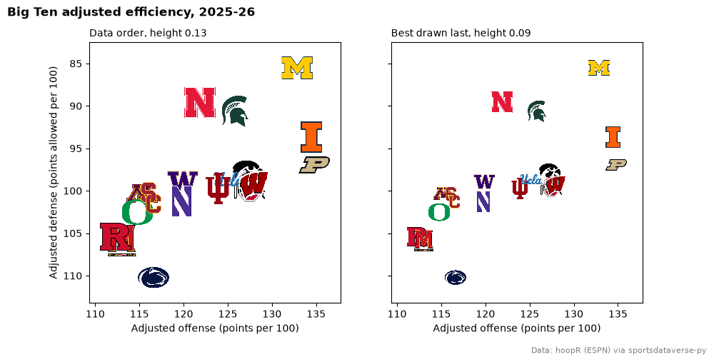
Logos are drawn in row order, so the last row ends on top. On the left, the Big Ten in the data's order (by
team id) hides some of its best teams; on the right, sorting weakest to strongest puts the contenders on top,
and a smaller height cuts the overlap.
big_ten = mbb_ratings.filter(pl.col("conference") == "Big Ten Conference")

fig, axes = plt.subplots(1, 2, figsize=(10, 5), sharex=True, sharey=True)
for ax, frame, height, label in [
    (axes[0], big_ten, 0.13, "Data order, height 0.13"),
    (axes[1], big_ten.sort("adj_em"), 0.09, "Best drawn last, height 0.09"),
]:
    ax.set_xlim(big_ten["adj_o"].min() - 3, big_ten["adj_o"].max() + 3)
    ax.set_ylim(big_ten["adj_d"].max() + 3, big_ten["adj_d"].min() - 3)  # inverted: good defense is up
    sdvplot.add_logos(ax, frame["adj_o"], frame["adj_d"], frame["team_id"], league="mbb", height=height)
    ax.set_title(label, loc="left", fontsize=10)
    ax.set_xlabel("Adjusted offense (points per 100)")
axes[0].set_ylabel("Adjusted defense (points allowed per 100)")
fig.suptitle("Big Ten adjusted efficiency, 2025-26", x=0.01, ha="left", fontweight="bold")
fig.subplots_adjust(bottom=0.15)
fig.text(0.99, 0.01, HOOPR, ha="right", fontsize=8, color="grey")
plt.show()
For a single team that must stay visible, draw it in its own add_logos call with a higher zorder.
7. Show the logo a team wore that season
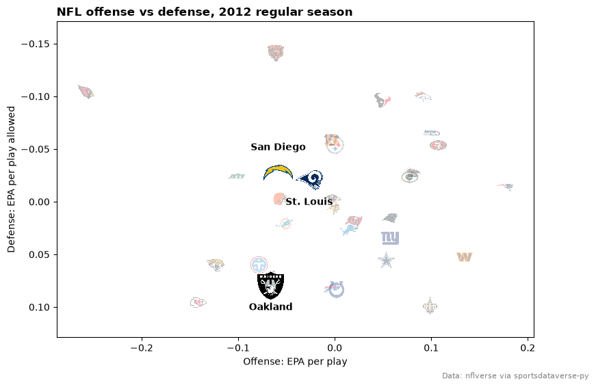
nflverse files past seasons under today's codes (LV, LAC, LA), but season= still picks the mark in
use that year: 2012 brings back the Oakland, San Diego and St. Louis logos. Teams with no older mark in the
archive keep today's.
epa_2012 = epa_per_play(nfl.load_nfl_team_stats([2012]).filter(pl.col("season_type") == "REG"))
moved = {"LV": ("Oakland", -26), "LAC": ("San Diego", 24), "LA": ("St. Louis", -26)}  # label, offset (pt)
then = epa_2012.filter(pl.col("team").is_in(list(moved)))
rest = epa_2012.filter(~pl.col("team").is_in(list(moved)))

fig, ax = plt.subplots(figsize=(9, 6))
ax.set_xlim(epa_2012["off_epa"].min() - 0.03, epa_2012["off_epa"].max() + 0.03)
ax.set_ylim(epa_2012["def_epa"].max() + 0.03, epa_2012["def_epa"].min() - 0.03)
x, y = "off_epa", "def_epa"
sdvplot.add_logos(ax, rest[x], rest[y], rest["team"], league="nfl", season=2012, height=0.06, alpha=0.3)
sdvplot.add_logos(ax, then[x], then[y], then["team"], league="nfl", season=2012, height=0.1)
for team, xi, yi in then.select("team", x, y).iter_rows():
    label, dy = moved[team]
    ax.annotate(label, (xi, yi), xytext=(0, dy), textcoords="offset points", ha="center", fontweight="bold")
ax.set_xlabel("Offense: EPA per play")
ax.set_ylabel("Defense: EPA per play allowed")
ax.set_title("NFL offense vs defense, 2012 regular season", loc="left", fontweight="bold")
fig.text(0.99, 0.01, NFLVERSE, ha="right", fontsize=8, color="grey")
plt.show()
8. Put a logo beside the title
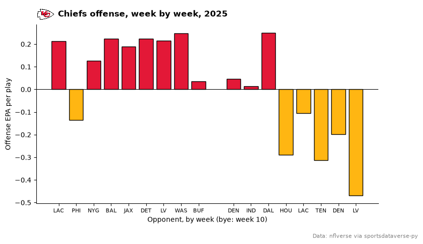
title_image sets the title and draws a team's logo (or any image) beside it. height is in points, so give
a tall image room with pad=. One team's season, week by week:
plays = pl.col("attempts") + pl.col("sacks_suffered") + pl.col("carries")
kc = (
    nfl_weeks.filter(pl.col("team") == "KC")
    .with_columns(epa=(pl.col("passing_epa") + pl.col("rushing_epa")) / plays)
    .sort("week")
)
good, bad = sdvplot.team_colors("KC", "nfl"), sdvplot.team_colors("KC", "nfl", "secondary")

fig, ax = plt.subplots(figsize=(9, 5))
ax.bar(kc["week"], kc["epa"], color=[good if e >= 0 else bad for e in kc["epa"]], edgecolor="black")
ax.axhline(0, color="black", linewidth=0.8)
ax.set_xticks(kc["week"].to_list(), kc["opponent_team"].to_list(), fontsize=8)
bye = sorted(set(range(1, kc["week"].max() + 1)) - set(kc["week"]))
ax.set_xlabel(f"Opponent, by week (bye: week {bye[0]})")
ax.set_ylabel("Offense EPA per play")
ax.spines[["top", "right"]].set_visible(False)
title = f"Chiefs offense, week by week, {NFL_SEASON}"
title_image(ax, "KC", title, league="nfl", height=28, loc="left", fontweight="bold", pad=12)
fig.subplots_adjust(bottom=0.15)
fig.text(0.99, 0.01, NFLVERSE, ha="right", fontsize=8, color="grey")
plt.show()
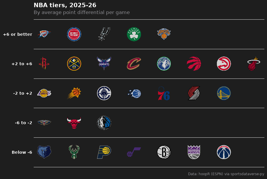
9. Build a tier list
team_tiers takes a frame with team and tier_no (1 on top) and returns a finished figure on sdvplotR's
Tiermaker theme; tier_desc names the tiers. NBA teams tiered by point differential:
tiers = nba_teams.sort(["diff", "team_abbreviation"], descending=[True, False]).with_columns(
    team=pl.col("team_abbreviation"),
    tier_no=pl.when(pl.col("diff") >= 6)
    .then(1)
    .when(pl.col("diff") >= 2)
    .then(2)
    .when(pl.col("diff") >= -2)
    .then(3)
    .when(pl.col("diff") >= -6)
    .then(4)
    .otherwise(5),
)
fig = team_tiers(
    tiers,
    "nba",
    title="NBA tiers, 2025-26",
    subtitle="By average point differential per game",
    caption=HOOPR,
    tier_desc={1: "+6 or better", 2: "+2 to +6", 3: "-2 to +2", 4: "-6 to -2", 5: "Below -6"},
)
fig.set_size_inches(9, 6)
plt.show()
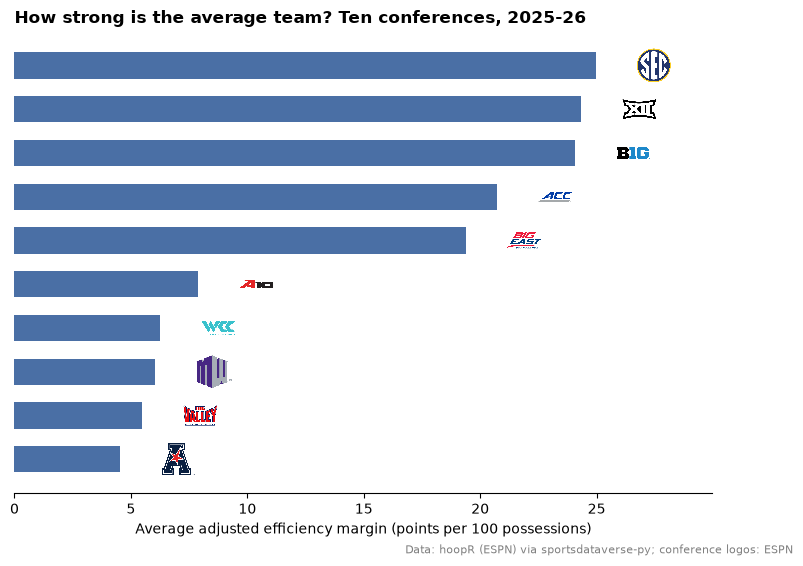
10. Place any image: conference logos
add_images is add_logos for any picture, by URL or local path, with the same height. Conferences are not
teams, so their marks come from ESPN's conference logo URLs, one per bar.
CONFERENCES = {
    "Southeastern Conference": "sec",
    "Big Ten Conference": "big_ten",
    "Big 12 Conference": "big_12",
    "Big East Conference": "big_east",
    "Atlantic Coast Conference": "acc",
    "Mountain West Conference": "mountain_west",
    "West Coast Conference": "west_coast",
    "Atlantic 10 Conference": "atlantic_10",
    "American Conference": "american",
    "Missouri Valley Conference": "missouri_valley",
}
conf = (
    mbb_ratings.filter(pl.col("conference").is_in(list(CONFERENCES)))
    .group_by("conference")
    .agg(pl.col("adj_em").mean())
    .sort("adj_em")
)
urls = [f"https://a.espncdn.com/i/teamlogos/ncaa_conf/500/{CONFERENCES[c]}.png" for c in conf["conference"]]
y = list(range(conf.height))

fig, ax = plt.subplots(figsize=(9, 6))
ax.barh(y, conf["adj_em"], color="#4a6fa5", height=0.6)
ax.set_xlim(0, conf["adj_em"].max() + 5)
add_images(ax, conf["adj_em"] + 2.5, y, urls, height=0.08)
ax.set_yticks([])
ax.set_xlabel("Average adjusted efficiency margin (points per 100 possessions)")
ax.spines[["top", "right", "left"]].set_visible(False)
ax.set_title("How strong is the average team? Ten conferences, 2025-26", loc="left", fontweight="bold")
fig.text(0.99, 0.01, f"{HOOPR}; conference logos: ESPN", ha="right", fontsize=8, color="grey")
plt.show()
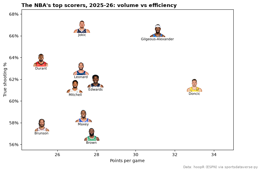
11. Put headshots on a scatter
add_headshots works like add_logos with player ids instead of teams; ESPN athlete ids, as in hoopR's player
box score, work directly. The season's top scorers (50+ games), by volume and efficiency:
players = nba.load_nba_player_boxscore(seasons=[SEASON]).filter((pl.col("season_type") == 2) & ~pl.col("did_not_play"))
scorers = (
    players.group_by("athlete_id", "athlete_display_name")
    .agg(
        games=pl.len(),
        ppg=pl.col("points").mean(),
        ts=pl.col("points").sum()
        / (2 * (pl.col("field_goals_attempted").sum() + 0.44 * pl.col("free_throws_attempted").sum())),
    )
    .filter(pl.col("games") >= 50)
    .sort("ppg", descending=True)
    .head(10)
)

fig, ax = plt.subplots(figsize=(9, 6))
ax.set_xlim(scorers["ppg"].min() - 1, scorers["ppg"].max() + 2)
ax.set_ylim(scorers["ts"].min() - 0.015, scorers["ts"].max() + 0.015)
sdvplot.add_headshots(ax, scorers["ppg"], scorers["ts"], scorers["athlete_id"], league="nba", height=0.1)
halo = [patheffects.withStroke(linewidth=3, foreground="white")]  # keeps a name readable over a photo
for name, ppg, ts in scorers.select("athlete_display_name", "ppg", "ts").iter_rows():
    ax.annotate(name.split()[-1], (ppg, ts), xytext=(0, -24), textcoords="offset points", ha="center",
                fontsize=8, path_effects=halo, zorder=4)  # fmt: skip
ax.yaxis.set_major_formatter(lambda v, _: f"{v:.0%}")
ax.set_xlabel("Points per game")
ax.set_ylabel("True shooting %")
ax.set_title("The NBA's top scorers, 2025-26: volume vs efficiency", loc="left", fontweight="bold")
fig.text(0.99, 0.01, HOOPR, ha="right", fontsize=8, color="grey")
plt.show()
12. Save at social media sizes
Size the figure in inches times dpi: 10.8 x 10.8 in at 100 dpi is 1080 x 1080 px (square), 12 x 6.75 in is
1200 x 675 px (a landscape card). Skip bbox_inches="tight", which trims the canvas to a different size;
logos scale with the Axes, so nothing needs resizing.
out = Path(tempfile.mkdtemp())
for name, size in {"square": (10.8, 10.8), "landscape": (12, 6.75)}.items():
    fig, ax = plt.subplots(figsize=size, dpi=100, layout="constrained")
    ax.set_xlim(nfl_epa["off_epa"].min() - 0.03, nfl_epa["off_epa"].max() + 0.03)
    ax.set_ylim(nfl_epa["def_epa"].max() + 0.03, nfl_epa["def_epa"].min() - 0.03)
    sdvplot.add_logos(ax, nfl_epa["off_epa"], nfl_epa["def_epa"], nfl_epa["team"], league="nfl", height=0.08)
    ax.set_xlabel("Offense: EPA per play")
    ax.set_ylabel("Defense: EPA per play allowed")
    ax.set_title(f"NFL offense vs defense, {NFL_SEASON}", loc="left", fontweight="bold", fontsize=16)
    fig.text(0.99, 0.005, NFLVERSE, ha="right", fontsize=9, color="grey")
    fig.savefig(out / f"{name}.png", dpi=100)
    plt.close(fig)
    print(name, plt.imread(out / f"{name}.png").shape[1::-1])

display(Image(filename=out / "landscape.png", width=600))
square (1080, 1080)
landscape (1200, 675)

Run it yourself
Download the notebook (outputs cleared) or open it on GitHub.