plotnine
Twelve recipes for team marks in plotnine, the Python grammar of graphics: logo, wordmark and headshot layers,
team color scales, facets, logo axes, title images, any image by URL, reference lines, tier lists and themes.
Every sdvplot layer is an ordinary plotnine layer, so it composes with + like geom_point. The data is one
season each from the WNBA and NBA (wehoop and hoopR), the NFL (nflverse), the NHL (fastRhockey) and men's
college basketball, read from GitHub release files by sportsdataverse-py.
import polars as pl
import sportsdataverse.mbb as mbb
import sportsdataverse.nba as nba
import sportsdataverse.nfl as nfl
import sportsdataverse.nhl as nhl
import sportsdataverse.wnba as wnba
from plotnine import (
    aes,
    coord_flip,
    element_blank,
    element_line,
    element_rect,
    element_text,
    facet_wrap,
    geom_col,
    geom_hline,
    geom_line,
    geom_point,
    geom_text,
    ggplot,
    labs,
    scale_fill_manual,
    scale_x_continuous,
    scale_y_continuous,
    scale_y_reverse,
    theme,
    theme_bw,
    theme_minimal,
)

import sdvplot
from sdvplot.plotnine import (
    geom_from_path,
    geom_mean_lines,
    geom_median_lines,
    geom_sdv_headshots,
    geom_sdv_logos,
    geom_sdv_wordmarks,
    scale_color_sdv,
    scale_fill_sdv,
    team_tiers,
    title_image,
)

NFL_SEASON = 2025  # nflverse names a season by the year it starts
SEASON = 2026  # the 2026 WNBA season and the 2025-26 NBA, NHL and college season
NFLVERSE = "Data: nflverse via sportsdataverse-py"
HOOPR = "Data: hoopR (ESPN) via sportsdataverse-py"
WEHOOP = "Data: wehoop (ESPN) via sportsdataverse-py"
FASTRHOCKEY = "Data: fastRhockey via sportsdataverse-py"
The shared tables: WNBA team scoring per game (more than ten games drops the All-Star Game's teams), NFL EPA per play on offense and defense with each team's division, the NHL team box score, NBA team box scores and college basketball's adjusted efficiency with each team's conference.
wnba_games = wnba.load_wnba_team_boxscore(seasons=[SEASON]).filter(pl.col("season_type") == 2)
wnba_teams = (
    wnba_games.group_by("team_abbreviation")
    .agg(games=pl.len(), scored=pl.col("team_score").mean(), allowed=pl.col("opponent_team_score").mean())
    .filter(pl.col("games") > 10)
    .sort("team_abbreviation")
)

nfl_weeks = nfl.load_nfl_team_stats([NFL_SEASON]).filter(pl.col("season_type") == "REG")
plays = pl.col("attempts") + pl.col("sacks_suffered") + pl.col("carries")
epa = pl.col("passing_epa") + pl.col("rushing_epa")
nfl_epa = (
    nfl_weeks.group_by("team")
    .agg(off_epa=epa.sum() / plays.sum())
    .join(nfl_weeks.group_by(team=pl.col("opponent_team")).agg(def_epa=epa.sum() / plays.sum()), on="team")
    .join(nfl.load_nfl_teams().select(team="team_abbr", division="team_division"), on="team")
    .sort("team")
)

nhl_games = nhl.load_nhl_team_box(seasons=[SEASON]).filter(pl.col("game_id") // 10_000 % 100 == 2)
nba_box = nba.load_nba_team_boxscore(seasons=[SEASON]).filter(pl.col("season_type") == 2)
mbb_ratings = (
    mbb.load_mbb_ratings(SEASON)
    .join(sdvplot.teams("mbb").select("team_id", "conference"), on="team_id")
    .sort("team_id")
)
wnba_teams.height, nfl_epa.height, nhl_games.height, nba_box.height, mbb_ratings.height
(15, 32, 2624, 2470, 365)
1. Logos as points
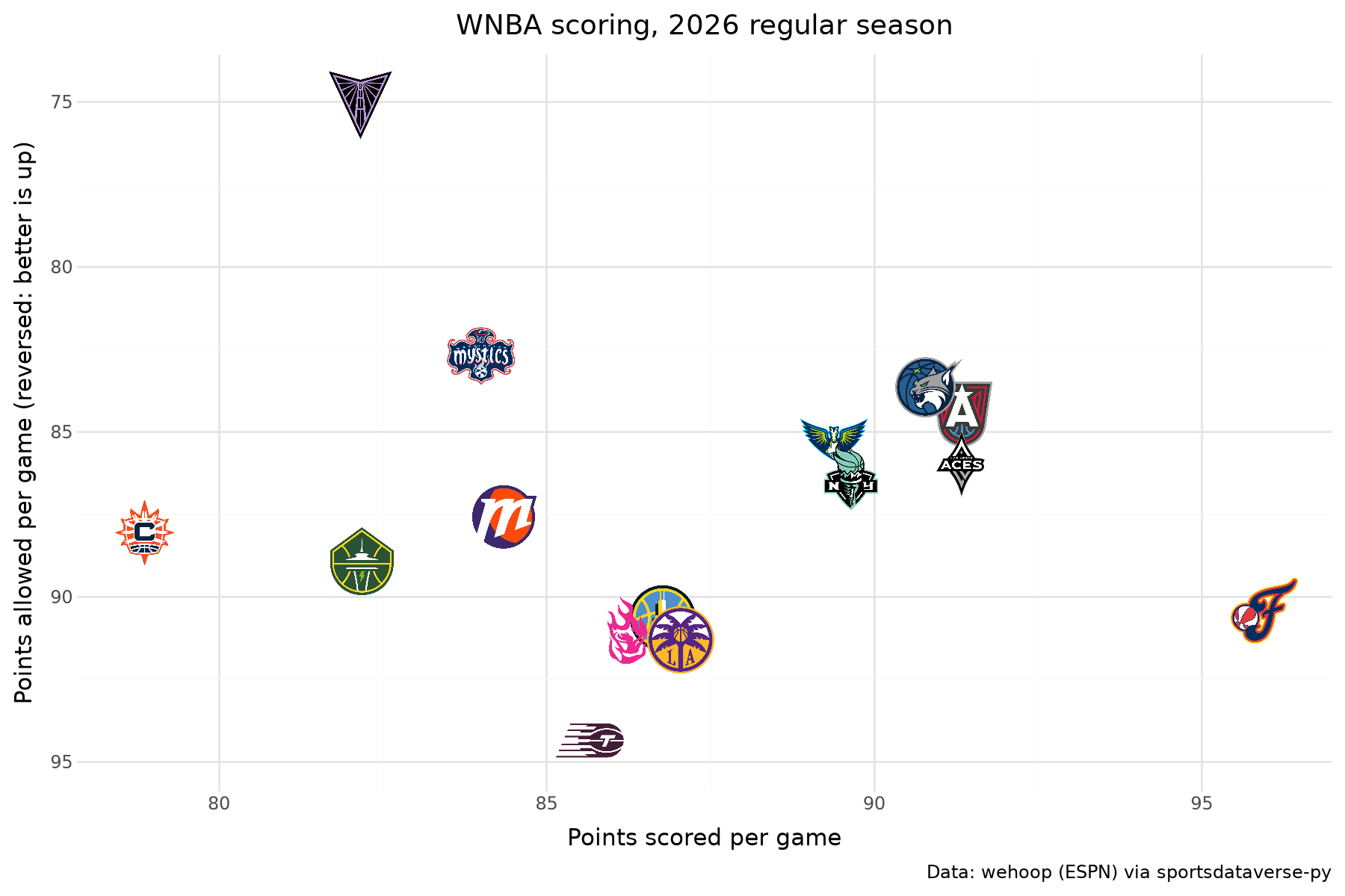
Map the team column to the team aesthetic and add geom_sdv_logos(league=...). height is a fraction of
the panel height. The layer trains the scales on the points, not on the images, so widen expand to keep the
logos at the edges inside the panel.
(
    ggplot(wnba_teams, aes("scored", "allowed", team="team_abbreviation"))
    + geom_sdv_logos(league="wnba", height=0.1)
    + scale_x_continuous(expand=(0.06, 0))
    + scale_y_reverse(expand=(0.08, 0))
    + labs(
        x="Points scored per game",
        y="Points allowed per game (reversed: better is up)",
        title=f"WNBA scoring, {SEASON} regular season",
        caption=WEHOOP,
    )
    + theme_minimal()
    + theme(figure_size=(9, 6))
)
2. Wordmarks instead of logos
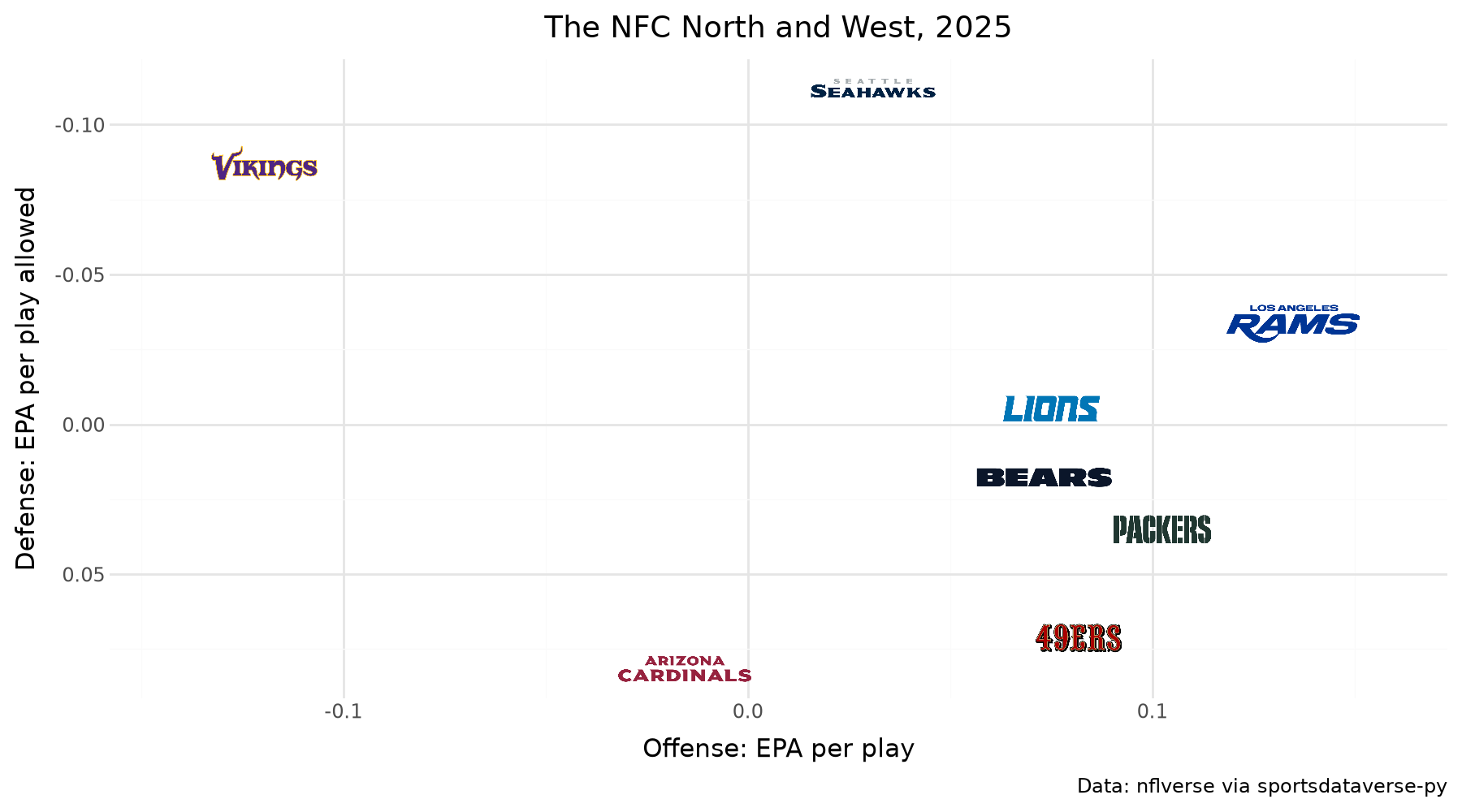
geom_sdv_wordmarks takes the same aesthetics; wordmarks are wide, so give them a smaller height. The archive
has wordmarks for NFL and MLB teams; a team without one is skipped with a warning. Two NFC divisions:
(
    ggplot(
        nfl_epa.filter(pl.col("division").is_in(["NFC North", "NFC West"])),
        aes("off_epa", "def_epa", team="team"),
    )
    + geom_sdv_wordmarks(league="nfl", height=0.06)
    + scale_y_reverse()
    + scale_x_continuous(expand=(0.15, 0))
    + labs(
        x="Offense: EPA per play",
        y="Defense: EPA per play allowed",
        title=f"The NFC North and West, {NFL_SEASON}",
        caption=NFLVERSE,
    )
    + theme_minimal()
    + theme(figure_size=(9, 5))
)
3. Headshots as points
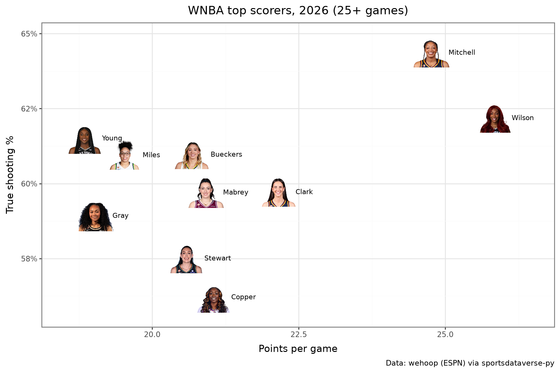
geom_sdv_headshots maps player_id (ESPN athlete ids by default; NFL gsis ids with id_system="gsis").
geom_text, nudged to the right, names each one. The WNBA's top scorers:
players = wnba.load_wnba_player_boxscore(seasons=[SEASON]).filter(
    (pl.col("season_type") == 2) & ~pl.col("did_not_play")
)
scorers = (
    players.group_by("athlete_id", "athlete_display_name")
    .agg(
        games=pl.len(),
        ppg=pl.col("points").mean(),
        ts=pl.col("points").sum()
        / (2 * (pl.col("field_goals_attempted").sum() + 0.44 * pl.col("free_throws_attempted").sum())),
    )
    .filter(pl.col("games") >= 25)
    .sort("ppg", descending=True)
    .head(10)
    .with_columns(name=pl.col("athlete_display_name").str.split(" ").list.last())
)
(
    ggplot(scorers, aes("ppg", "ts", player_id="athlete_id"))
    + geom_sdv_headshots(league="wnba", height=0.1)
    + geom_text(aes(label="name"), nudge_x=0.3, ha="left", size=8)
    + scale_x_continuous(expand=(0.1, 0))
    + scale_y_continuous(labels=lambda bs: [f"{b:.0%}" for b in bs], expand=(0.12, 0))
    + labs(
        x="Points per game",
        y="True shooting %",
        title=f"WNBA top scorers, {SEASON} (25+ games)",
        caption=WEHOOP,
    )
    + theme_bw()
    + theme(figure_size=(9, 6))
)
4. Fill bars with team colors
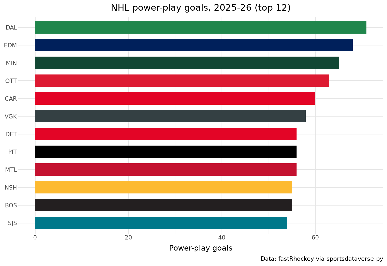
scale_fill_sdv(league) maps any team value to its primary color (which="secondary" for the other one);
guide=None drops the legend the bars don't need. NHL power-play goals, top 12:
power_play = (
    nhl_games.group_by("team_abbrev")
    .agg(pl.col("power_play_goals").sum())
    .sort(["power_play_goals", "team_abbrev"], descending=[True, False])
    .head(12)
)
(
    ggplot(power_play, aes("reorder(team_abbrev, power_play_goals)", "power_play_goals", fill="team_abbrev"))
    + geom_col(width=0.7)
    + coord_flip()
    + scale_fill_sdv("nhl", guide=None)
    + labs(x="", y="Power-play goals", title="NHL power-play goals, 2025-26 (top 12)", caption=FASTRHOCKEY)
    + theme_minimal()
    + theme(figure_size=(8, 5.5))
)
5. Color lines with team colors
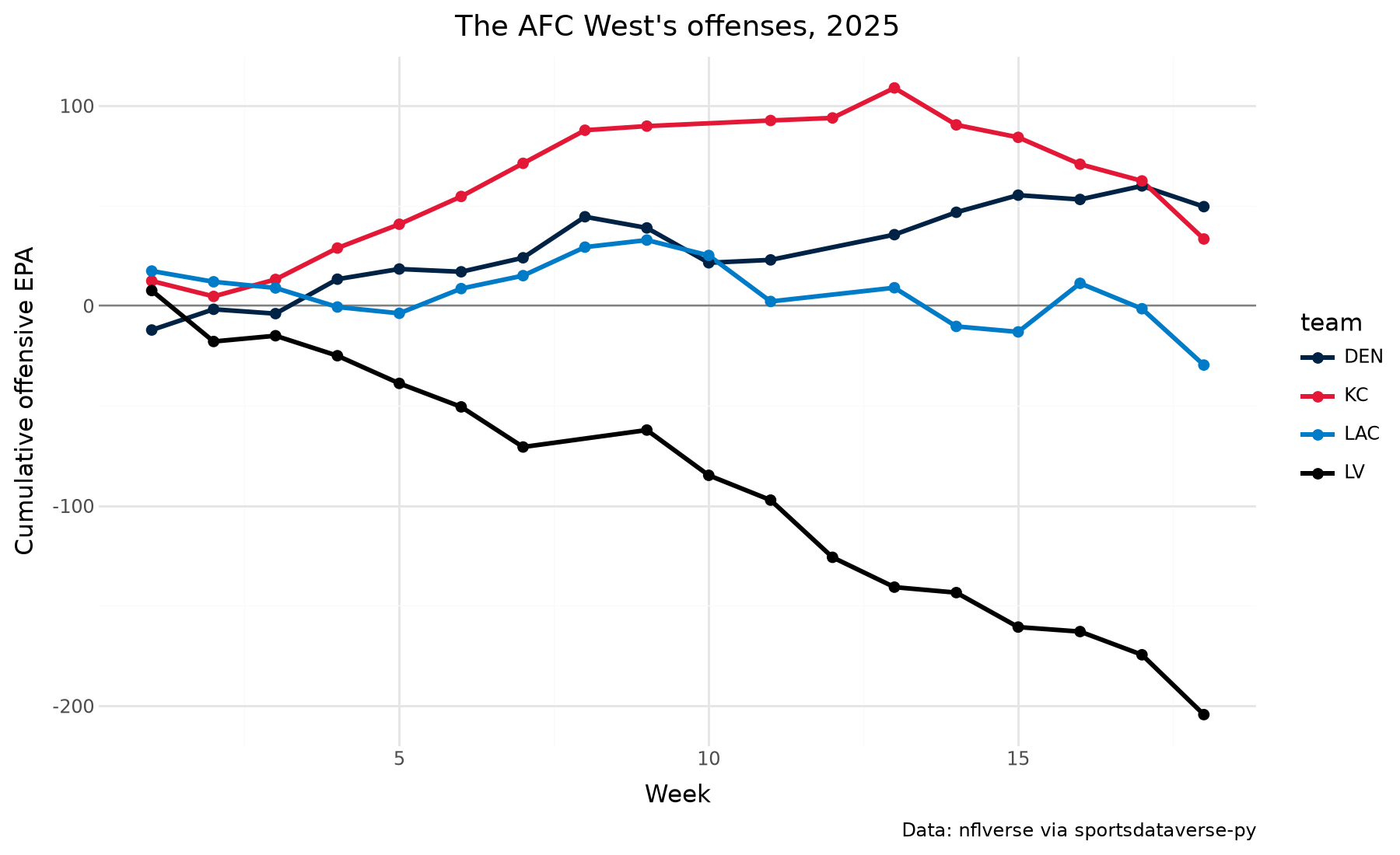
scale_color_sdv does the same for color, and keeps a legend when you want one. The AFC West's season as
cumulative offensive EPA:
afc_west = (
    nfl_weeks.filter(pl.col("team").is_in(["DEN", "KC", "LAC", "LV"]))
    .sort("week")
    .with_columns(cum_epa=epa.cum_sum().over("team"))
)
(
    ggplot(afc_west, aes("week", "cum_epa", color="team"))
    + geom_hline(yintercept=0, color="grey")
    + geom_line(size=1.2)
    + geom_point(size=2)
    + scale_color_sdv("nfl", name="")
    + labs(
        x="Week",
        y="Cumulative offensive EPA",
        title=f"The AFC West's offenses, {NFL_SEASON}",
        caption=NFLVERSE,
    )
    + theme_minimal()
    + theme(figure_size=(9, 5.5))
)
6. Facet a logo plot
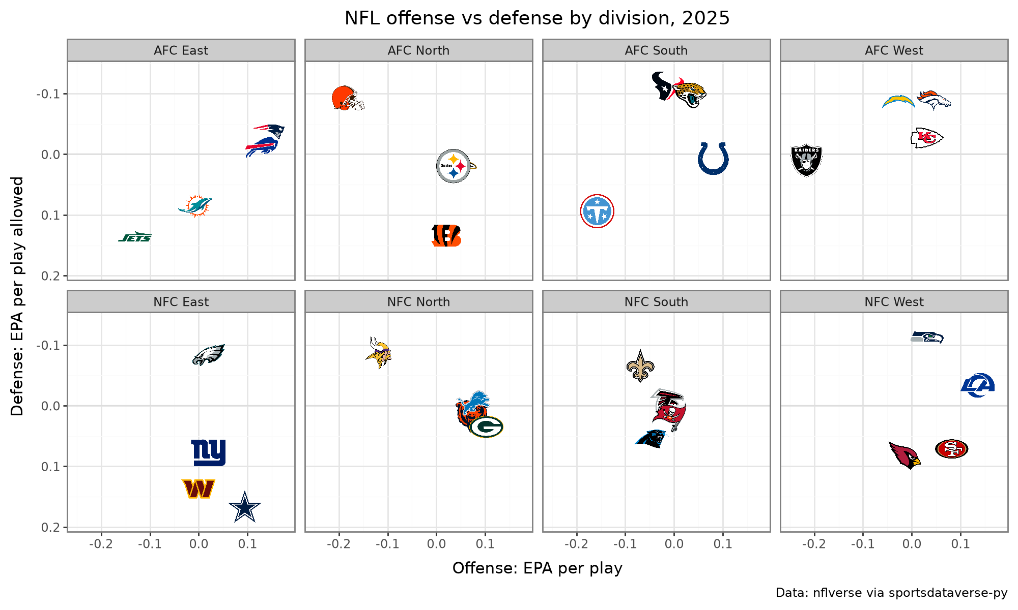
The logo layer facets like any geom; each panel draws its own teams, and height is relative to the panel.
Every NFL division:
(
    ggplot(nfl_epa, aes("off_epa", "def_epa", team="team"))
    + geom_hline(yintercept=0, color="#dddddd")
    + geom_sdv_logos(league="nfl", height=0.17)
    + facet_wrap("division", ncol=4)
    + scale_x_continuous(expand=(0.15, 0))
    + scale_y_reverse(expand=(0.15, 0))
    + labs(
        x="Offense: EPA per play",
        y="Defense: EPA per play allowed",
        title=f"NFL offense vs defense by division, {NFL_SEASON}",
        caption=NFLVERSE,
    )
    + theme_bw()
    + theme(figure_size=(10, 6))
)
7. Logos on a discrete axis
axis_logos (the front door, or sdvplot.plotnine.axis_logos) returns a copy of the plot whose team axis
shows logos instead of labels. Map the team column to that axis; here ESPN team ids join the index's
conference, cast from the raw integer so the join keys agree.
east = sdvplot.teams("nba").filter(pl.col("conference") == "Eastern Conference").select("team_id")
threes = (
    nba_box.group_by("team_id", "team_abbreviation")
    .agg(games=pl.len(), fg3a=pl.col("three_point_field_goals_attempted").mean())
    .filter(pl.col("games") > 10)
    .with_columns(pl.col("team_id").cast(pl.Int64).cast(pl.Utf8))
    .join(east, on="team_id")
    .sort("team_abbreviation")
)
p = (
    ggplot(threes, aes("reorder(team_abbreviation, -fg3a)", "fg3a", fill="team_abbreviation"))
    + geom_col(width=0.75)
    + scale_fill_sdv("nba", guide=None)
    + labs(
        x="", y="Three-point attempts per game", title="Eastern Conference three-point volume, 2025-26", caption=HOOPR
    )  # fmt: skip
    + theme_minimal()
    + theme(figure_size=(10, 5))
)
sdvplot.axis_logos(p, "x", league="nba", height=0.09)
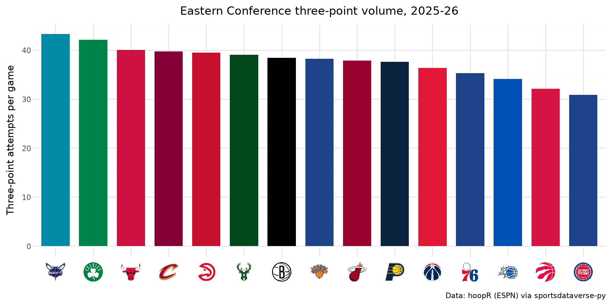
For leagues with wordmarks in the archive (NFL, MLB), mark_type="wordmark" puts those on the axis instead.
8. A logo beside the title
Add title_image(team, title, league=...) after any labs; it replaces the title. One team's season, game by
game:
avs = (
    nhl_games.filter(pl.col("team_abbrev") == "COL")
    .sort("game_date")
    .with_columns(game_no=pl.int_range(1, pl.len() + 1), margin=pl.col("goals") - pl.col("goals_against"))
)
decided = avs.filter(pl.col("margin") != 0).with_columns(
    result=pl.when(pl.col("margin") > 0).then(pl.lit("Won")).otherwise(pl.lit("Lost"))
)
shootouts = avs.height - decided.height
colors = {"Won": sdvplot.team_colors("COL", "nhl"), "Lost": sdvplot.team_colors("COL", "nhl", "secondary")}
(
    ggplot(decided, aes("game_no", "margin", fill="result"))
    + geom_col(width=0.8)
    + geom_hline(yintercept=0)
    + scale_fill_manual(values=colors, breaks=["Won", "Lost"])
    + labs(x="Game", y="Goal margin", fill="", caption=f"{shootouts} games went to a shootout (no bar). {FASTRHOCKEY}")
    + title_image("COL", "Colorado's 2025-26, game by game", league="nhl", height=22)
    + theme_minimal()
    + theme(figure_size=(10, 4.5), legend_position="top")
)
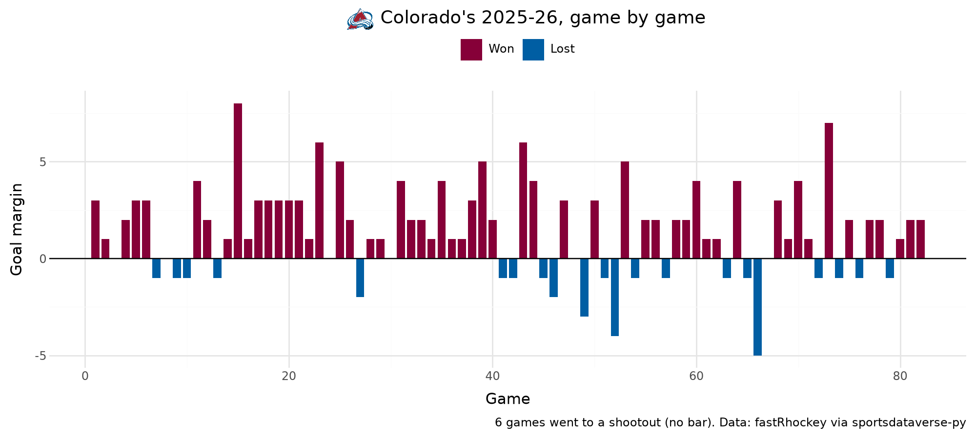
result is not a team column, so scale_fill_sdv does not apply; a manual scale takes the team's two colors
from team_colors instead. The box score's goals leave out the shootout, so those games (a margin of 0) are
left out and counted in the caption.
9. Mean and median reference lines
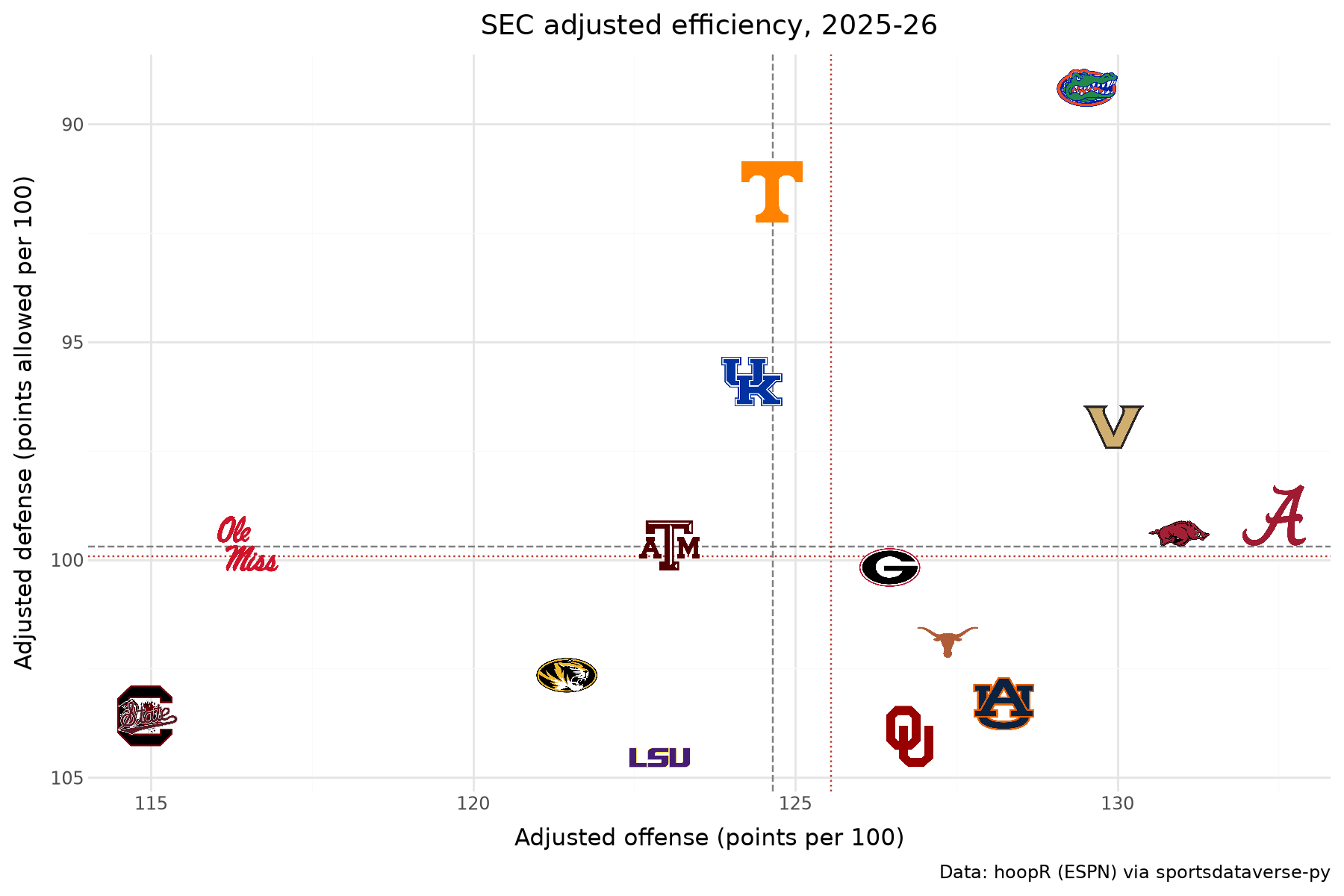
geom_mean_lines(aes(x0=..., y0=...)) draws a vertical and a horizontal line at the means, per panel;
geom_median_lines does the same at the medians. Both on one SEC chart: dashed grey at the mean, dotted red
at the median.
sec = mbb_ratings.filter(pl.col("conference") == "Southeastern Conference")
(
    ggplot(sec, aes("adj_o", "adj_d", team="team_id", x0="adj_o", y0="adj_d"))
    + geom_mean_lines(color="grey")
    + geom_median_lines(color="#c0392b", linetype="dotted")
    + geom_sdv_logos(league="mbb", height=0.09)
    + scale_y_reverse()
    + labs(
        x="Adjusted offense (points per 100)",
        y="Adjusted defense (points allowed per 100)",
        title="SEC adjusted efficiency, 2025-26",
        caption=HOOPR,
    )
    + theme_minimal()
    + theme(figure_size=(9, 6))
)
10. Any image, by URL: conference logos as row labels
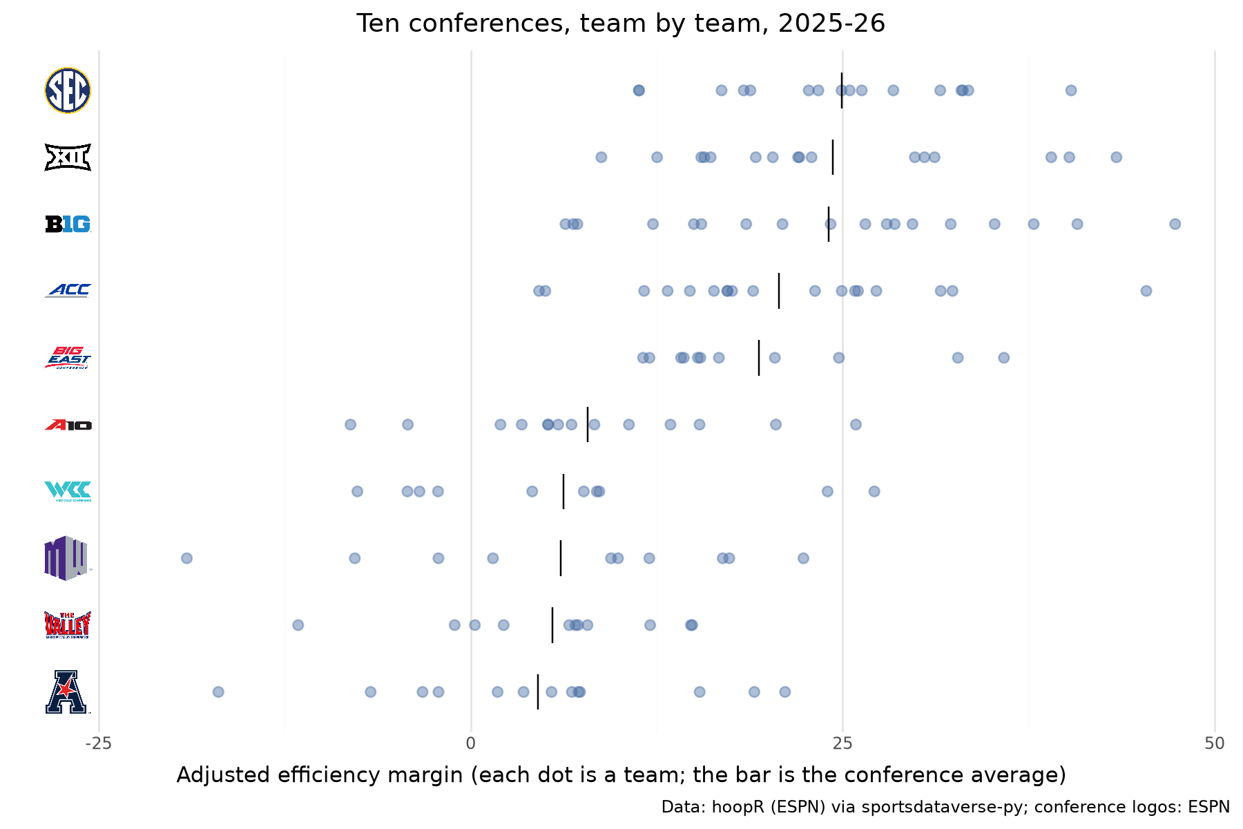
geom_from_path(aes(..., path=...)) draws any image by URL or local path, sized like the logo layers.
Conferences are not teams, so their marks are ESPN's conference logo URLs. Every team's efficiency margin is a
dot in its conference's row, and each row's logo sits at the left edge in place of a label. A polars Enum
fixes the row order in all three layers.
CONFERENCES = {
    "Southeastern Conference": "sec",
    "Big Ten Conference": "big_ten",
    "Big 12 Conference": "big_12",
    "Big East Conference": "big_east",
    "Atlantic Coast Conference": "acc",
    "Mountain West Conference": "mountain_west",
    "West Coast Conference": "west_coast",
    "Atlantic 10 Conference": "atlantic_10",
    "American Conference": "american",
    "Missouri Valley Conference": "missouri_valley",
}
members = mbb_ratings.filter(pl.col("conference").is_in(list(CONFERENCES)))
means = members.group_by("conference").agg(pl.col("adj_em").mean()).sort("adj_em")
rows = pl.Enum(means["conference"].to_list())  # weakest at the bottom, strongest on top
members = members.with_columns(pl.col("conference").cast(rows))
means = means.with_columns(
    pl.col("conference").cast(rows),
    left=pl.lit(members["adj_em"].min() - 8),
    logo=pl.format(
        "https://a.espncdn.com/i/teamlogos/ncaa_conf/500/{}.png",
        pl.col("conference").cast(pl.String).replace_strict(CONFERENCES),
    ),
)
(
    ggplot(members, aes("adj_em", "conference"))
    + geom_point(color="#4a6fa5", alpha=0.45, size=2.5)
    + geom_point(data=means, shape="|", size=10, color="black")
    + geom_from_path(aes(x="left", path="logo"), data=means, height=0.075)
    + labs(
        x="Adjusted efficiency margin (each dot is a team; the bar is the conference average)",
        y="",
        title="Ten conferences, team by team, 2025-26",
        caption=f"{HOOPR}; conference logos: ESPN",
    )
    + theme_minimal()
    + theme(figure_size=(9, 6), axis_text_y=element_blank(), panel_grid_major_y=element_blank())
)
11. A tier list as a ggplot
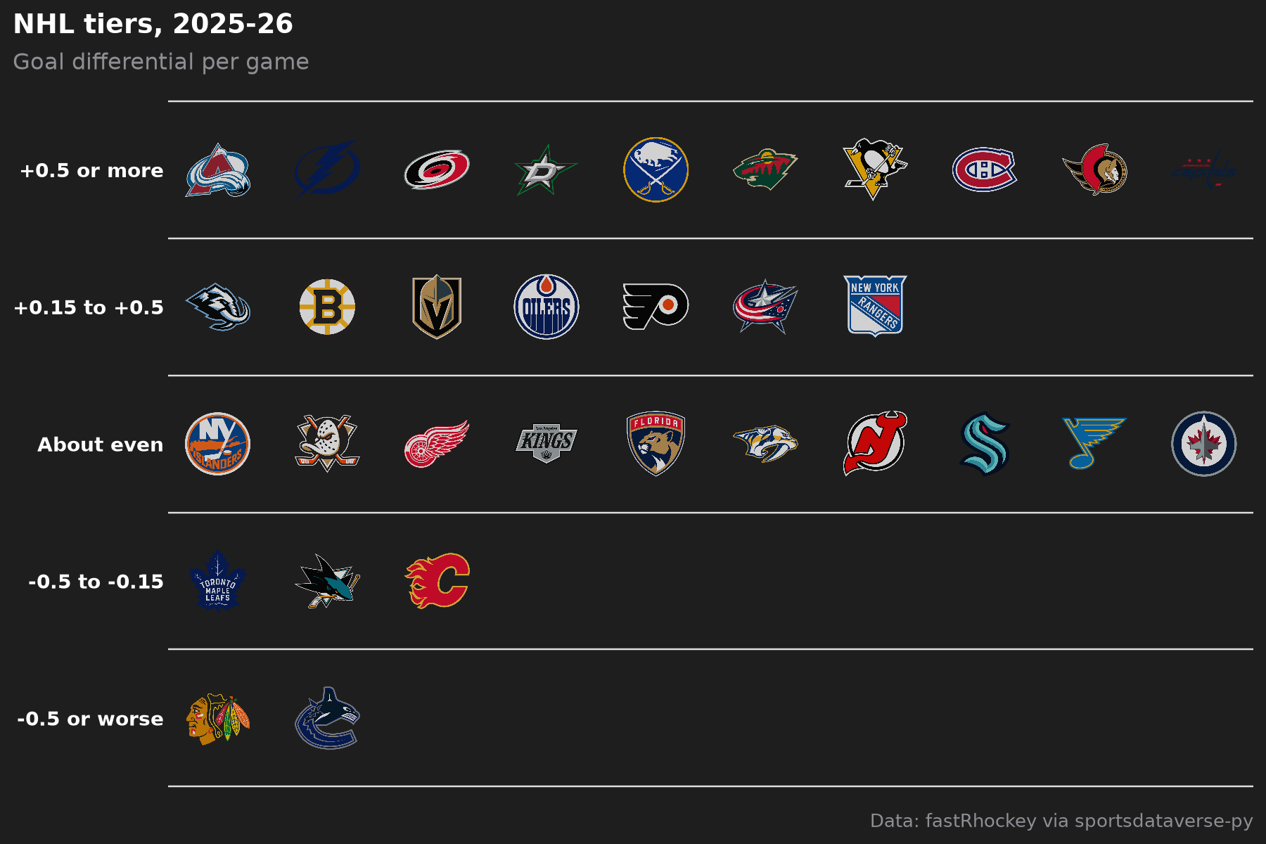
sdvplot.plotnine.team_tiers is the plotnine twin of the matplotlib tier list: same team / tier_no input,
a ggplot out, so + theme(...) still works. NHL teams by goal differential per game:
nhl_tiers = (
    nhl_games.group_by("team_abbrev")
    .agg(gd=(pl.col("goals") - pl.col("goals_against")).mean())
    .sort(["gd", "team_abbrev"], descending=[True, False])
    .with_columns(
        team=pl.col("team_abbrev"),
        tier_no=pl.when(pl.col("gd") >= 0.5)
        .then(1)
        .when(pl.col("gd") >= 0.15)
        .then(2)
        .when(pl.col("gd") > -0.15)
        .then(3)
        .when(pl.col("gd") > -0.5)
        .then(4)
        .otherwise(5),
    )
)
(
    team_tiers(
        nhl_tiers,
        "nhl",
        title="NHL tiers, 2025-26",
        subtitle="Goal differential per game",
        caption=FASTRHOCKEY,
        tier_desc={1: "+0.5 or more", 2: "+0.15 to +0.5", 3: "About even", 4: "-0.5 to -0.15", 5: "-0.5 or worse"},
    )
    + theme(figure_size=(9, 6))
)
12. Dark themes and dark logo variants
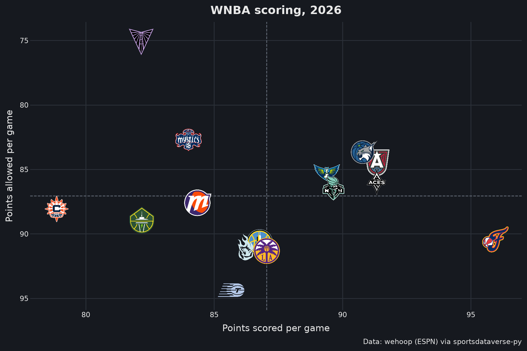
Logos are drawn over whatever theme you use. On a dark background, variant="dark" picks marks made for dark
grounds where the archive has them (others keep their default mark). The WNBA chart from recipe 1, dark:
ink, ground, grid = "#e8e8e8", "#16191f", "#2b3038"
(
    ggplot(wnba_teams, aes("scored", "allowed", team="team_abbreviation", x0="scored", y0="allowed"))
    + geom_mean_lines(color="#6b7380")
    + geom_sdv_logos(league="wnba", variant="dark", height=0.1)
    + scale_x_continuous(expand=(0.06, 0))
    + scale_y_reverse(expand=(0.08, 0))
    + labs(
        x="Points scored per game",
        y="Points allowed per game",
        title=f"WNBA scoring, {SEASON}",
        caption=WEHOOP,
    )
    + theme_minimal()
    + theme(
        figure_size=(9, 6),
        plot_background=element_rect(fill=ground, color=ground),
        panel_grid_major=element_line(color=grid),
        panel_grid_minor=element_blank(),
        text=element_text(color=ink),
        axis_text=element_text(color=ink),
        plot_title=element_text(weight="bold", size=14),
    )
)
Run it yourself
Download the notebook (outputs cleared) or open it on GitHub.