Tables
Twelve recipes for team and player marks in tables: great_tables with sdvplot's logo and headshot cells, its twenty themes, the cell helpers (color pills, percentile bars, indicator boxes, legends, tier lists, snaked lists, captions) and image export for social posts, then the same marks in reactable and plottable. The data is one season each from the NHL (its standings endpoint), MLB (ESPN), the NBA, WNBA and men's college basketball (hoopR and wehoop) and the NFL (nflverse), all through sportsdataverse-py. Tables saved as images go to a temporary folder.
import tempfile
from pathlib import Path

import matplotlib.pyplot as plt
import polars as pl
import sportsdataverse.mbb as mbb
import sportsdataverse.mlb as mlb
import sportsdataverse.nba as nba
import sportsdataverse.nfl as nfl
import sportsdataverse.nhl as nhl
import sportsdataverse.wnba as wnba
from great_tables import GT
from IPython.display import Image, display

import sdvplot
from sdvplot.great_tables import (
    gt_538_caption,
    gt_color_pills,
    gt_grid,
    gt_indicator_boxes,
    gt_legend_continuous,
    gt_merge_stack_team_color,
    gt_percentile_bar,
    gt_save_crop,
    gt_sdv_headshots,
    gt_sdv_logos,
    gt_snake,
    gt_social_crop,
    gt_theme_almanac,
    gt_theme_athletic,
    gt_theme_kenpom,
    gt_theme_preview,
    gt_theme_savant,
    gt_theme_sdv,
    gt_theme_sdv_team,
    gt_tiers,
)

NFL_SEASON = 2025  # nflverse names a season by the year it starts
SEASON = 2026  # the 2026 MLB and WNBA seasons, and the 2025-26 NBA, NHL and college basketball season
OUT = Path(tempfile.mkdtemp())  # saved images go here, not into your working folder
The shared tables: the NHL's final 2025-26 standings (from the NHL's standings endpoint, as of the last day of the regular season) and MLB's final 2026 standings from ESPN.
nhl_standings = nhl.nhl_standings("2026-04-16")
mlb_standings = mlb.espn_mlb_standings(season=SEASON).with_columns(
    pl.col("wins", "losses", "points_for", "points_against", "point_differential").cast(pl.Int64)
)
nhl_standings["conference_name"].unique().sort().to_list(), mlb_standings["group_name"].unique().sort().to_list()
(['Eastern', 'Western'], ['American League', 'National League'])
1. Logos in a team column, with a theme
gt_sdv_logos(gt, column, league=...) turns each cell's team into its logo; any id the index knows works (here
the NHL's own abbreviations). gt_theme_sdv is the SportsDataverse house style: Chivo labels, a Lato body and
the SDV gradient under the column labels.
east = (
    nhl_standings.filter(pl.col("conference_name") == "Eastern")
    .sort("division_name", "division_sequence")
    .select(
        division="division_name",
        logo="team_abbrev_default",
        team="team_name_default",
        gp="games_played",
        w="wins",
        l="losses",
        otl="ot_losses",
        pts="points",
        pct="point_pctg",
        diff="goal_differential",
    )
)
gt = (
    GT(east, groupname_col="division")
    .tab_header("Eastern Conference standings, 2025-26", "Final regular season, by division")
    .cols_label(logo="", team="Team", gp="GP", w="W", l="L", otl="OTL", pts="PTS", pct="PTS%", diff="DIFF")
    .fmt_number("pct", decimals=3)
    .tab_source_note("Data: NHL via sportsdataverse-py")
)
gt = gt_theme_sdv(gt_sdv_logos(gt, "logo", league="nhl", height=26))
gt
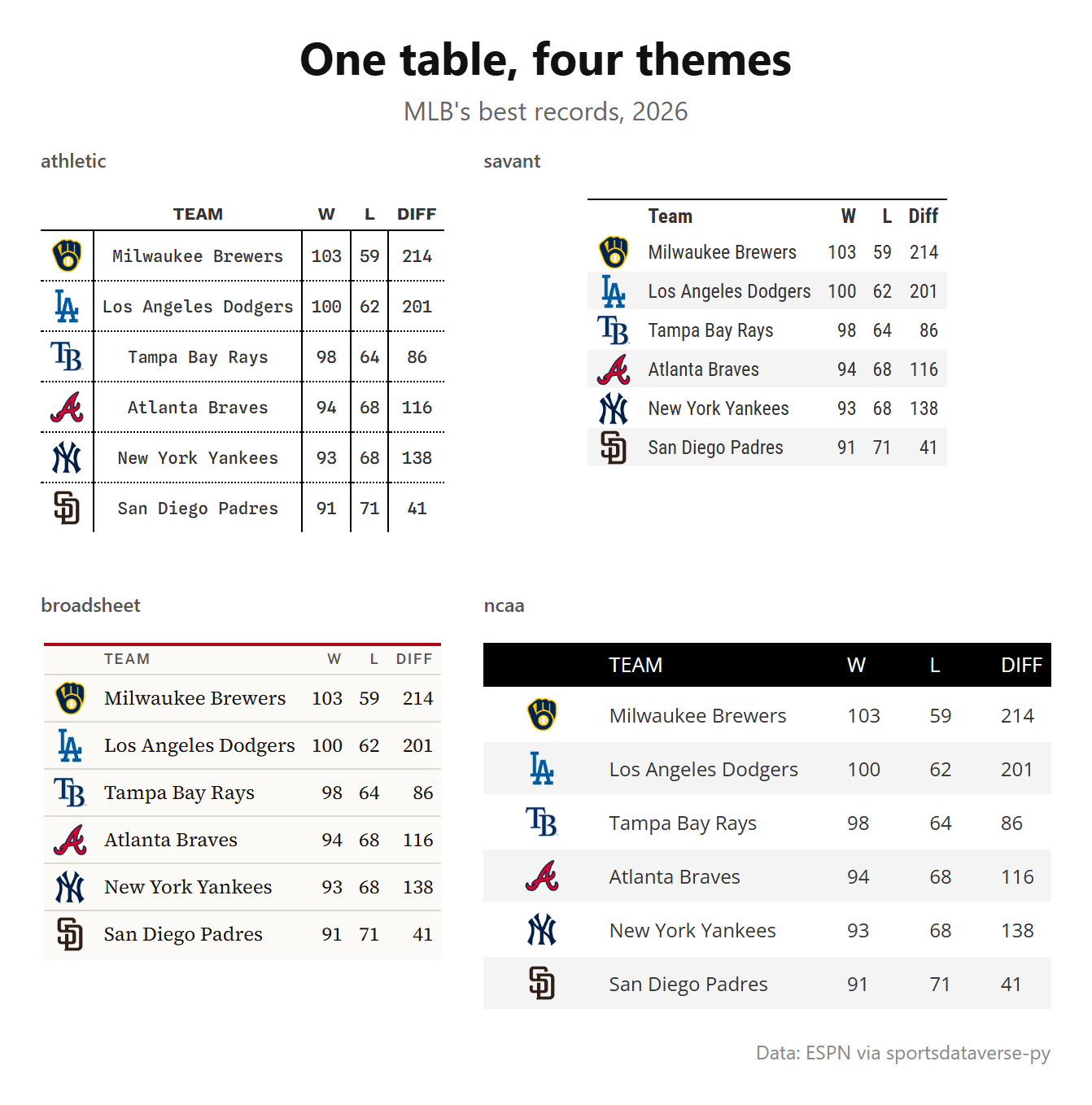
2. Compare themes, and save them as one image
gt_theme_preview gives the same rows in each theme you name; gt_grid lays tables out side by side and,
with file=, saves the grid as a PNG (through headless Chrome). MLB's six best records in four looks:
best = (
    mlb_standings.sort(["win_percent", "team_abbreviation"], descending=[True, False])
    .head(6)
    .select(logo="team_abbreviation", Team="team_display_name", W="wins", L="losses", Diff="point_differential")
)
themes = gt_theme_preview(
    best, themes=["gt_theme_athletic", "gt_theme_savant", "gt_theme_broadsheet", "gt_theme_ncaa"], n=6
)
tables = [gt_sdv_logos(t.cols_label(logo=""), "logo", league="mlb", height=22) for t in themes.values()]
grid = gt_grid(
    tables,
    ncol=2,
    labels=[name.removeprefix("gt_theme_") for name in themes],
    title="One table, four themes",
    subtitle=f"MLB's best records, {SEASON}",
    source_note="Data: ESPN via sportsdataverse-py",
    file=OUT / "themes.png",
)
display(Image(filename=grid, width=760))
3. Headshots and a two-line name cell
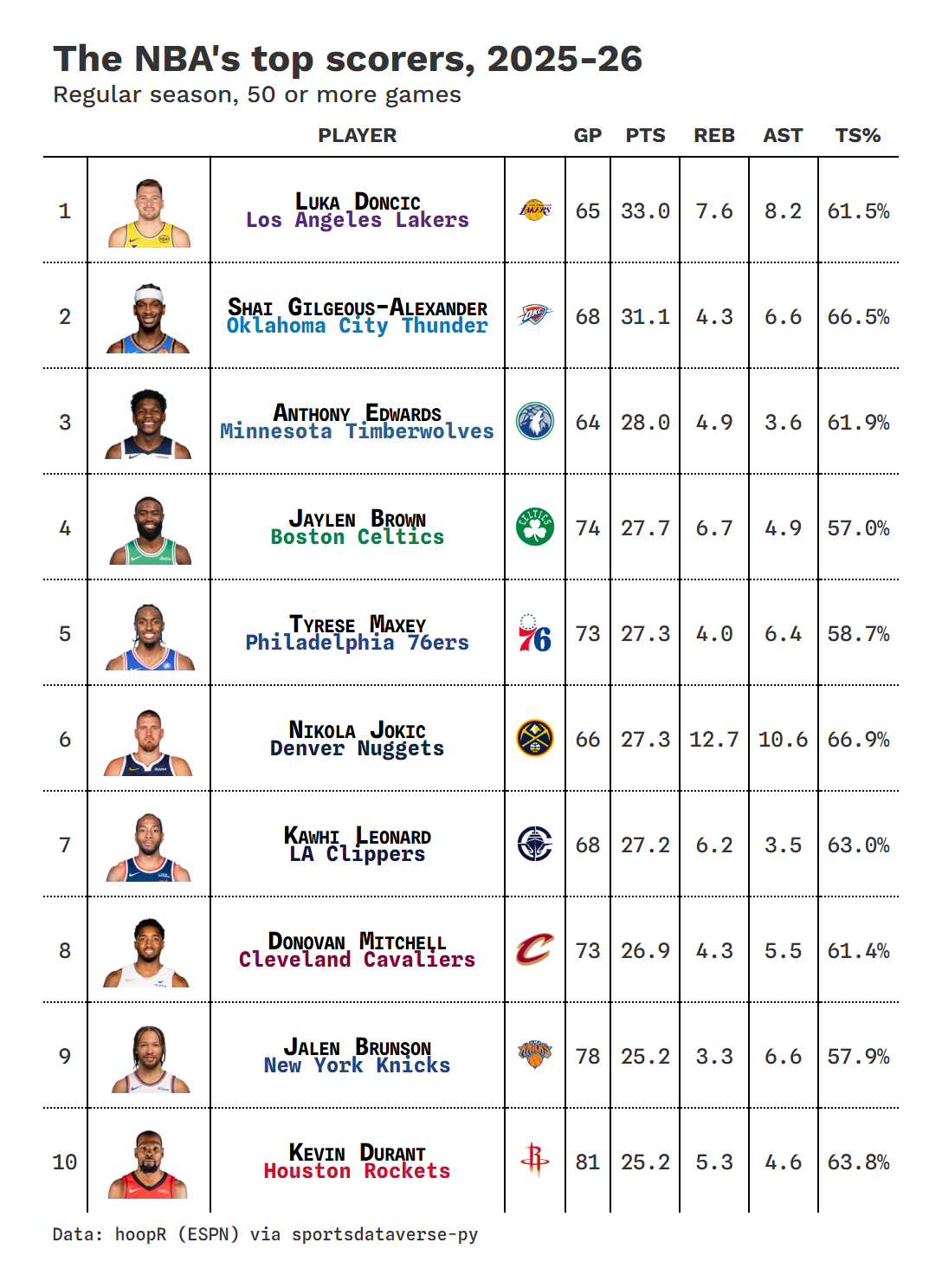
gt_sdv_headshots turns ESPN athlete ids into photos. gt_merge_stack_team_color stacks the player's name over
the team's, the second line in the team's color. The NBA's top scorers, saved with gt_save_crop, the way
you would post them:
players = nba.load_nba_player_boxscore(seasons=[SEASON]).filter((pl.col("season_type") == 2) & ~pl.col("did_not_play"))
scorers = (
    players.sort("game_date")
    .group_by("athlete_id", "athlete_display_name")
    .agg(
        team=pl.col("team_abbreviation").last(),
        team_name=pl.col("team_display_name").last(),
        gp=pl.len(),
        ppg=pl.col("points").mean(),
        rpg=pl.col("rebounds").mean(),
        apg=pl.col("assists").mean(),
        ts=pl.col("points").sum()
        / (2 * (pl.col("field_goals_attempted").sum() + 0.44 * pl.col("free_throws_attempted").sum())),
    )
    .filter(pl.col("gp") >= 50)
    .sort("ppg", descending=True)
    .head(10)
    .with_columns(rank=pl.int_range(1, 11), photo=pl.col("athlete_id"), logo=pl.col("team"))
    .select("rank", "photo", "athlete_display_name", "team_name", "team", "logo", "gp", "ppg", "rpg", "apg", "ts")
)
gt = (
    GT(scorers)
    .tab_header("The NBA's top scorers, 2025-26", "Regular season, 50 or more games")
    .cols_label(
        rank="", photo="", athlete_display_name="Player", logo="", gp="GP", ppg="PTS", rpg="REB", apg="AST", ts="TS%"
    )
    .fmt_number(["ppg", "rpg", "apg"], decimals=1)
    .fmt_percent("ts", decimals=1)
    .tab_source_note("Data: hoopR (ESPN) via sportsdataverse-py")
)
gt = gt_merge_stack_team_color(gt, "athlete_display_name", "team_name", "team", league="nba")
gt = gt_sdv_headshots(gt, "photo", league="nba", height=44)
gt = gt_sdv_logos(gt, "logo", league="nba", height=24).cols_hide("team")
gt = gt_theme_athletic(gt)
display(Image(filename=gt_save_crop(gt, OUT / "scorers.png"), width=720))
4. Color pills with a matching legend
gt_color_pills shows each value as a rounded pill filled from a palette, with black or white text, whichever
reads; give it a domain so the colors mean the same thing in every table. It records its scale, so
gt_legend_continuous(gt) draws a key that cannot disagree with the cells. The American League:
al = (
    mlb_standings.filter(pl.col("group_name") == "American League")
    .sort(["win_percent", "team_abbreviation"], descending=[True, False])
    .select(
        logo="team_abbreviation",
        team="team_display_name",
        w="wins",
        l="losses",
        pct="win_percent",
        rs="points_for",
        ra="points_against",
        diff="point_differential",
    )
)
gt = (
    GT(al)
    .tab_header(f"American League, {SEASON}", "Final regular season")
    .cols_label(logo="", team="Team", w="W", l="L", pct="PCT", rs="RS", ra="RA", diff="DIFF")
    .fmt_number("pct", decimals=3)
    .tab_source_note("Data: ESPN via sportsdataverse-py")
)
gt = gt_theme_savant(gt_sdv_logos(gt, "logo", league="mlb", height=24))  # theme first, then the fills
gt = gt_color_pills(gt, "diff", palette=["#C84630", "#F4F4F4", "#2A7AB9"], domain=(-250, 250), digits=0)
gt_legend_continuous(gt, title="Run differential", labels=["-250", "0", "+250"])
5. Gotcha: stripes and themes can paint over your fills
Two rules keep cell fills (data_color, gt_color_ranks, gt_color_results) visible.
- Turn row striping off when you fill cells. In a notebook, and on these pages, great_tables shows a table
with every CSS rule marked
!important, so a striped row's background beats the fill. Useopt_row_striping(row_striping=False)(or a theme's own switch, such asrow_striping_include_table_body). Saved images andas_raw_html()keep the fills, so a table can look right in an export and wrong here. - Apply a theme before the fills. Some themes band their rows with cell styles:
gt_theme_kenpomfills every body row. Applied after the fills, it replaces them, and turning striping off does not help, because those bands are cell styles, not striping.
The first two tables show rule 1; the pair at the end shows rule 2.
top = (
    nhl_standings.sort(["goal_differential", "team_abbrev_default"], descending=[True, False])
    .head(8)
    .select(logo="team_abbrev_default", team="team_name_default", diff="goal_differential")
)


def fill(gt):
    return gt.data_color("diff", palette=["#FFFFFF", "#2E7D32"], domain=[0, 130])


base = gt_sdv_logos(GT(top).cols_label(logo="", team="Team", diff="Goal diff."), "logo", league="nhl", height=22)
display(fill(base.opt_row_striping()).tab_header("Striping on: every other fill is covered"))
display(fill(base.opt_row_striping(row_striping=False)).tab_header("Striping off: every fill shows"))
gt_grid(
    [gt_theme_kenpom(fill(base)), fill(gt_theme_kenpom(base))],
    labels=["Fill, then theme: the fill is gone", "Theme, then fill: the fill shows"],
    source_note="Data: NHL via sportsdataverse-py",
)
6. Percentile bars, in a team's colors
gt_percentile_bar draws each percentile as a track with a marker. Here the WNBA's best regular-season team
against the league, each stat ranked so 100 is best (fewest points allowed and turnovers count as high).
gt_theme_sdv_team themes the table in that team's colors.
games = wnba.load_wnba_team_boxscore(seasons=[SEASON]).filter(pl.col("season_type") == 2)
made, tried = pl.col("three_point_field_goals_made"), pl.col("three_point_field_goals_attempted")
per_game = (
    games.group_by("team_abbreviation", "team_display_name")
    .agg(
        gp=pl.len(),
        wins=pl.col("team_winner").sum(),
        Points=pl.col("team_score").mean(),
        Allowed=pl.col("opponent_team_score").mean(),
        Rebounds=pl.col("total_rebounds").mean(),
        Assists=pl.col("assists").mean(),
        Turnovers=pl.col("turnovers").mean(),
        three=made.sum() / tried.sum(),
    )
    .rename({"three": "3P%"})
    .filter(pl.col("gp") > 10)
)
lower_is_better = {"Points": False, "Allowed": True, "Rebounds": False, "Assists": False, "3P%": False,
                   "Turnovers": True}  # fmt: skip
ranks = per_game.with_columns(
    ((pl.col(s).rank("average", descending=low) - 1) / (pl.len() - 1) * 100).alias(f"{s} pct")
    for s, low in lower_is_better.items()
)
team = ranks.sort(["wins", "team_abbreviation"], descending=[True, False]).row(0, named=True)
card = pl.DataFrame(
    {
        "stat": list(lower_is_better),
        "value": [f"{team[s]:.1%}" if s == "3P%" else f"{team[s]:.1f}" for s in lower_is_better],
        "pct": [team[f"{s} pct"] for s in lower_is_better],
    }
)
won_lost = f"{team['wins']}-{team['gp'] - team['wins']}"
gt = (
    GT(card)
    .tab_header(f"{team['team_display_name']}, {SEASON}", f"{won_lost}; per game, as a percentile among WNBA teams")
    .cols_label(stat="", value="Per game", pct="Percentile")
    .tab_source_note("Data: wehoop (ESPN) via sportsdataverse-py")
)
gt = gt_theme_sdv_team(gt, team["team_abbreviation"], league="wnba")
gt_percentile_bar(gt, "pct", width=260)
7. Indicator boxes: a season at a glance
gt_indicator_boxes swaps values for filled or empty boxes; key_columns keeps the columns that are not
boxes. One row per team, one box per week: green for a win, grey for a loss or tie, white for the bye. The
AFC North:
schedule = nfl.load_nfl_schedule([NFL_SEASON]).filter(pl.col("game_type") == "REG")
results = pl.concat(
    [
        schedule.select("week", team="home_team", pts="home_score", opp="away_score"),
        schedule.select("week", team="away_team", pts="away_score", opp="home_score"),
    ]
).filter(pl.col("team").is_in(["BAL", "CIN", "CLE", "PIT"]))
record = results.group_by("team").agg(
    w=(pl.col("pts") > pl.col("opp")).sum(),
    l=(pl.col("pts") < pl.col("opp")).sum(),
    t=(pl.col("pts") == pl.col("opp")).sum(),
)
boxes = results.with_columns(win=(pl.col("pts") > pl.col("opp")).cast(pl.Int8)).pivot(
    on="week", index="team", values="win"
)
weeks = [str(w) for w in range(1, schedule["week"].max() + 1)]  # a team's bye week is a missing value
grid = (
    boxes.join(record, on="team")
    .sort(["w", "team"], descending=[True, False])
    .select(
        pl.col("team").alias("logo"),
        pl.when(pl.col("t") > 0)
        .then(pl.format("{}-{}-{}", "w", "l", "t"))
        .otherwise(pl.format("{}-{}", "w", "l"))
        .alias("record"),
        *weeks,
    )
)
gt = (
    GT(grid)
    .tab_header(f"The AFC North, week by week, {NFL_SEASON}", "Green: a win. White: the bye week.")
    .cols_label(logo="", record="Record")
    .tab_source_note("Data: nflverse via sportsdataverse-py")
)
gt = gt_sdv_logos(gt_theme_sdv(gt), "logo", league="nfl", height=28)
gt = gt_indicator_boxes(gt, key_columns=["logo", "record"], color_yes="#2E7D32", color_na="#FFFFFF", box_width=22)
gt.cols_move_to_start(["logo", "record"])
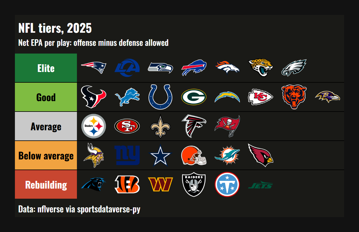
8. A tier list as a table
gt_tiers takes one row per tier, a tier column and image columns (URLs or paths); logo_url supplies each
team's logo. NFL teams tiered by net EPA per play (offense minus defense allowed), saved as an image:
weeks_stats = nfl.load_nfl_team_stats([NFL_SEASON]).filter(pl.col("season_type") == "REG")
plays = pl.col("attempts") + pl.col("sacks_suffered") + pl.col("carries")
epa = pl.col("passing_epa") + pl.col("rushing_epa")
net = (
    weeks_stats.group_by("team")
    .agg(off=epa.sum() / plays.sum())
    .join(weeks_stats.group_by(team=pl.col("opponent_team")).agg(dfn=epa.sum() / plays.sum()), on="team")
    .with_columns(net=pl.col("off") - pl.col("dfn"))
    .sort("net", descending=True)
    .with_columns(
        tier=pl.when(pl.col("net") >= 0.1)
        .then(pl.lit("Elite"))
        .when(pl.col("net") >= 0.03)
        .then(pl.lit("Good"))
        .when(pl.col("net") > -0.03)
        .then(pl.lit("Average"))
        .when(pl.col("net") > -0.1)
        .then(pl.lit("Below average"))
        .otherwise(pl.lit("Rebuilding"))
    )
)
levels = {
    "Elite": "#1B7837",
    "Good": "#7FBC41",
    "Average": "#C9C9C9",
    "Below average": "#F1A340",
    "Rebuilding": "#C84630",
}
by_tier = net.group_by("tier", maintain_order=True).agg(pl.col("team"))
width = by_tier["team"].list.len().max()
rows = {"tier": by_tier["tier"].to_list()}
for i in range(width):
    rows[f"t{i}"] = [sdvplot.logo_url(t[i], "nfl") if i < len(t) else None for t in by_tier["team"]]
gt = (
    gt_tiers(GT(pl.DataFrame(rows)), levels, img_height="46px")
    .tab_header(f"NFL tiers, {NFL_SEASON}", "Net EPA per play: offense minus defense allowed")
    .tab_source_note("Data: nflverse via sportsdataverse-py")
)
display(Image(filename=gt_save_crop(gt, OUT / "tiers.png", bg="#121212"), width=760))
9. A long list in two columns, with a caption
gt_snake wraps a long table into side-by-side blocks, suffixing the columns _1, _2; it rebuilds the table,
so apply formats, logos and the theme after it. gt_538_caption adds a FiveThirtyEight-style note under a
rule. Men's college basketball's top 40 by adjusted efficiency margin:
top40 = (
    mbb.load_mbb_ratings(SEASON)
    .join(sdvplot.teams("mbb").select("team_id", "short_name"), on="team_id")
    .sort("adj_em", descending=True)
    .head(40)
    .select(rank=pl.int_range(1, 41), logo="team_id", team="short_name", em="adj_em")
)
gt = gt_snake(GT(top40).cols_label(rank="", logo="", team="Team", em="Margin"), n_cols=2)
gt = gt.fmt_number(["em_1", "em_2"], decimals=1, force_sign=True)
gt = gt_sdv_logos(gt, ["logo_1", "logo_2"], league="mbb", height=20)
gt = gt_theme_almanac(gt.tab_header("Men's college basketball's top 40, 2025-26"))
gt_538_caption(
    gt,
    top_caption="Margin: adjusted points scored minus allowed per 100 possessions, against an average team.",
    bottom_caption="Data: hoopR (ESPN) via sportsdataverse-py",
)
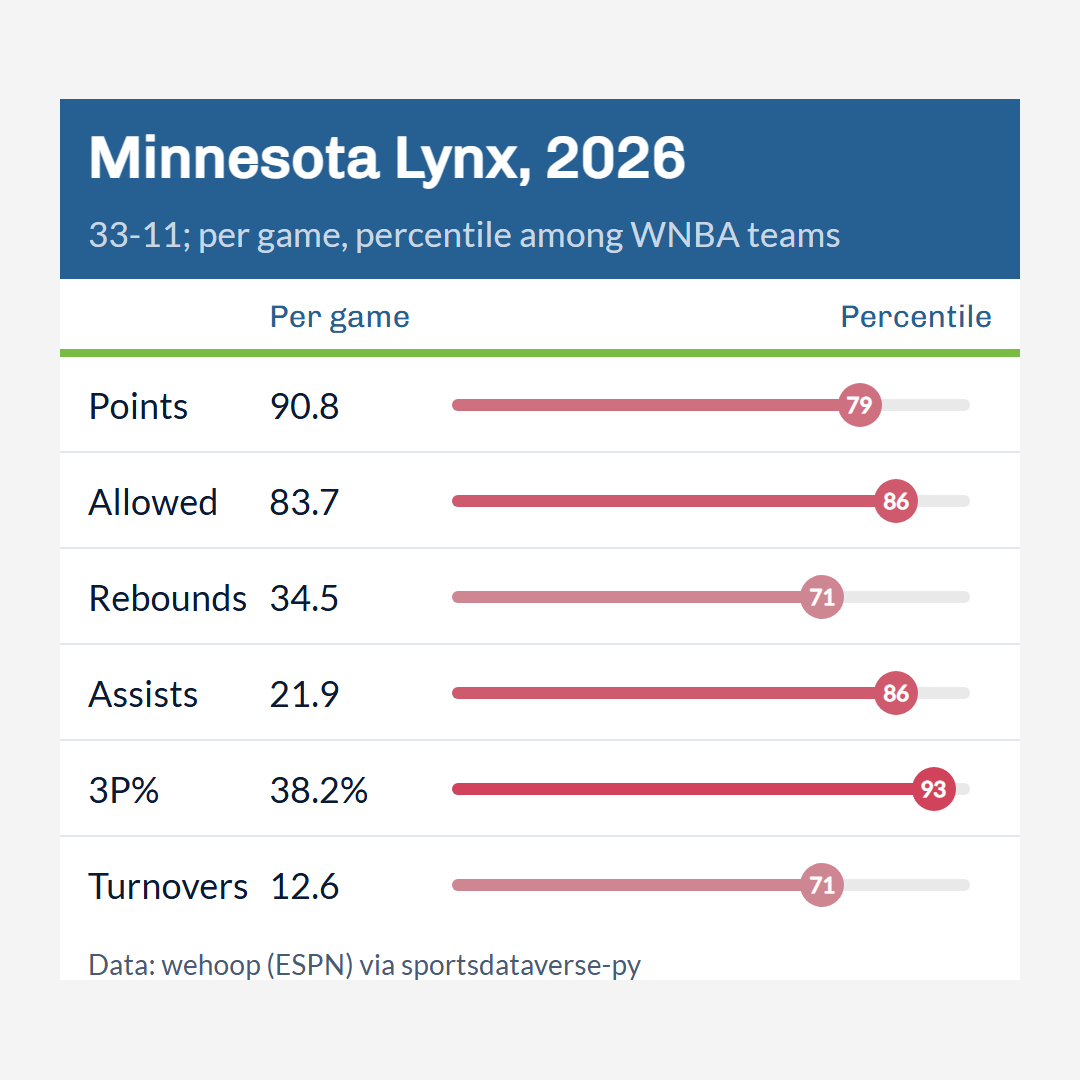
10. Save for social: a trimmed image and a square post
gt_save_crop trims the page around the table and pads an even border; gt_social_crop centers the table on
a canvas of a fixed ratio (1:1, 4:5, 16:9) without cropping it, and width= sets the final pixel width. The
percentile card from recipe 6, as a 1080 x 1080 post:
card_gt = (
    GT(card)
    .tab_header(f"{team['team_display_name']}, {SEASON}", f"{won_lost}; per game, percentile among WNBA teams")
    .cols_label(stat="", value="Per game", pct="Percentile")
    .tab_source_note("Data: wehoop (ESPN) via sportsdataverse-py")
)
card_gt = gt_theme_sdv_team(card_gt, team["team_abbreviation"], league="wnba", density="social")
card_gt = gt_percentile_bar(card_gt, "pct", width=300)
trimmed = gt_save_crop(card_gt, OUT / "card.png")
square = gt_social_crop(card_gt, OUT / "card_square.png", aspect_ratio="1:1", width=1080, bg="#F4F4F4")
for path in (trimmed, square):
    w, h = plt.imread(path).shape[1::-1]
    print(f"{Path(path).name}: {w} x {h} px")
display(Image(filename=square, width=540))
card.png: 1060 x 981 px
card_square.png: 1080 x 1080 px
11. reactable: a sortable, searchable table
sdvplot.reactable gives reactable columns: reactable_sdv_logos renders a team column as logos and
reactable_sdv_team_color_bar draws each value as a bar in the row's team color, as long as its share of
max_value. A max_value a little past the 82-game maximum keeps every bar short of the number, so the number
never sits on a dark fill. Click a header to sort; search by team.
from reactable import Column, Reactable, embed_css

from sdvplot.reactable import reactable_sdv_logos, reactable_sdv_team_color_bar

embed_css()
nba_teams = (
    nba.load_nba_team_boxscore(seasons=[SEASON])
    .filter(pl.col("season_type") == 2)
    .group_by("team_abbreviation", "team_display_name")
    .agg(
        gp=pl.len(),
        wins=pl.col("team_winner").sum(),
        ppg=pl.col("team_score").mean().round(1),
        diff=(pl.col("team_score") - pl.col("opponent_team_score")).mean().round(1),
    )
    .filter(pl.col("gp") > 10)
    .sort(["wins", "team_abbreviation"], descending=[True, False])
    .drop("gp")
)
Reactable(
    nba_teams,
    columns=[
        reactable_sdv_logos(league="nba", id="team_abbreviation", name="", width=60),
        Column(id="team_display_name", name="Team", min_width=200),
        reactable_sdv_team_color_bar(
            nba_teams, "team_abbreviation", league="nba", max_value=82 * 1.15, id="wins", name="Wins", width=220
        ),
        Column(id="ppg", name="Points per game"),
        Column(id="diff", name="Point differential"),
    ],
    default_page_size=10,
    searchable=True,
    striped=True,
)
12. plottable: a table drawn by matplotlib
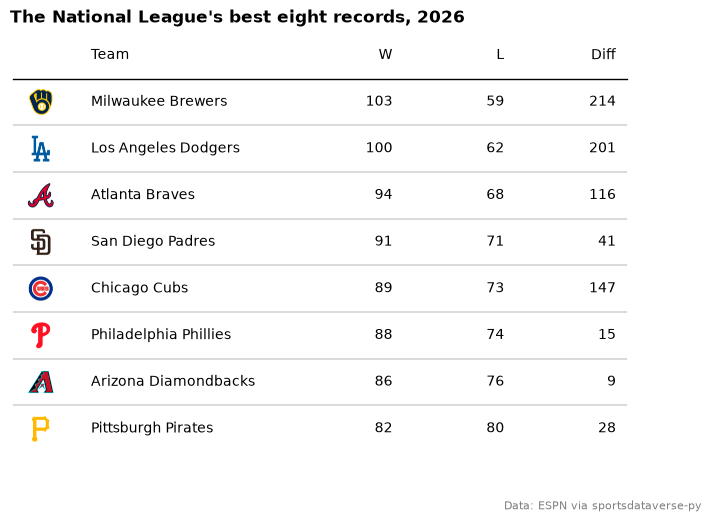
sdvplot.plottable.logo_column is a plottable ColumnDefinition that draws each row's team as its logo, so the
table is an ordinary matplotlib figure you can save like any chart. The National League's eight best
records:
from plottable import ColumnDefinition, Table

from sdvplot.plottable import logo_column

nl = (
    mlb_standings.filter(pl.col("group_name") == "National League")
    .sort(["win_percent", "team_abbreviation"], descending=[True, False])
    .head(8)
    .select(logo="team_abbreviation", team="team_display_name", w="wins", l="losses", diff="point_differential")
    .to_pandas()
    .set_index("logo", drop=False)
)
fig, ax = plt.subplots(figsize=(8, 5.5))
Table(
    nl,
    ax=ax,
    index_col="logo",
    column_definitions=[
        logo_column("logo", league="mlb", title="", width=0.5),
        ColumnDefinition("team", title="Team", width=2, textprops={"ha": "left"}),
        ColumnDefinition("w", title="W"),
        ColumnDefinition("l", title="L"),
        ColumnDefinition("diff", title="Diff"),
    ],
)
ax.set_title(f"The National League's best eight records, {SEASON}", loc="left", fontweight="bold")
fig.text(0.99, 0.01, "Data: ESPN via sportsdataverse-py", ha="right", fontsize=8, color="grey")
plt.show()
Run it yourself
Download the notebook (outputs cleared) or open it on GitHub.