WNBA scoring leaders card
The brief: the regular season just ended, and the social team wants a scoring-leaders card: the top ten in
points per game with each player's face and team, as a 1080 x 1080 image for Instagram, plus a top-five cut at
1200 x 675 for X and Bluesky. The box scores are hoopR/wehoop's ESPN data through sportsdataverse.wnba; the
headshots come from ESPN's CDN through sdvplot.add_headshots.
import tempfile
from pathlib import Path

import matplotlib.pyplot as plt
import polars as pl
import sportsdataverse.wnba as wnba
from IPython.display import Image
from matplotlib.colors import to_rgb
from PIL import Image as PILImage

import sdvplot

SEASON = 2026
OUT = Path(tempfile.mkdtemp(prefix="sdvplot-recipe-"))  # where the exports go; use your own folder
1. Get the data
One row per player per game. ESPN files the All-Star Game and the Commissioner's Cup final as regular-season
games, but neither counts in the official stats; the schedule marks the standard games with type_abbreviation
"STD", so a semi join keeps only those. Players who did not play are dropped, the qualifier is 30 games (about 70%
of the 44-game schedule), and a player traded mid-season is listed with her last team.
regular = wnba.load_wnba_schedule(seasons=[SEASON]).filter(pl.col("season_type") == 2)
print(
    regular.group_by("type_abbreviation").len().sort("type_abbreviation")
)  # STD, plus one ALLSTAR and one CC (the Cup final)
standard = regular.filter(pl.col("type_abbreviation") == "STD").select("game_id")

box = wnba.load_wnba_player_boxscore(seasons=[SEASON])
assert box.schema["game_id"] == standard.schema["game_id"]  # one dtype on both sides of the join key
box = box.join(standard, on="game_id", how="semi").filter(~pl.col("did_not_play"))
leaders = (
    box.group_by("athlete_id", "athlete_display_name")
    .agg(
        games=pl.len(),
        ppg=pl.col("points").mean(),
        team=pl.col("team_abbreviation").sort_by("game_date").last(),
    )
    .filter(pl.col("games") >= 30)
    .sort(["ppg", "athlete_display_name"], descending=[True, False])
    .head(10)
    .with_columns(rank=pl.int_range(1, pl.len() + 1))
)
leaders
| type_abbreviation | len |
|-------------------|-----|
| ALLSTAR           | 1   |
| CC                | 1   |
| STD               | 331 |
| athlete_id | athlete_display_name | games | ppg | team | rank |
|---|---|---|---|---|---|
| 3149391 | A'ja Wilson | 41 | 26.170732 | LV | 1 |
| 3142191 | Kelsey Mitchell | 44 | 24.681818 | IND | 2 |
| 4433403 | Caitlin Clark | 40 | 22.275 | IND | 3 |
| 2998938 | Kahleah Copper | 40 | 21.475 | PHX | 4 |
| 4433730 | Paige Bueckers | 42 | 20.904762 | DAL | 5 |
| 3904576 | Marina Mabrey | 32 | 20.84375 | TOR | 6 |
| 2998928 | Breanna Stewart | 42 | 20.833333 | NY | 7 |
| 4433791 | Olivia Miles | 40 | 19.75 | MIN | 8 |
| 3058901 | Allisha Gray | 44 | 19.022727 | ATL | 9 |
| 4065870 | Jackie Young | 43 | 18.930233 | LV | 10 |
2. The first draft
A horizontal bar chart is the right shape for a ranked list of names.
fig, ax = plt.subplots(figsize=(8, 5))
ax.barh(leaders["athlete_display_name"], leaders["ppg"])
plt.show()
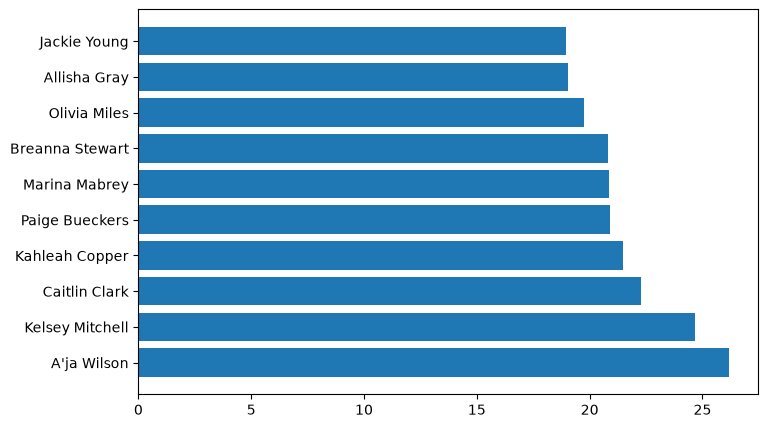
The leader is at the bottom (barh draws the first row lowest), every bar is the same blue, the exact values are
missing, and nothing says what or when.
3. Order, team colors and values
Inverting the y axis puts No. 1 on top. Each bar takes its team's color, with one catch: a few primaries (the Aces' silver, the Liberty's seafoam) are too light to read on a light card, so a small WCAG luminance check swaps those to the team's secondary color. The values go at the end of each bar, which makes the x axis unnecessary.
def luminance(color):
    """WCAG relative luminance, 0 (black) to 1 (white)."""
    r, g, b = (c / 12.92 if c <= 0.03928 else ((c + 0.055) / 1.055) ** 2.4 for c in to_rgb(color))
    return 0.2126 * r + 0.7152 * g + 0.0722 * b


primary = sdvplot.team_colors(leaders["team"], "wnba")
secondary = sdvplot.team_colors(leaders["team"], "wnba", which="secondary")
leaders = leaders.with_columns(
    color=pl.Series([p if luminance(p) < 0.3 else s for p, s in zip(primary, secondary, strict=True)])
)

fig, ax = plt.subplots(figsize=(8, 5))
ax.barh(leaders["athlete_display_name"], leaders["ppg"], color=leaders["color"])
ax.invert_yaxis()
for y, v in enumerate(leaders["ppg"]):
    ax.text(v + 0.3, y, f"{v:.1f}", va="center", fontsize=9, fontweight="bold")
ax.xaxis.set_visible(False)
ax.spines[["top", "right", "bottom"]].set_visible(False)
plt.show()
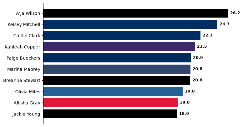
4. Faces and logos
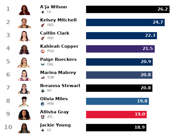
A card like this sells on faces. Moving to a blank canvas (an axes with fixed 0-100 x coordinates and one unit per
row) makes room for a column of headshots and a small team logo under each name. add_headshots and add_logos
size their images as a fraction of the axes height, so with ten rows a headshot of 0.085 fills most of a row.
def rows(ax, data, bar_from=47, bar_to=94):
    """Ranked rows on a 0-100 canvas: rank, headshot, name, team logo and a bar with its value."""
    n = data.height
    ax.set(xlim=(0, 100), ylim=(n + 0.5, 0.5))
    ax.axis("off")
    face, logo = 0.85 / n, 0.32 / n  # image heights as a fraction of the axes: most of a row, a third of one
    sdvplot.add_headshots(ax, [12] * n, data["rank"], data["athlete_id"], league="wnba", height=face)
    sdvplot.add_logos(ax, [22.5] * n, data["rank"] + 0.2, data["team"], league="wnba", season=SEASON, height=logo)
    scale = (bar_to - bar_from) / data["ppg"].max()
    for row in data.iter_rows(named=True):
        y = row["rank"]
        ax.text(3, y, str(row["rank"]), ha="center", va="center", fontsize=15, fontweight="bold", color="#9a9a9a")
        ax.text(21, y - 0.17, row["athlete_display_name"], va="center", fontsize=11, fontweight="bold")
        ax.text(25, y + 0.2, row["team"], va="center", fontsize=8.5, color="#6b6b6b")
        ax.barh(y, row["ppg"] * scale, left=bar_from, height=0.56, color=row["color"])
        ax.text(
            bar_from + row["ppg"] * scale - 1,
            y,
            f"{row['ppg']:.1f}",
            ha="right",
            va="center",
            fontsize=11,
            fontweight="bold",
            color="white",
        )


fig, ax = plt.subplots(figsize=(8, 6))
rows(ax, leaders)
plt.show()
5. Make it a card
The finishing pass is the frame: a warm off-white background, the headline as the title (the stat goes in the subtitle), the qualifier stated, and a footer with the source. Everything is placed in inches from the edges, so the same function draws the square post and a wider one.
BG, INK, GREY = "#f6f4ef", "#1d1d1d", "#6b6b6b"


def card(data, figsize, dpi=100):
    w, h = figsize
    fig = plt.figure(figsize=figsize, dpi=dpi, facecolor=BG)
    top, bottom = 1.15, 0.45  # inches for the header and the footer
    ax = fig.add_axes((0.25 / w, bottom / h, 1 - 0.5 / w, 1 - (top + bottom) / h), facecolor=BG)
    rows(ax, data)
    leader = data.row(0, named=True)
    fig.text(
        0.3 / w,
        1 - 0.3 / h,
        f"{leader['athlete_display_name']} won the {SEASON} scoring title",
        fontsize=19,
        fontweight="bold",
        color=INK,
        va="top",
    )
    fig.text(
        0.3 / w,
        1 - 0.75 / h,
        f"Points per game, {SEASON} WNBA regular season (minimum 30 games)",
        fontsize=10.5,
        color=GREY,
        va="top",
    )
    fig.text(0.3 / w, 0.18 / h, "Data: wehoop (ESPN) via sportsdataverse-py", fontsize=8, color=GREY)
    fig.text(1 - 0.3 / w, 0.18 / h, "#WNBA  |  made with sdvplot", fontsize=8, color=GREY, ha="right")
    return fig


fig = card(leaders, (7.2, 7.2))
plt.show()
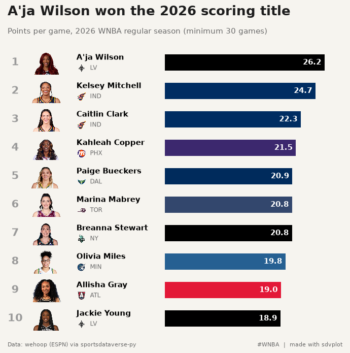
6. Export for Instagram and X
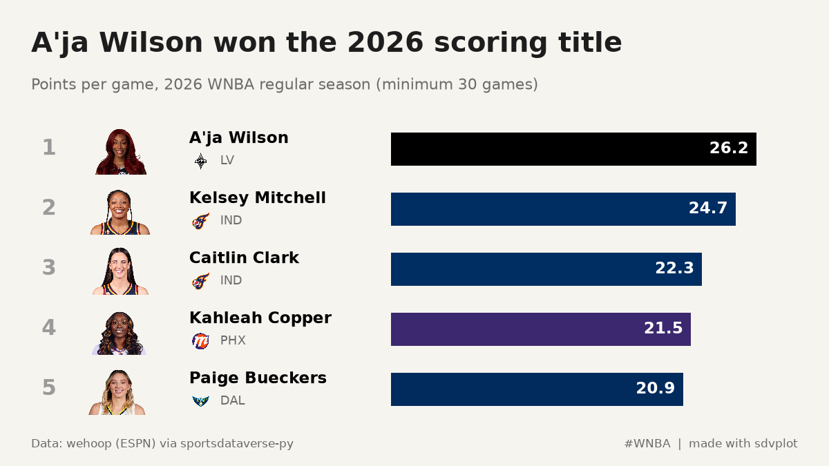
The square holds all ten. The 16:9 post for X and Bluesky is too short for ten readable rows, so it gets the top five from the same function: changing the content to fit the format beats shrinking the type. Inches times dpi gives the exact pixels.
exports = {
    "wnba_scoring_1080x1080.png": card(leaders, (7.2, 7.2), dpi=150),
    "wnba_scoring_top5_1200x675.png": card(leaders.head(5), (8, 4.5), dpi=150),
}
for name, fig in exports.items():
    fig.savefig(OUT / name, dpi=150, facecolor=BG)
    plt.close(fig)
    print(name, PILImage.open(OUT / name).size)
Image(OUT / "wnba_scoring_1080x1080.png", width=600)
wnba_scoring_1080x1080.png (1080, 1080)
wnba_scoring_top5_1200x675.png (1200, 675)

The top-five cut for X and Bluesky:
Image(OUT / "wnba_scoring_top5_1200x675.png", width=700)
Run it yourself
Download the notebook (outputs cleared) or open it on GitHub.