College baseball and softball
Nine worked examples on the 2026 college season: the Men's College World Series in Omaha, the Women's College World
Series champion's run, the SEC in both sports, and every team in ESPN's Division I softball standings. All data comes
from ESPN's college-baseball and college-softball endpoints through
sportsdataverse-py; sdvplot's ncaa_baseball and ncaa_softball leagues key on
ESPN's team ids, so the data's ids go straight in.
import datetime as dt

import matplotlib.pyplot as plt
import polars as pl
import sportsdataverse as sdv

import sdvplot

SEASON = 2026  # the 2026 season ended with the World Series in June
ESPN = "Data: ESPN via sportsdataverse-py"


def scoreboard(sport: str, start: dt.date, days: int) -> pl.DataFrame:
    """Every game on ESPN's college scoreboard for `days` dates from `start` (the endpoint takes one date per call)."""
    fetch = getattr(sdv, f"espn_college_{sport}_scoreboard")
    frames = [fetch(dates=(start + dt.timedelta(days=d)).strftime("%Y%m%d")) for d in range(days)]
    return pl.concat([f for f in frames if f.height], how="diagonal_relaxed")
The 2026 Men's College World Series ran from June 12 to June 22. Each scoreboard row is one game, with both teams' ESPN ids, abbreviations and scores, and ESPN's note naming the round.
cws = (
    scoreboard("baseball", dt.date(SEASON, 6, 12), 11)
    .filter(pl.col("note").str.contains("College World Series"))
    .with_columns(
        pl.col("home_score").cast(pl.Int64),
        pl.col("away_score").cast(pl.Int64),
        local=pl.col("date")
        .str.strptime(pl.Datetime, "%Y-%m-%dT%H:%MZ")
        .dt.replace_time_zone("UTC")
        .dt.convert_time_zone("America/Chicago"),
    )
    .sort("local")
)
cws.select("local", "note", "away_abbreviation", "away_score", "home_abbreviation", "home_score").tail(3)
| local | note | away_abbreviation | away_score | home_abbreviation | home_score |
|---|---|---|---|---|---|
| 2026-06-20 14:00:00 CDT | Men's College World Series Championship Final - Game 1 | OU | 9 | UNC | 3 |
| 2026-06-21 13:30:00 CDT | Men's College World Series Championship Final - Game 2 | UNC | 6 | OU | 2 |
| 2026-06-22 18:00:00 CDT | Men's College World Series Championship Final - Game 3 | OU | 13 | UNC | 2 |
1. The College World Series, game by game
A great_tables results table: gt_sdv_logos turns the winner and loser id columns into logos, and gt_theme_ncaa
gives it the NCAA stats-site look.
from great_tables import GT

from sdvplot.great_tables import gt_sdv_logos, gt_theme_ncaa

home_won = pl.col("home_score") > pl.col("away_score")
results = cws.select(
    date=pl.col("local").dt.strftime("%b %d"),
    round=pl.col("note").str.replace(r"^Men's College World Series( - )?", ""),
    winner_logo=pl.when(home_won).then("home_id").otherwise("away_id"),
    winner=pl.when(home_won).then("home_display_name").otherwise("away_display_name"),
    score=pl.format(
        "{}-{}", pl.max_horizontal("home_score", "away_score"), pl.min_horizontal("home_score", "away_score")
    ),
    loser_logo=pl.when(home_won).then("away_id").otherwise("home_id"),
    loser=pl.when(home_won).then("away_display_name").otherwise("home_display_name"),
)
gt = gt_theme_ncaa(
    GT(results)
    .cols_label(
        date="Date", round="Round", winner_logo="", winner="Winner", score="Score", loser_logo="", loser="Loser"
    )
    .cols_align("center", columns="score")
    .tab_header(title=f"{SEASON} Men's College World Series", subtitle="Charles Schwab Field, Omaha")
    .tab_source_note(ESPN)
)
gt_sdv_logos(gt, ["winner_logo", "loser_logo"], league="ncaa_baseball", height=26)
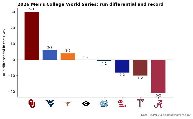
2. Run differential in Omaha
Stack the home and away sides into one row per team per game, then total each team's runs for and against. The bar
colors come from team_colors with ESPN ids, and axis_logos replaces the id tick labels with logos.
sides = pl.concat(
    [
        cws.select(team="home_id", rf="home_score", ra="away_score"),
        cws.select(team="away_id", rf="away_score", ra="home_score"),
    ]
)
omaha = (
    sides.group_by("team")
    .agg(games=pl.len(), wins=(pl.col("rf") > pl.col("ra")).sum(), diff=(pl.col("rf") - pl.col("ra")).sum())
    .sort("diff", descending=True)
)

fig, ax = plt.subplots(figsize=(8, 5))
ax.bar(omaha["team"], omaha["diff"], color=sdvplot.team_colors(omaha["team"].to_list(), "ncaa_baseball"))
for i, (diff, wins, games) in enumerate(omaha.select("diff", "wins", "games").iter_rows()):
    ax.text(
        i,
        diff + (0.6 if diff >= 0 else -0.6),
        f"{wins}-{games - wins}",
        ha="center",
        va="bottom" if diff >= 0 else "top",
        fontsize=9,
    )
ax.axhline(0, color="#222222", linewidth=0.8)
ax.set_ylabel("Run differential in the CWS")
ax.spines[["top", "right"]].set_visible(False)
ax.set_title(f"{SEASON} Men's College World Series: run differential and record", loc="left", fontweight="bold")
fig.subplots_adjust(bottom=0.16)
fig.text(0.99, 0.01, ESPN, ha="right", fontsize=8, color="#666666")
sdvplot.axis_logos(ax, "x", league="ncaa_baseball", height=0.1)
plt.show()
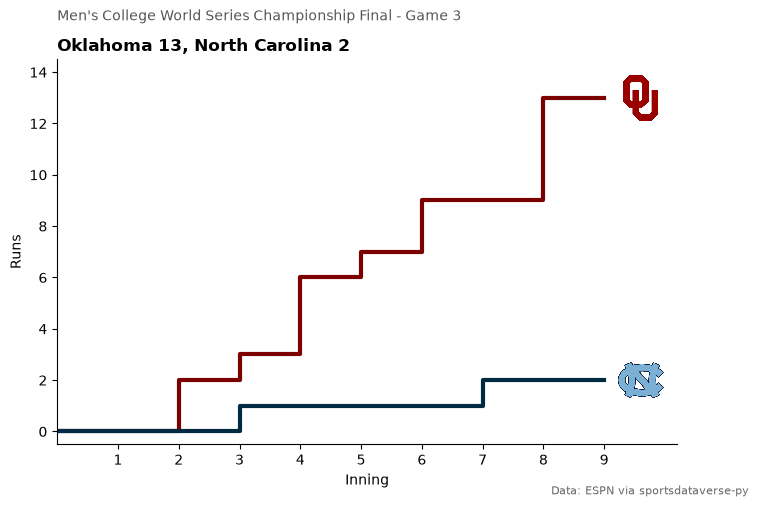
3. The clincher, inning by inning
ESPN's game summary carries each team's line score. Cumulative runs by inning, in team colors, with each team's logo at the end of its line.
final = cws.row(-1, named=True)
summary = sdv.espn_college_baseball_summary(event_id=final["game_id"], return_parsed=False)
line = pl.DataFrame(
    [
        {"team": c["team"]["id"], "inning": i + 1, "runs": int(s["displayValue"]) if s["displayValue"].isdigit() else 0}
        for c in summary["header"]["competitions"][0]["competitors"]
        for i, s in enumerate(c["linescores"])
    ]
)
line = pl.concat([line.select("team").unique().with_columns(inning=0, runs=0), line], how="vertical_relaxed")
line = line.sort("team", "inning").with_columns(total=pl.col("runs").cum_sum().over("team"))

fig, ax = plt.subplots(figsize=(8, 5))
ends = line.group_by("team").agg(pl.col("inning").max(), pl.col("total").last())
for team in ends["team"]:
    t = line.filter(pl.col("team") == team)
    ax.step(t["inning"], t["total"], where="post", linewidth=3, color=sdvplot.team_colors(team, "ncaa_baseball"))
ax.set_xticks(range(1, line["inning"].max() + 1))
ax.set_xlim(0, line["inning"].max() + 1.2)
ax.set_ylim(-0.5, line["total"].max() + 1.5)
ax.set_xlabel("Inning")
ax.set_ylabel("Runs")
ax.spines[["top", "right"]].set_visible(False)
fig.suptitle(final["note"], x=0.125, ha="left", fontsize=10, color="#555555")
ax.set_title(
    f"{final['away_location']} {final['away_score']}, {final['home_location']} {final['home_score']}",
    loc="left",
    fontweight="bold",
)
fig.text(0.99, 0.01, ESPN, ha="right", fontsize=8, color="#666666")
sdvplot.add_logos(
    ax, (ends["inning"] + 0.6).to_list(), ends["total"].to_list(), ends["team"], league="ncaa_baseball", height=0.13
)
plt.show()
4. The Women's College World Series champion's run
The WCWS in Oklahoma City ran from May 28 to June 4. The champion is the winner of the series' last game; its games go into a
table where gt_color_results fills each row by the result. As with any fill, the theme goes on first and the
result colors after it; the theme's row stripes are switched off, since in notebook output great_tables marks its CSS
!important and stripes would cover the fills on every other row. logo_url puts the champion's logo in the title.
from great_tables import html

from sdvplot.great_tables import gt_color_results

wcws = (
    scoreboard("softball", dt.date(SEASON, 5, 28), 8)
    .filter(pl.col("note").str.contains("College World Series"))
    .with_columns(pl.col("home_score").cast(pl.Int64), pl.col("away_score").cast(pl.Int64))
    .sort("date")
)
last = wcws.row(-1, named=True)
won_home = last["home_score"] > last["away_score"]
champ, champ_name = (
    (last["home_id"], last["home_display_name"]) if won_home else (last["away_id"], last["away_display_name"])
)

at_home = pl.col("home_id") == champ
run = (
    wcws.filter(at_home | (pl.col("away_id") == champ))
    .select(
        round=pl.col("note").str.replace(r"^Women's College World Series( - )?", ""),
        opponent_logo=pl.when(at_home).then("away_id").otherwise("home_id"),
        opponent=pl.when(at_home).then("away_display_name").otherwise("home_display_name"),
        rf=pl.when(at_home).then("home_score").otherwise("away_score"),
        ra=pl.when(at_home).then("away_score").otherwise("home_score"),
    )
    .with_columns(result=pl.when(pl.col("rf") > pl.col("ra")).then(pl.lit("W")).otherwise(pl.lit("L")))
)

logo = sdvplot.logo_url(champ, "ncaa_softball")
gt = gt_theme_ncaa(
    GT(run.select("round", "opponent_logo", "opponent", "rf", "ra", "result"))
    .cols_label(round="Round", opponent_logo="", opponent="Opponent", rf="Runs", ra="Allowed", result="")
    .tab_header(
        title=html(f'<img src="{logo}" style="height:40px;vertical-align:middle"> {champ_name}'),
        subtitle=f"{SEASON} Women's College World Series",
    )
    .tab_source_note(ESPN),
    row_striping_include_table_body=False,
)
gt = gt_sdv_logos(gt, "opponent_logo", league="ncaa_softball", height=26)
gt_color_results(gt, "result")
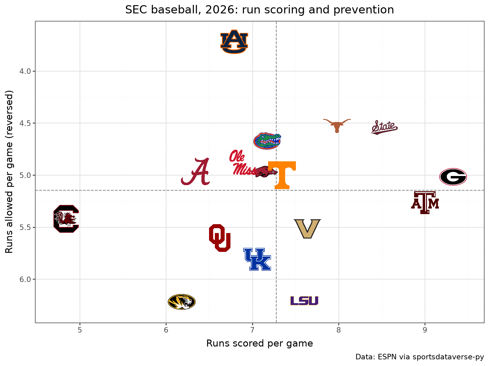
5. One conference: the SEC in college baseball
ESPN's standings take a group for one conference (27 is the SEC in college baseball). plotnine's geom_sdv_logos
plots runs scored against runs allowed per game, and geom_mean_lines adds the conference averages. The y axis is
reversed, so the best run prevention sits on top.
from plotnine import aes, ggplot, labs, scale_x_continuous, scale_y_reverse, theme, theme_bw

from sdvplot.plotnine import geom_mean_lines, geom_sdv_logos

sec = sdv.espn_college_baseball_standings(season=SEASON, group=27).with_columns(
    rs_g=pl.col("points_for") / pl.col("games_played"), ra_g=pl.col("points_against") / pl.col("games_played")
)
(
    ggplot(sec.to_pandas(), aes("rs_g", "ra_g", team="team_id", x0="rs_g", y0="ra_g"))
    + geom_mean_lines(color="#888888")
    + geom_sdv_logos(league="ncaa_baseball", height=0.1)
    + scale_x_continuous(expand=(0.08, 0))
    + scale_y_reverse(expand=(0.08, 0))
    + labs(
        x="Runs scored per game",
        y="Runs allowed per game (reversed)",
        title=f"SEC baseball, {SEASON}: run scoring and prevention",
        caption=ESPN,
    )
    + theme_bw()
    + theme(figure_size=(8, 6))
)
6. The best records in Division I (interactive)
The full Division I standings, top 15 by winning percentage, as an Altair bar chart. palette colors the bars by team,
axis_logos replaces the team axis with logos, and the tooltip names the team.
import altair as alt

top = (
    sdv.espn_college_baseball_standings(season=SEASON)
    .filter(pl.col("games_played") >= 40)
    .sort("win_percent", descending=True)
    .head(15)
    .with_columns(record=pl.format("{}-{}", pl.col("wins").cast(pl.Int64), pl.col("losses").cast(pl.Int64)))
)
colors = sdvplot.palette("ncaa_baseball", teams=top["team_id"])
bars = (
    alt.Chart(top.select("team_id", "team_display_name", "record", "win_percent").to_pandas())
    .mark_bar()
    .encode(
        x=alt.X("win_percent:Q", title="Winning percentage", axis=alt.Axis(format=".0%")),
        y=alt.Y("team_id:N", sort=top["team_id"].to_list(), title=None),  # an explicit order survives the logo layer
        color=alt.Color("team_id:N", scale=alt.Scale(domain=list(colors), range=list(colors.values())), legend=None),
        tooltip=[alt.Tooltip("team_display_name", title="Team"), alt.Tooltip("record", title="Record")],
    )
    .properties(width=480, height=420, title=f"Best records in Division I baseball, {SEASON} (40+ games)")
)
sdvplot.axis_logos(bars, "y", league="ncaa_baseball", height=0.055)
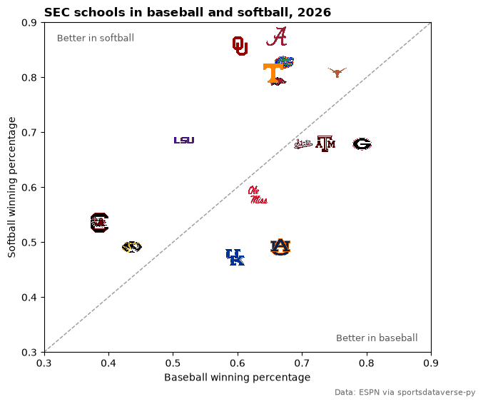
7. One school, two sports
The same school has a different ESPN id in each sport (Texas is 126 in college baseball and 538 in softball), so
ncaa_baseball and ncaa_softball are separate leagues in sdvplot. To compare a school across sports, join the two
standings on ESPN's abbreviation, which both sports share; 32 is the SEC's group in college softball. Vanderbilt has no
softball team, so 15 schools match.
sec_sb = sdv.espn_college_softball_standings(season=SEASON, group=32)
assert sec.schema["team_abbreviation"] == sec_sb.schema["team_abbreviation"]
both = sec.select("team_abbreviation", "team_id", baseball="win_percent").join(
    sec_sb.select("team_abbreviation", softball_id="team_id", softball="win_percent"), on="team_abbreviation"
)
both.filter(pl.col("team_abbreviation").is_in(["TEX", "OU", "ALA"])).select(
    "team_abbreviation", "team_id", "softball_id"
)
| team_abbreviation | team_id | softball_id |
|---|---|---|
| TEX | 126 | 538 |
| ALA | 148 | 560 |
| OU | 112 | 524 |
fig, ax = plt.subplots(figsize=(7, 6))
ax.plot([0.3, 0.9], [0.3, 0.9], color="#999999", linestyle="--", linewidth=1)
ax.set_xlim(0.3, 0.9)
ax.set_ylim(0.3, 0.9)
ax.set_xlabel("Baseball winning percentage")
ax.set_ylabel("Softball winning percentage")
ax.text(0.32, 0.88, "Better in softball", fontsize=9, color="#555555", va="top")
ax.text(0.88, 0.32, "Better in baseball", fontsize=9, color="#555555", ha="right")
ax.set_title(f"SEC schools in baseball and softball, {SEASON}", loc="left", fontweight="bold")
fig.text(0.99, 0.01, ESPN, ha="right", fontsize=8, color="#666666")
sdvplot.add_logos(ax, both["baseball"], both["softball"], both["team_id"], league="ncaa_baseball", height=0.065)
plt.show()
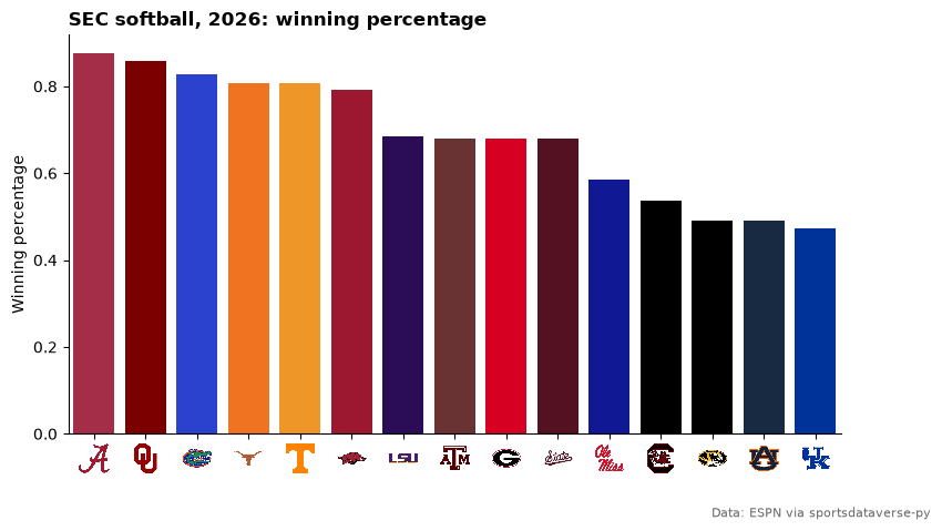
8. Team colors with seaborn
palette returns a plain {team: color} dict, which seaborn takes as is. College teams carry one ESPN color: the
secondary is None, so a second color has to come from elsewhere.
import seaborn as sns

sb = sec_sb.sort("win_percent", descending=True)
fig, ax = plt.subplots(figsize=(9, 5))
sns.barplot(
    sb.to_pandas(),
    x="team_id",
    y="win_percent",
    hue="team_id",
    order=sb["team_id"].to_list(),
    palette=sdvplot.palette("ncaa_softball", teams=sb["team_id"]),
    saturation=1,  # seaborn mutes bar colors by default; keep the teams' own
    legend=False,
    ax=ax,
)
ax.set_xlabel("")
ax.set_ylabel("Winning percentage")
ax.spines[["top", "right"]].set_visible(False)
ax.set_title(f"SEC softball, {SEASON}: winning percentage", loc="left", fontweight="bold")
fig.subplots_adjust(bottom=0.16)
fig.text(0.99, 0.01, ESPN, ha="right", fontsize=8, color="#666666")
sdvplot.axis_logos(ax, "x", league="ncaa_softball", height=0.08)
plt.show()
sdvplot.team_colors(sb["team_id"].head(3).to_list(), "ncaa_softball", which="secondary")
[None, None, None]
9. Every Division I softball team (interactive)
All teams in ESPN's Division I softball standings: runs scored against runs allowed per game, one logo each through the Plotly adapter. Hover a logo for the team and its record; the y axis runs high to low, so the best teams sit top right.
import plotly.graph_objects as go

d1 = (
    sdv.espn_college_softball_standings(season=SEASON)
    .filter(pl.col("games_played") > 0, pl.col("points_for") > 0)  # a few rows carry no run totals
    .with_columns(
        rs_g=pl.col("points_for") / pl.col("games_played"),
        ra_g=pl.col("points_against") / pl.col("games_played"),
        label=pl.format(
            "{} ({}-{})", "team_display_name", pl.col("wins").cast(pl.Int64), pl.col("losses").cast(pl.Int64)
        ),
    )
)
fig = go.Figure(
    go.Scatter(
        x=d1["rs_g"],
        y=d1["ra_g"],
        mode="markers",
        marker={"opacity": 0},
        text=d1["label"],
        hovertemplate="%{text}<br>%{x:.2f} scored, %{y:.2f} allowed per game<extra></extra>",
    )
)
fig = sdvplot.add_logos(fig, d1["rs_g"], d1["ra_g"], d1["team_id"], league="ncaa_softball", height=0.05)
fig.update_layout(
    title=f"Division I softball, {SEASON}: runs per game<br><sup>{ESPN}</sup>",
    xaxis={"title": "Runs scored per game", "range": [d1["rs_g"].min() - 0.5, d1["rs_g"].max() + 0.5]},
    yaxis={"title": "Runs allowed per game", "range": [d1["ra_g"].max() + 0.5, d1["ra_g"].min() - 0.5]},
    width=800,
    height=650,
    template="plotly_white",
)
fig
Run it yourself
Download the notebook (outputs cleared) or open it on GitHub.