College hockey
Nine charts and tables from the 2025-26 NCAA Division I men's and women's hockey seasons: records and
opponent-adjusted ratings built from ESPN's scoreboard, conference strength, the USCHO poll week by week, the men's
NCAA tournament and a women's ratings chart. ESPN publishes no college hockey standings, so everything starts from
the game results that sportsdataverse-py's espn_mch_* (men) and espn_wch_*
(women) wrappers return.
import warnings

import matplotlib.pyplot as plt
import polars as pl
import sportsdataverse as sdv
from sportsdataverse.hockey.college_hockey_ratings import college_hockey_game_results, college_hockey_ratings

import sdvplot

SEASON = 2026  # the 2025-26 season, named by the year it ends
MONTHS = ["202509", "202510", "202511", "202512", "202601", "202602", "202603", "202604"]


def season_events(league):
    """Every scoreboard event of the season: ESPN's college scoreboard takes a whole month (YYYYMM) as its date."""
    scoreboard = getattr(sdv, f"espn_{league}_scoreboard")
    return [e for m in MONTHS for e in scoreboard(dates=m, return_parsed=False).get("events", [])]


men, women = season_events("mch"), season_events("wch")
len(men), len(women)
(1149, 817)
1. Records from the scoreboard
college_hockey_game_results turns the events into one row per team and completed game; a record is a group_by
away. College hockey keeps ties (a game still level after overtime), so the winning percentage counts a tie as half a
win.
def records(events, league):
    games = college_hockey_game_results(events, league=league)
    names = {c["team"]["id"]: c["team"]["displayName"] for e in events for c in e["competitions"][0]["competitors"]}
    return (
        games.group_by("team_id")
        .agg(
            pl.len().alias("gp"),
            (pl.col("goals_for") > pl.col("goals_against")).sum().alias("w"),
            (pl.col("goals_for") < pl.col("goals_against")).sum().alias("l"),
            (pl.col("goals_for") == pl.col("goals_against")).sum().alias("t"),
            pl.col("goals_for").sum().alias("gf"),
            pl.col("goals_against").sum().alias("ga"),
        )
        .with_columns(
            team=pl.col("team_id").replace_strict(names),
            pct=(pl.col("w") + pl.col("t") / 2) / pl.col("gp"),
            record=pl.format("{}-{}-{}", "w", "l", "t"),
        )
        .sort("pct", descending=True)
    )


men_records = records(men, "mch")
men_records.head(5)
| team_id | gp | w | l | t | gf | ga | team | pct | record |
|---|---|---|---|---|---|---|---|---|---|
| 130 | 40 | 30 | 8 | 2 | 178 | 96 | Michigan Wolverines | 0.775 | 30-8-2 |
| 127 | 37 | 26 | 8 | 3 | 136 | 76 | Michigan State Spartans | 0.743243 | 26-8-3 |
| 155 | 40 | 29 | 10 | 1 | 151 | 90 | North Dakota Fighting Hawks | 0.7375 | 29-10-1 |
| 159 | 35 | 23 | 7 | 5 | 123 | 70 | Dartmouth Big Green | 0.728571 | 23-7-5 |
| 2172 | 43 | 29 | 11 | 3 | 154 | 90 | Denver Pioneers | 0.709302 | 29-11-3 |
2. The top sixteen, with conferences
ESPN's group endpoints list each conference's teams, which gives every team its conference. A great_tables table of
the sixteen best records with gt_sdv_logos on ESPN's team ids and the NCAA-style gt_theme_ncaa.
from great_tables import GT

from sdvplot.great_tables import gt_sdv_logos, gt_theme_ncaa

rows = []
for item in sdv.espn_mch_season_groups(season=SEASON, season_type=2, return_parsed=False)["items"]:
    group_id = item["$ref"].split("/groups/")[1].split("?")[0]
    group = sdv.espn_mch_season_group(season=SEASON, season_type=2, group_id=group_id, return_parsed=False)
    members = sdv.espn_mch_season_group_teams(SEASON, 2, group_id, return_parsed=False)["items"]
    rows += [
        {"team_id": m["$ref"].split("/teams/")[1].split("?")[0], "conference": group["abbreviation"]} for m in members
    ]
conferences = pl.DataFrame(rows)
assert conferences.schema["team_id"] == men_records.schema["team_id"] == pl.String
men_records = men_records.join(conferences, on="team_id", how="left")

top = men_records.head(16).with_row_index("rank", offset=1)
gt = (
    GT(top.select("rank", pl.col("team_id").alias("logo"), "team", "conference", "record", "pct", "gf", "ga"))
    .tab_header("Men's college hockey, 2025-26", "The sixteen best records, NCAA tournament included")
    .fmt_number("pct", decimals=3)
    .cols_label(rank="", logo="", team="Team", conference="Conf.", record="W-L-T", pct="Pct.", gf="GF", ga="GA")
    .tab_source_note("Data: ESPN via sportsdataverse-py")
)
gt_theme_ncaa(gt_sdv_logos(gt, "logo", league="ncaa_mhockey", height=24))
3. Opponent-adjusted ratings
Raw goals flatter teams with easy schedules. college_hockey_ratings adjusts each team's goals for and against for
its opponents (an iterative, KenPom-style fit), in goals per game against an average team. The scoreboard also holds
a few exhibitions against teams outside Division I; keep teams with at least ten games.
men_ratings = college_hockey_ratings(men, league="mch").filter(pl.col("games") >= 10)  # drops one-off exhibition foes
fig, ax = plt.subplots(figsize=(10, 6))
ax.scatter(men_ratings["adj_off"], men_ratings["adj_def"], alpha=0)
ax.axvline(men_ratings["adj_off"].mean(), color="grey", lw=0.8, ls="--")
ax.axhline(men_ratings["adj_def"].mean(), color="grey", lw=0.8, ls="--")
ax.invert_yaxis()
ax.margins(0.06)
sdvplot.add_logos(
    ax,
    men_ratings["adj_off"],
    men_ratings["adj_def"],
    men_ratings["team_id"],
    league="ncaa_mhockey",
    season=SEASON,
    height=0.055,
)
ax.set(xlabel="Adjusted goals for per game", ylabel="Adjusted goals against per game (reversed)")
ax.set_title("Men's college hockey, opponent-adjusted, 2025-26", loc="left", fontweight="bold")
fig.text(0.99, 0.01, "Data: ESPN via sportsdataverse-py", ha="right", fontsize=8, color="grey")
plt.show()
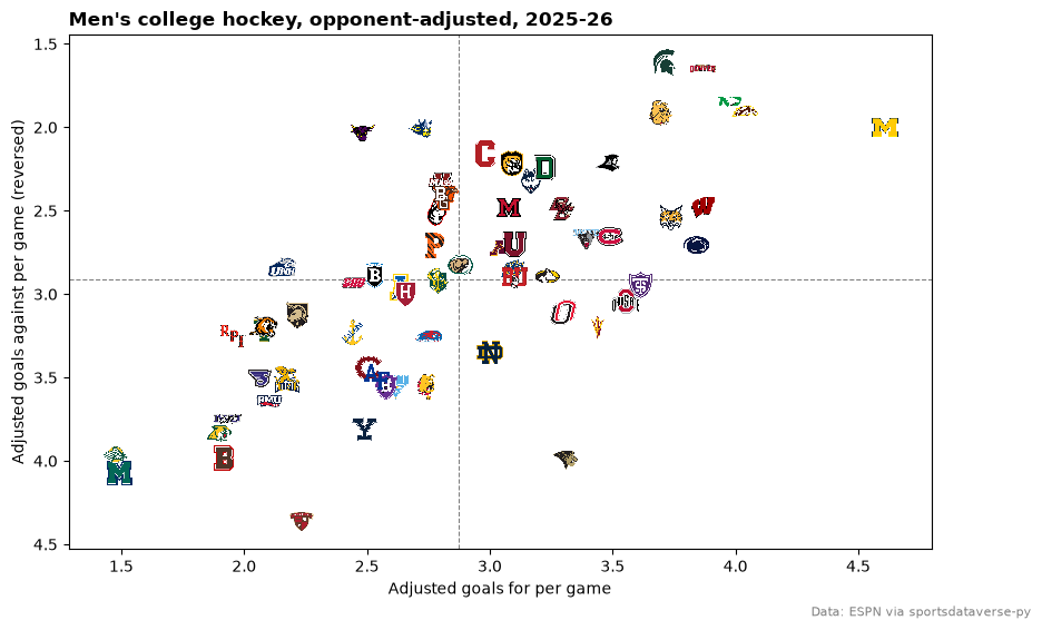
Michigan's attack, 4.6 adjusted goals a game, was the best in the country by more than half a goal; Michigan State allowed the fewest.
4. Conference strength, in conference colors
Each team's net rating (adjusted goals for minus against) as a dot colored by its conference, one row per conference
ordered by its average; the best team in each conference carries its logo. (HE is Hockey East, AHA Atlantic Hockey
America and IND the independents.) The index has no school colors for college hockey yet (color_source is
"fallback"), and conference colors read better here anyway.
from plotnine import (
    aes,
    element_blank,
    element_text,
    geom_point,
    geom_vline,
    ggplot,
    labs,
    scale_color_manual,
    theme,
    theme_minimal,
)

from sdvplot.plotnine import geom_sdv_logos

net = men_ratings.join(conferences, on="team_id")
order = net.group_by("conference").agg(pl.col("adj_net").mean()).sort("adj_net")["conference"].to_list()
best = net.sort("adj_net", descending=True).group_by("conference", maintain_order=True).first()
frame, best_frame = net.to_pandas(), best.to_pandas()
for f in (frame, best_frame):
    f["conference"] = f["conference"].astype("category").cat.set_categories(order)
palette = dict(
    zip(
        order,
        [
            "#4e79a7",
            "#f28e2b",
            "#e15759",
            "#76b7b2",
            "#59a14f",
            "#edc948",
            "#b07aa1",
            "#ff9da7",
            "#9c755f",
            "#bab0ac",
            "#86bcb6",
            "#d37295",
        ],
        strict=False,
    )
)
(
    ggplot(frame, aes("adj_net", "conference"))
    + geom_vline(xintercept=0, color="#bbbbbb")
    + geom_point(aes(color="conference"), size=3.5, alpha=0.8, show_legend=False)
    + geom_sdv_logos(aes(team="team_id"), data=best_frame, league="ncaa_mhockey", season=SEASON, height=0.075)
    + scale_color_manual(values=palette)
    + labs(
        x="Net rating (adjusted goals per game)",
        y="",
        title="Conference strength, men's 2025-26",
        caption="Data: ESPN via sportsdataverse-py",
    )
    + theme_minimal()
    + theme(figure_size=(9, 5.5), panel_grid_minor=element_blank(), plot_title=element_text(weight="bold"))
)

The NCHC was the strongest conference on average; the Big Ten had the best team, Michigan.
5. The USCHO poll, week by week
Every competitor on ESPN's scoreboard carries its poll rank at game time (curatedRank, 99 when unranked), so the
weekly USCHO poll falls out of the same events. Conference tournaments give byes in March, so take the top ten from
the last week in which all ten ranked teams played, and follow them back through the season as a bump chart.
weekly = (
    pl.DataFrame(
        [
            {"date": e["date"][:10], "team_id": c["team"]["id"], "rank": c.get("curatedRank", {}).get("current", 99)}
            for e in men
            if e["season"]["type"] == 2
            for c in e["competitions"][0]["competitors"]
        ]
    )
    .with_columns(week=pl.col("date").str.to_date().dt.truncate("1w"))
    .group_by("team_id", "week")
    .agg(pl.col("rank").min())
)
full = weekly.filter(pl.col("rank") <= 10).group_by("week").len().filter(pl.col("len") == 10)
last_week = full["week"].max()  # the last week in which all ten ranked teams played
polls = weekly.filter((pl.col("rank") <= 20) & (pl.col("week") <= last_week))
final10 = polls.filter((pl.col("week") == last_week) & (pl.col("rank") <= 10))["team_id"].to_list()
fig, ax = plt.subplots(figsize=(10, 6))
for team_id in final10:
    t = polls.filter(pl.col("team_id") == team_id).sort("week")
    ax.plot(t["week"], t["rank"], marker="o", ms=3, lw=1.6, alpha=0.75)
ends = polls.filter((pl.col("week") == last_week) & pl.col("team_id").is_in(final10))
sdvplot.add_logos(ax, ends["week"], ends["rank"], ends["team_id"], league="ncaa_mhockey", season=SEASON, height=0.07)
ax.invert_yaxis()
ax.set_yticks([1, 5, 10, 15, 20])
ax.set_ylabel("USCHO poll rank")
ax.spines[["top", "right"]].set_visible(False)
ax.set_title(f"The USCHO top ten of {last_week:%B} {last_week.day}, through the season", loc="left", fontweight="bold")
fig.text(
    0.99,
    0.01,
    "Weeks when a team was outside the top 20 are left out. Data: ESPN via sportsdataverse-py",
    ha="right",
    fontsize=8,
    color="grey",
)
plt.show()

6. The men's NCAA tournament
The sixteen-team tournament is in the same events (season type 3), with the round in each game's notes. A results table with two logo columns, one for the winner and one for the loser.
from sdvplot.great_tables import gt_theme_scoreboard

games = []
for e in men:
    if e["season"]["type"] != 3:
        continue
    comp = e["competitions"][0]
    win, lose = sorted(comp["competitors"], key=lambda c: not c["winner"])
    games.append(
        {
            "date": e["date"][:10],
            "round": comp["notes"][0]["headline"].replace("NCAA Men's Hockey ", "").replace("Championship - ", ""),
            "winner": win["team"]["id"],
            "winner_name": win["team"]["shortDisplayName"],
            "score": f"{win['score']}-{lose['score']}"
            + (" (OT)" if "OT" in e["status"]["type"]["shortDetail"] else ""),
            "loser": lose["team"]["id"],
            "loser_name": lose["team"]["shortDisplayName"],
        }
    )
bracket = pl.DataFrame(games).sort("date")
gt = (
    GT(bracket)
    .tab_header("2026 NCAA men's hockey tournament", "Every game, regionals to the national championship")
    .cols_label(
        date="Date", round="Round", winner="", winner_name="Winner", score="Score", loser="", loser_name="Loser"
    )
    .tab_source_note("Data: ESPN via sportsdataverse-py")
)
gt_theme_scoreboard(gt_sdv_logos(gt, ["winner", "loser"], league="ncaa_mhockey", height=22))
Denver won the title, beating Wisconsin 2-1 in the final after a double-overtime semifinal against Michigan.
7. Tiers of the top thirty-two
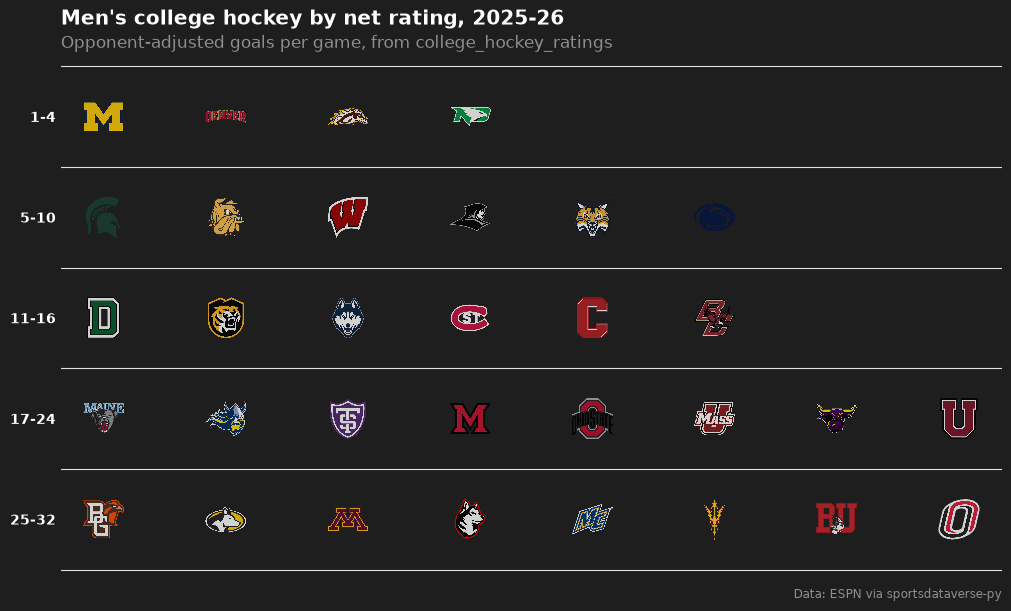
The thirty-two best net ratings as a tier list, with matplotlib's team_tiers. Tiers are rating ranks, so the
labels say which.
from sdvplot.matplotlib import team_tiers

ranked = men_ratings.sort("adj_net", descending=True).head(32).with_row_index("rank", offset=1)
ranked = ranked.with_columns(
    tier_no=pl.when(pl.col("rank") <= 4)
    .then(1)
    .when(pl.col("rank") <= 10)
    .then(2)
    .when(pl.col("rank") <= 16)
    .then(3)
    .when(pl.col("rank") <= 24)
    .then(4)
    .otherwise(5)
)
fig = team_tiers(
    ranked.select(pl.col("team_id").alias("team"), "tier_no"),
    "ncaa_mhockey",
    title="Men's college hockey by net rating, 2025-26",
    subtitle="Opponent-adjusted goals per game, from college_hockey_ratings",
    caption="Data: ESPN via sportsdataverse-py",
    tier_desc={1: "1-4", 2: "5-10", 3: "11-16", 4: "17-24", 5: "25-32"},
    height=0.085,
)
fig.set_size_inches(10, 6)
plt.show()
8. Women's ratings: when an id does not resolve, try the name
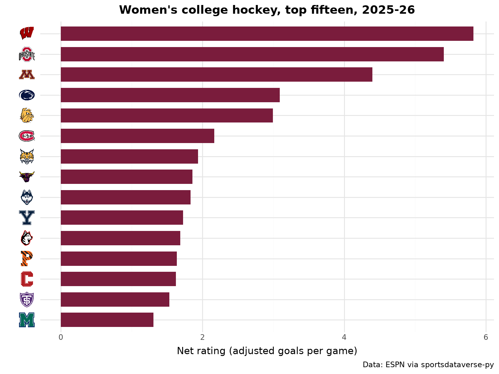
The same pipeline for the women. Two of ESPN's women's team ids are not in the index, and resolve warns rather than
guessing. Minnesota State's women's team has its own ESPN id; its name resolves to the school. Delaware has no entry
yet, so it drops out of the logo charts with one warning.
names = {c["team"]["id"]: c["team"]["displayName"] for e in women for c in e["competitions"][0]["competitors"]}
ids = list(names)
with warnings.catch_warnings(record=True) as caught:
    warnings.simplefilter("always")
    by_id = sdvplot.resolve(ids, "ncaa_whockey")
    missing = [i for i, key in zip(ids, by_id, strict=True) if key is None]
    by_name = dict(zip(missing, sdvplot.resolve([names[i] for i in missing], "ncaa_whockey"), strict=True))
for w in caught:
    print(w.message)
keys = pl.DataFrame({"team_id": ids, "key": [key or by_name[i] for i, key in zip(ids, by_id, strict=True)]})
women_ratings = college_hockey_ratings(women, league="wch").filter(pl.col("games") >= 10).join(keys, on="team_id")
women_ratings.filter(pl.col("team_id").is_in(missing)).select("team_id", "key", "adj_net", "games")
2 value(s) did not resolve to a ncaa_whockey team: '24059' (unknown), '48' (unknown). Use sdvplot.suggest() for candidates, or strict=True to raise.
1 value(s) did not resolve to a ncaa_whockey team: 'Delaware Blue Hens' (unknown). Use sdvplot.suggest() for candidates, or strict=True to raise.
| team_id | key | adj_net | games |
|---|---|---|---|
| 24059 | 2364 | 1.859313 | 38 |
| 48 | null | -3.04131 | 33 |
from plotnine import coord_flip, geom_col

top15 = women_ratings.filter(pl.col("key").is_not_null()).sort("adj_net", descending=True).head(15)
frame = top15.to_pandas()
frame["key"] = frame["key"].astype("category").cat.set_categories(top15["key"].reverse().to_list())
p = (
    ggplot(frame, aes("key", "adj_net"))
    + geom_col(fill="#7a1c3c", width=0.7)
    + coord_flip()
    + labs(
        x="",
        y="Net rating (adjusted goals per game)",
        title="Women's college hockey, top fifteen, 2025-26",
        caption="Data: ESPN via sportsdataverse-py",
    )
    + theme_minimal()
    + theme(figure_size=(8, 6), plot_title=element_text(weight="bold"))
)
sdvplot.axis_logos(p, "y", league="ncaa_whockey", season=SEASON, height=0.055)  # "y": the axis as drawn, after the flip
9. Women's scoring, interactive
Goals for and against per game for every women's team in Plotly, logos as the points; hover for the record.
import plotly.graph_objects as go

w = records(women, "wch").join(keys.rename({"key": "logo"}), on="team_id").filter(pl.col("logo").is_not_null())
w = w.with_columns(gf_pg=pl.col("gf") / pl.col("gp"), ga_pg=pl.col("ga") / pl.col("gp"))
fig = go.Figure(
    go.Scatter(
        x=w["gf_pg"],
        y=w["ga_pg"],
        mode="markers",
        marker={"opacity": 0},
        text=w["team"],
        customdata=w["record"],
        hovertemplate="%{text}<br>%{customdata}<br>%{x:.2f} for, %{y:.2f} against<extra></extra>",
    )
)
fig = sdvplot.add_logos(fig, w["gf_pg"], w["ga_pg"], w["logo"], league="ncaa_whockey", season=SEASON, height=0.07)
fig.update_layout(
    title="Women's college hockey: goals for and against per game, 2025-26",
    template="plotly_white",
    xaxis_title="Goals for per game",
    yaxis={"title": "Goals against per game (reversed)", "autorange": "reversed"},
    width=800,
    height=560,
)
fig
Wisconsin, the women's national champion, beat Ohio State 3-2 in the final.
Run it yourself
Download the notebook (outputs cleared) or open it on GitHub.