AHL, ECHL and junior hockey
Eight charts and tables from the 2025-26 seasons of six North American leagues: the AHL and ECHL (the minor leagues
below the NHL), the three Canadian Hockey League circuits (OHL, WHL, QMJHL) and the USHL. All six run on the
HockeyTech stats platform, so sportsdataverse-py reads them with one family of functions
(sdv.<league>_standings, <league>_leaders, <league>_schedule, ...) and sdvplot knows their teams by HockeyTech id
and by name.
import matplotlib.pyplot as plt
import polars as pl
import sportsdataverse as sdv

import sdvplot

SEASON = 2026  # the 2025-26 season, named by the year it ends
LEAGUES = {"ahl": "AHL", "echl": "ECHL", "ohl": "OHL", "whl": "WHL", "qmjhl": "QMJHL", "ushl": "USHL"}
1. Six leagues, one function each
season=2026 asks HockeyTech for a season by its name, and for some leagues the first match is an all-star or
prospects event rather than the regular season. Pin each league's 2025-26 regular-season id instead (listed in the
league's own season feed). The standings prefix clinched teams with a marker (x - Providence Bruins); strip it and
the names resolve, which also gives each team's HockeyTech id.
SEASON_IDS = {"ahl": 90, "echl": 73, "ohl": 83, "whl": 289, "qmjhl": 211, "ushl": 88}  # 2025-26 regular seasons


def load_standings(league):
    raw = getattr(sdv, f"{league}_standings")(season_id=SEASON_IDS[league])
    table = raw.select(
        pl.lit(league).alias("league"),
        pl.col("team").str.replace(r"^\w+ - ", "").alias("team"),
        pl.col("games_played").cast(pl.Int64).alias("gp"),
        pl.col("wins").cast(pl.Int64).alias("w"),
        pl.col("points").cast(pl.Int64),
        pl.col("goals_for").cast(pl.Int64).alias("gf"),
        pl.col("goals_against").cast(pl.Int64).alias("ga"),
    )
    return table.with_columns(team_id=sdvplot.resolve(table["team"], league, season=SEASON))


standings = pl.concat([load_standings(lg) for lg in LEAGUES]).with_columns(
    pct=pl.col("points") / (2 * pl.col("gp")),  # two points a game available
    gf_pg=pl.col("gf") / pl.col("gp"),
    ga_pg=pl.col("ga") / pl.col("gp"),
)
assert standings["team_id"].null_count() == 0
standings.group_by("league", maintain_order=True).agg(
    pl.len().alias("teams"),
    pl.col("gp").max().alias("games"),
    pl.col("team").sort_by("points", descending=True).first().alias("first_place"),
    pl.col("points").max().alias("points"),
)
| league | teams | games | first_place | points |
|---|---|---|---|---|
| ahl | 32 | 72 | Providence Bruins | 110 |
| echl | 30 | 72 | Kansas City Mavericks | 115 |
| ohl | 20 | 68 | Brantford Bulldogs | 106 |
| whl | 23 | 68 | Everett Silvertips | 117 |
| qmjhl | 18 | 64 | Moncton, Wildcats | 104 |
| ushl | 16 | 62 | Youngstown Phantoms | 91 |
2. The AHL's top twelve
A great_tables standings table of the AHL's best twelve records, with gt_sdv_logos on the HockeyTech ids that
resolve returned and the Premier League-style gt_theme_pl.
from great_tables import GT

from sdvplot.great_tables import gt_sdv_logos, gt_theme_pl

ahl = standings.filter(pl.col("league") == "ahl").sort("pct", "gf", descending=True).head(12)
gt = (
    GT(ahl.select(pl.col("team_id").alias("logo"), "team", "gp", "w", "points", "pct", "gf", "ga"))
    .tab_header("AHL standings, 2025-26", "The twelve best points percentages of the regular season")
    .fmt_number("pct", decimals=3)
    .cols_label(logo="", team="Team", gp="GP", w="W", points="PTS", pct="PTS%", gf="GF", ga="GA")
    .tab_source_note("Data: AHL HockeyTech feed via sportsdataverse-py")
)
gt_theme_pl(gt_sdv_logos(gt, "logo", league="ahl", height=24))
3. The same chart in six leagues
Goals for and against per game, one small multiple per league on shared axes, so the leagues compare directly. One
add_logos call per panel, each with its own league.
fig, axes = plt.subplots(2, 3, figsize=(10, 6), sharex=True, sharey=True)
for ax, (league, label) in zip(axes.flat, LEAGUES.items(), strict=True):
    d = standings.filter(pl.col("league") == league)
    ax.scatter(d["gf_pg"], d["ga_pg"], alpha=0)
    ax.axline((3, 3), slope=1, color="#cccccc", lw=0.8, zorder=0)
    sdvplot.add_logos(ax, d["gf_pg"], d["ga_pg"], d["team_id"], league=league, season=SEASON, height=0.08)
    ax.set_title(label, fontweight="bold")
axes[0, 0].invert_yaxis()  # shared: flips every panel, so better defenses sit higher
for ax in axes[1]:
    ax.set_xlabel("Goals for per game")
for ax in axes[:, 0]:
    ax.set_ylabel("Goals against per game")
fig.suptitle("Goals for and against per game, 2025-26 regular seasons", fontweight="bold")
fig.text(
    0.99,
    0.005,
    "Above the grey line: more scored than allowed. Data: HockeyTech via sportsdataverse-py",
    ha="right",
    fontsize=8,
    color="grey",
)
plt.show()
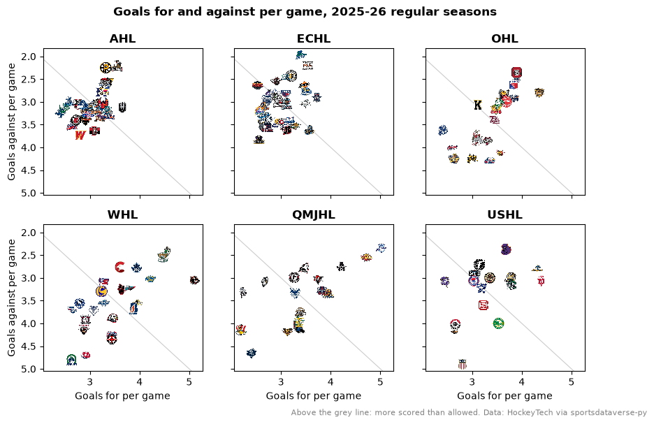
The AHL's goal differences run from -0.92 to +1.33 a game; the QMJHL's run from -2.25 to +2.67. The junior leagues spread out about twice as far as the pro ones.
4. AHL clubs and their NHL parents
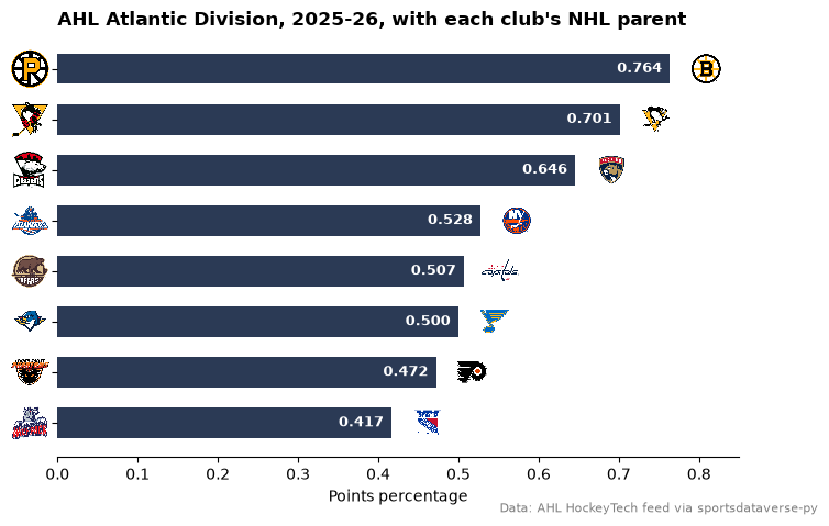
Every AHL club is an NHL team's top affiliate, so a chart can carry two leagues' logos: axis_logos with
league="ahl" on the y axis, add_logos with league="nhl" at the end of each bar. The affiliations are not in any
feed; here are the eight clubs of the AHL's Atlantic Division and their 2025-26 parents.
PARENTS = {
    "Providence Bruins": "BOS",
    "Wilkes-Barre/Scranton Penguins": "PIT",
    "Charlotte Checkers": "FLA",
    "Hershey Bears": "WSH",
    "Lehigh Valley Phantoms": "PHI",
    "Springfield Thunderbirds": "STL",
    "Hartford Wolf Pack": "NYR",
    "Bridgeport Islanders": "NYI",
}
atlantic = (
    standings.filter((pl.col("league") == "ahl") & pl.col("team").is_in(list(PARENTS)))
    .with_columns(parent=pl.col("team").replace_strict(PARENTS))
    .sort("pct")
)
assert atlantic.height == len(PARENTS)
fig, ax = plt.subplots(figsize=(8, 5))
ax.barh(atlantic["team_id"], atlantic["pct"], color="#2b3a55", height=0.6)
sdvplot.axis_logos(ax, "y", league="ahl", season=SEASON, height=0.09)
sdvplot.add_logos(
    ax,
    (atlantic["pct"] + 0.045).to_list(),
    list(range(atlantic.height)),
    atlantic["parent"],
    league="nhl",
    season=SEASON,
    height=0.08,
)
for i, p in enumerate(atlantic["pct"]):
    ax.text(p - 0.01, i, f"{p:.3f}", va="center", ha="right", color="white", fontsize=9, fontweight="bold")
ax.set_xlim(0, 0.85)
ax.spines[["top", "right", "left"]].set_visible(False)
ax.set_xlabel("Points percentage")
ax.set_title("AHL Atlantic Division, 2025-26, with each club's NHL parent", loc="left", fontweight="bold")
fig.text(0.99, 0.01, "Data: AHL HockeyTech feed via sportsdataverse-py", ha="right", fontsize=8, color="grey")
plt.show()
5. The CHL's three leagues on one scale
The OHL, WHL and QMJHL make up the Canadian Hockey League. Each team is a logo on a common points-percentage axis, one row per league; alternate teams sit a little above and below the line so neighbours do not cover each other.
chl = standings.filter(pl.col("league").is_in(["ohl", "whl", "qmjhl"])).sort("pct")
rows = {"qmjhl": 0, "whl": 1, "ohl": 2}
fig, ax = plt.subplots(figsize=(10, 5))
for league, row in rows.items():
    d = chl.filter(pl.col("league") == league).with_row_index("i")
    y = (row + pl.when(pl.col("i") % 2 == 0).then(0.17).otherwise(-0.17)).alias("y")
    d = d.with_columns(y)
    ax.hlines(row, 0.2, 0.85, color="#dddddd", lw=1, zorder=0)
    sdvplot.add_logos(ax, d["pct"], d["y"], d["team_id"], league=league, season=SEASON, height=0.085)
ax.set_xlim(0.2, 0.85)
ax.set_ylim(-0.6, 2.6)
ax.set_yticks(list(rows.values()), [LEAGUES[k] for k in rows])
ax.tick_params(axis="y", length=0, labelsize=11)
ax.spines[["top", "right", "left"]].set_visible(False)
ax.set_xlabel("Points percentage, 2025-26 regular season")
ax.set_title("Every CHL team on one scale", loc="left", fontweight="bold")
fig.subplots_adjust(bottom=0.15)
fig.text(
    0.99, 0.01, "Data: OHL, WHL and QMJHL HockeyTech feeds via sportsdataverse-py", ha="right", fontsize=8, color="grey"
)
plt.show()
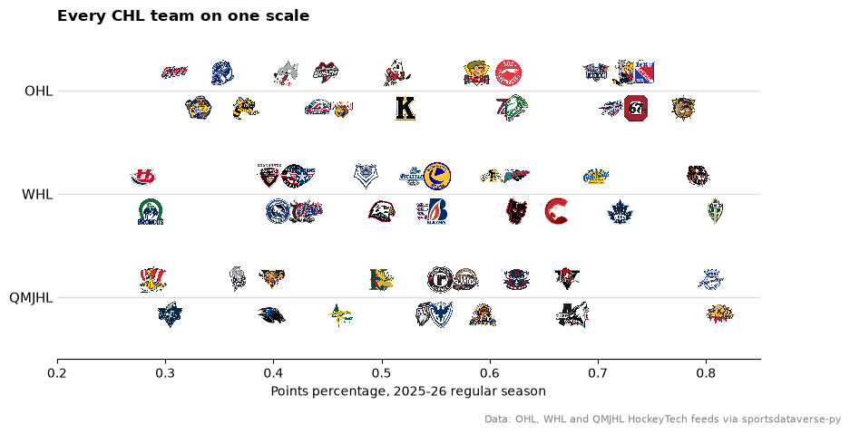
The WHL's Everett Silvertips (.860) had the best record in the CHL, ahead of Moncton (.812) in the QMJHL and Brantford (.779) in the OHL.
6. Each league's scoring leader
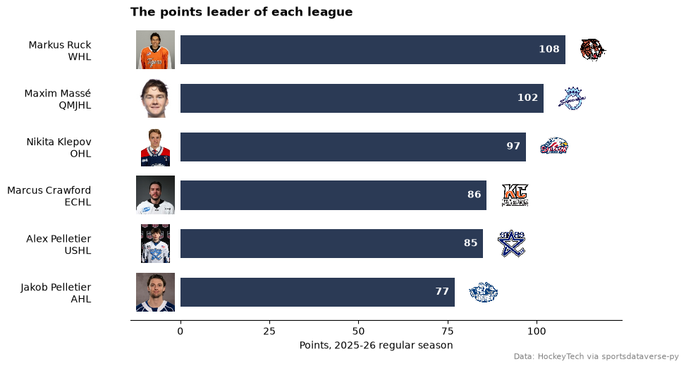
The <league>_leaders feeds carry the top five scorers with a photo URL. One bar per league for its points leader,
the photo drawn with add_images and the team logo with add_logos (one call per league, since each row is a
different league).
from sdvplot.matplotlib import add_images

tops = []
for league in LEAGUES:
    top = getattr(sdv, f"{league}_leaders")(season_id=SEASON_IDS[league]).filter(pl.col("type_formatted") == "Points")
    tops.append(
        top.sort("rank")
        .head(1)
        .select(
            pl.lit(league).alias("league"),
            "name",
            "team_id",
            "photo",
            pl.col("stat_formatted").cast(pl.Int64).alias("points"),
        )
    )
tops = pl.concat(tops).sort("points")
fig, ax = plt.subplots(figsize=(9, 5.5))
y = list(range(tops.height))
ax.barh(y, tops["points"], color="#2b3a55", height=0.6)
ax.set_yticks(y, [f"{n}\n{LEAGUES[lg]}" for n, lg in zip(tops["name"], tops["league"], strict=True)])
ax.tick_params(axis="y", length=0, pad=40)
ax.set_xlim(-14, tops["points"].max() + 16)
add_images(ax, [-7] * tops.height, y, tops["photo"], height=0.13)
for i, row in enumerate(tops.iter_rows(named=True)):
    sdvplot.add_logos(ax, [row["points"] + 8], [i], [row["team_id"]], league=row["league"], season=SEASON, height=0.1)
    ax.text(row["points"] - 1.5, i, str(row["points"]), va="center", ha="right", color="white", fontweight="bold")
ax.set_xticks([0, 25, 50, 75, 100])
ax.spines[["top", "right", "left"]].set_visible(False)
ax.set_xlabel("Points, 2025-26 regular season")
ax.set_title("The points leader of each league", loc="left", fontweight="bold")
fig.text(0.99, 0.01, "Data: HockeyTech via sportsdataverse-py", ha="right", fontsize=8, color="grey")
plt.show()
7. The USHL, interactive with Bokeh
The USHL is the top junior league in the United States. Points against goal difference in a Bokeh figure: hover for
the record, zoom and the logos keep their size. file_html wraps the figure as a self-contained page.
from bokeh.embed import file_html
from bokeh.models import ColumnDataSource, HoverTool
from bokeh.plotting import figure
from bokeh.resources import CDN
from IPython.display import HTML

ushl = standings.filter(pl.col("league") == "ushl").with_columns(
    diff=pl.col("gf") - pl.col("ga"), record=pl.format("{}-{} ({} pts)", "w", pl.col("gp") - pl.col("w"), "points")
)
p = figure(
    title="USHL 2025-26: points and goal difference",
    x_axis_label="Goal difference",
    y_axis_label="Points",
    width=760,
    frame_height=420,
    toolbar_location="right",
)
dots = p.scatter(
    "diff",
    "points",
    source=ColumnDataSource(ushl.select("team", "diff", "points", "record").to_pandas()),
    size=46,
    alpha=0,
)  # invisible targets for the hover tool, under the logos
p.add_tools(HoverTool(renderers=[dots], tooltips=[("", "@team"), ("Record", "@record"), ("Goal diff", "@diff")]))
sdvplot.add_logos(p, ushl["diff"], ushl["points"], ushl["team_id"], league="ushl", season=SEASON, height=0.1)
HTML(file_html(p, CDN, "USHL 2025-26"))
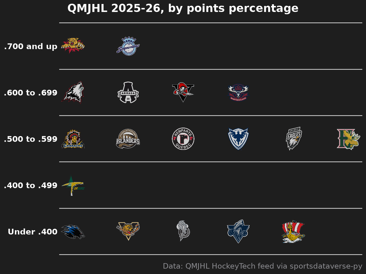
8. QMJHL tiers
A tier list of the QMJHL by points percentage, drawn with plotnine's team_tiers. The tier labels are the
points-percentage bands.
from sdvplot.plotnine import team_tiers

qmjhl = (
    standings.filter(pl.col("league") == "qmjhl")
    .sort("pct", descending=True)
    .with_columns(
        tier_no=pl.when(pl.col("pct") >= 0.7)
        .then(1)
        .when(pl.col("pct") >= 0.6)
        .then(2)
        .when(pl.col("pct") >= 0.5)
        .then(3)
        .when(pl.col("pct") >= 0.4)
        .then(4)
        .otherwise(5)
    )
)
team_tiers(
    qmjhl.select(pl.col("team_id").alias("team"), "tier_no"),
    "qmjhl",
    title="QMJHL 2025-26, by points percentage",
    subtitle=None,
    caption="Data: QMJHL HockeyTech feed via sportsdataverse-py",
    tier_desc={1: ".700 and up", 2: ".600 to .699", 3: ".500 to .599", 4: ".400 to .499", 5: "Under .400"},
)
Run it yourself
Download the notebook (outputs cleared) or open it on GitHub.