NFL
Ten charts and tables from one season of nflverse play-by-play: team logos on a scatter, bars in team colors, a
standings table, small multiples, a quarterback headshot chart, relocated franchises, an interactive plot, a field in
team colors and a tier list. The data comes from the nflverse releases through sportsdataverse.nfl; sdvplot takes
the abbreviations straight from it.
import matplotlib.pyplot as plt
import polars as pl
import sportsdataverse.nfl as nfl

import sdvplot

SEASON = 2025
CAPTION = f"Data: nflverse via sportsdataverse-py | {SEASON} regular season"

pbp = nfl.load_nfl_pbp([SEASON])
plays = pbp.filter(
    pl.col("season_type") == "REG",
    pl.col("play_type").is_in(["pass", "run"]),
    pl.col("epa").is_not_null(),
)
plays.height
32941
1. Offense vs defense EPA per play
The chart every NFL season ends with: each team's offensive EPA per play against the EPA per play its defense allowed, with the team's logo as the point. The defense axis is flipped so the good teams sit top right.
offense = plays.group_by("posteam").agg(off_epa=pl.col("epa").mean(), off_sr=pl.col("success").mean())
defense = plays.group_by("defteam").agg(def_epa=pl.col("epa").mean(), def_sr=pl.col("success").mean())
teams = offense.join(defense, left_on="posteam", right_on="defteam").rename({"posteam": "team"})

fig, ax = plt.subplots(figsize=(9, 6))
ax.axvline(teams["off_epa"].mean(), color="grey", lw=0.8, ls="--")
ax.axhline(teams["def_epa"].mean(), color="grey", lw=0.8, ls="--")
ax.scatter(teams["off_epa"], teams["def_epa"], s=0)  # sets the axis limits; the logos are the marks
ax.margins(0.08)
sdvplot.add_logos(ax, teams["off_epa"], teams["def_epa"], teams["team"], league="nfl", season=SEASON, height=0.07)
ax.invert_yaxis()
for x, y, text in [(0.98, 0.98, "good offense, good defense"), (0.02, 0.02, "bad offense, bad defense")]:
    ax.text(
        x,
        y,
        text,
        transform=ax.transAxes,
        ha="right" if x > 0.5 else "left",
        va="top" if y > 0.5 else "bottom",
        color="grey",
        fontsize=9,
    )
ax.set(xlabel="Offense EPA per play", ylabel="Defense EPA per play allowed (better is up)")
ax.set_title(f"NFL offense vs defense, {SEASON}", loc="left", fontweight="bold")
fig.text(0.99, 0.01, CAPTION, ha="right", fontsize=8, color="grey")
plt.show()

2. A ranked bar chart with logos on the axis
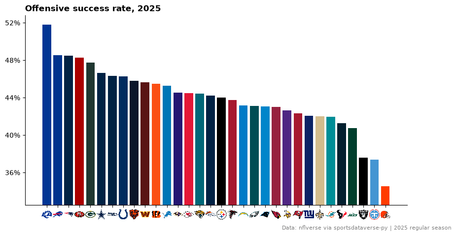
Offensive success rate, sorted, each bar in its team's primary color from team_colors, and axis_logos swapping
the abbreviations under the bars for logos.
from matplotlib.ticker import MultipleLocator, PercentFormatter

ranked = teams.sort("off_sr", descending=True)

fig, ax = plt.subplots(figsize=(10, 5))
ax.bar(ranked["team"], ranked["off_sr"], color=sdvplot.team_colors(ranked["team"], "nfl").to_list())
ax.set_ylim(ranked["off_sr"].min() - 0.02, ranked["off_sr"].max() + 0.01)
ax.yaxis.set_major_locator(MultipleLocator(0.04))
ax.yaxis.set_major_formatter(PercentFormatter(1, decimals=0))
ax.spines[["top", "right"]].set_visible(False)
sdvplot.axis_logos(ax, "x", league="nfl", season=SEASON, height=0.06)
ax.set_title(f"Offensive success rate, {SEASON}", loc="left", fontweight="bold")
fig.text(0.99, 0.01, CAPTION, ha="right", fontsize=8, color="grey")
plt.show()
3. Division standings table
Records come from the schedule (load_nfl_schedule), divisions from load_nfl_teams. great_tables draws the table;
gt_sdv_logos turns the abbreviation column into logos, data_color shades the point differential and
gt_theme_sdv gives it the SportsDataverse look.
from great_tables import GT

from sdvplot.great_tables import gt_sdv_logos, gt_theme_sdv

schedule = nfl.load_nfl_schedule([SEASON]).filter(pl.col("game_type") == "REG")
games = pl.concat(
    [
        schedule.select("week", team="home_team", pf="home_score", pa="away_score"),
        schedule.select("week", team="away_team", pf="away_score", pa="home_score"),
    ]
)
divisions = nfl.load_nfl_teams().select(team="team_abbr", division="team_division")
names = sdvplot.teams("nfl").select("team_id", "name")

records = games.group_by("team").agg(
    W=(pl.col("pf") > pl.col("pa")).sum(),
    L=(pl.col("pf") < pl.col("pa")).sum(),
    T=(pl.col("pf") == pl.col("pa")).sum(),
    PF=pl.col("pf").sum(),
    PA=pl.col("pa").sum(),
)
# resolve maps the schedule's abbreviations to sdvplot team ids, which carry the full names
standings = (
    records.with_columns(
        team_id=sdvplot.resolve(records["team"], "nfl"),
        Diff=pl.col("PF") - pl.col("PA"),
        pct=(pl.col("W") + pl.col("T") / 2) / (pl.col("W") + pl.col("L") + pl.col("T")),
    )
    .join(names, on="team_id")
    .join(divisions, on="team")
    .sort(["division", "pct", "Diff"], descending=[False, True, True])
    .select("division", logo="team", Team="name", W="W", L="L", T="T", PF="PF", PA="PA", Diff="Diff")
)
limit = standings["Diff"].abs().max()  # a color scale centered on zero

(
    GT(standings, groupname_col="division")
    .pipe(gt_sdv_logos, "logo", league="nfl", season=SEASON, height=22)
    .cols_label(logo="")
    .data_color(columns="Diff", palette=["#b2182b", "#f7f7f7", "#1b7837"], domain=[-limit, limit])
    .tab_header(title=f"{SEASON} NFL standings", subtitle="Regular season, by division")
    .tab_source_note(CAPTION)
    .pipe(gt_theme_sdv, density="compact")
)
4. Small multiples by division with plotnine
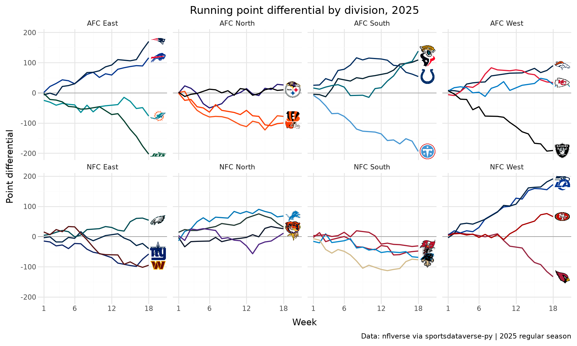
Each team's running point differential through the season, one panel per division. scale_color_sdv colors the
lines by team and geom_sdv_logos puts each logo just past the end of its line. The logo layer gets its own data (the last
week per team) with the division column, so plotnine draws each logo in its own panel.
from plotnine import aes, facet_wrap, geom_hline, geom_line, ggplot, labs, scale_x_continuous, theme, theme_minimal

from sdvplot.plotnine import geom_sdv_logos, scale_color_sdv

running = (
    games.sort("week")
    .with_columns(diff=(pl.col("pf") - pl.col("pa")).cum_sum().over("team"))
    .join(divisions, on="team")
)
ends = running.group_by("team", maintain_order=True).last().with_columns(week=pl.col("week") + 1.5)

(
    ggplot(running.to_pandas(), aes("week", "diff", color="team"))
    + geom_hline(yintercept=0, color="grey", size=0.3)
    + geom_line(size=0.8)
    + geom_sdv_logos(
        aes("week", "diff", team="team"),
        data=ends.to_pandas(),
        league="nfl",
        season=SEASON,
        height=0.13,
        inherit_aes=False,
    )
    + scale_color_sdv("nfl")
    + scale_x_continuous(breaks=[1, 6, 12, 18], limits=(1, 20))
    + facet_wrap("division", ncol=4)
    + labs(x="Week", y="Point differential", title=f"Running point differential by division, {SEASON}", caption=CAPTION)
    + theme_minimal()
    + theme(figure_size=(10, 6), legend_position="none")
)
5. A win probability chart with a logo in the title
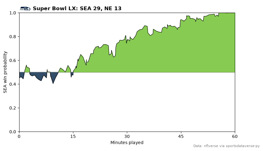
nflverse's home_wp traced through Super Bowl LX. title_image sets the title with the winner's logo beside it.
The fills use the teams' colors from team_colors; when two primaries are the same, one team switches to its
secondary color.
from sdvplot.matplotlib import title_image

game = nfl.load_nfl_schedule([SEASON]).filter(pl.col("game_type") == "SB").row(0, named=True)
wp = pbp.filter(pl.col("game_id") == game["game_id"], pl.col("home_wp").is_not_null()).select(
    minute=(3600 - pl.col("game_seconds_remaining")) / 60, away_wp=1 - pl.col("home_wp")
)
away, home = game["away_team"], game["home_team"]
away_color, home_color = sdvplot.team_colors([away, home], "nfl")
if away_color == home_color:  # both teams' primary is the same navy: use the away team's second color
    away_color = sdvplot.team_colors(away, "nfl", which="secondary")

fig, ax = plt.subplots(figsize=(9, 5))
ax.fill_between(
    wp["minute"], 0.5, wp["away_wp"], where=wp["away_wp"] >= 0.5, color=away_color, alpha=0.8, interpolate=True
)
ax.fill_between(
    wp["minute"], 0.5, wp["away_wp"], where=wp["away_wp"] < 0.5, color=home_color, alpha=0.8, interpolate=True
)
ax.plot(wp["minute"], wp["away_wp"], color="black", lw=0.8)
ax.set(xlim=(0, 60), ylim=(0, 1), xticks=[0, 15, 30, 45, 60], xlabel="Minutes played", ylabel=f"{away} win probability")
ax.axhline(0.5, color="grey", lw=0.6)
winner = away if game["away_score"] > game["home_score"] else home
title_image(
    ax,
    winner,
    f"Super Bowl LX: {away} {game['away_score']}, {home} {game['home_score']}",
    league="nfl",
    season=SEASON,
    height=28,
    loc="left",
    fontweight="bold",
)
fig.text(0.99, 0.01, "Data: nflverse via sportsdataverse-py", ha="right", fontsize=8, color="grey")
plt.show()
6. A quarterback leaderboard with headshots
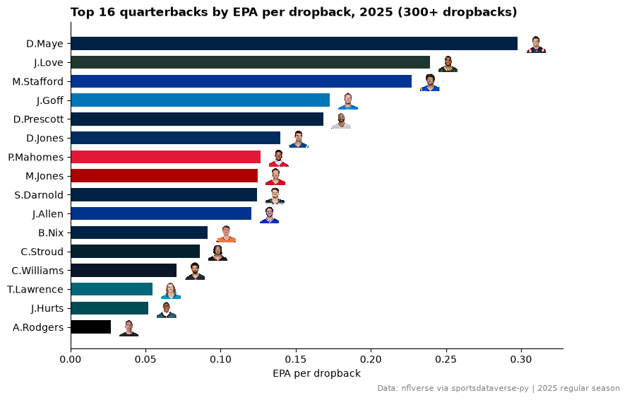
nflverse identifies players by gsis id (passer_player_id). add_headshots takes those ids with
id_system="gsis" and looks up each player's headshot through the nflverse player table; the bars take each
quarterback's team color.
qbs = (
    pbp.filter(pl.col("season_type") == "REG", pl.col("passer_player_id").is_not_null(), pl.col("epa").is_not_null())
    .group_by("passer_player_id")
    .agg(
        name=pl.col("passer_player_name").first(),
        team=pl.col("posteam").last(),
        plays=pl.len(),
        epa=pl.col("epa").mean(),
    )
    .filter(pl.col("plays") >= 300)
    .sort("epa", descending=True)
    .head(16)
    .reverse()  # barh draws from the bottom up, so the leader ends on top
)

fig, ax = plt.subplots(figsize=(9, 6))
ax.barh(qbs["name"], qbs["epa"], height=0.7, color=sdvplot.team_colors(qbs["team"], "nfl").to_list())
sdvplot.add_headshots(
    ax,
    qbs["epa"] + 0.012,
    list(range(qbs.height)),
    qbs["passer_player_id"],
    league="nfl",
    id_system="gsis",
    height=0.06,
)
ax.set_xlim(0, qbs["epa"].max() + 0.03)
ax.spines[["top", "right"]].set_visible(False)
ax.set_xlabel("EPA per dropback")
ax.set_title(f"Top 16 quarterbacks by EPA per dropback, {SEASON} (300+ dropbacks)", loc="left", fontweight="bold")
fig.text(0.99, 0.01, CAPTION, ha="right", fontsize=8, color="grey")
plt.show()
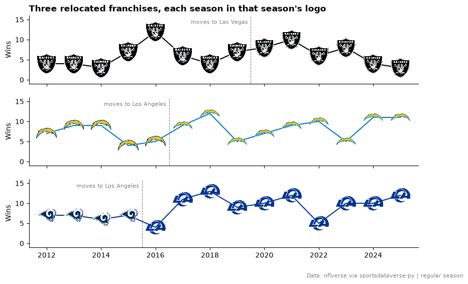
7. Relocated franchises and their eras
The schedules use the abbreviation a team had that season: OAK until 2019, SD until 2016, STL until 2015. resolve
with one season per row maps every era to the same franchise id, and add_logos with one season per point draws the
mark the team wore that year.
history = nfl.load_nfl_schedule(list(range(2012, SEASON + 1))).filter(pl.col("game_type") == "REG")
wins = (
    pl.concat(
        [
            history.select("season", team="home_team", win=pl.col("result") > 0),
            history.select("season", team="away_team", win=pl.col("result") < 0),
        ]
    )
    .filter(pl.col("team").is_in(["OAK", "LV", "SD", "LAC", "STL", "LA"]))
    .group_by("season", "team")
    .agg(wins=pl.col("win").sum())
    .sort("season")
)
wins = wins.with_columns(team_id=sdvplot.resolve(wins["team"], "nfl", season=wins["season"]))
wins.group_by("team_id", "team").agg(first=pl.col("season").min(), last=pl.col("season").max()).sort("team_id", "first")
| team_id | team | first | last |
|---|---|---|---|
| 13 | OAK | 2012 | 2019 |
| 13 | LV | 2020 | 2025 |
| 14 | STL | 2012 | 2015 |
| 14 | LA | 2016 | 2025 |
| 24 | SD | 2012 | 2016 |
| 24 | LAC | 2017 | 2025 |
moves = {"13": (2020, "Las Vegas"), "24": (2017, "Los Angeles"), "14": (2016, "Los Angeles")}
fig, axes = plt.subplots(3, 1, figsize=(10, 6), sharex=True, sharey=True)
for ax, (team_id, (moved, city)) in zip(axes, moves.items(), strict=True):
    rows = wins.filter(pl.col("team_id") == team_id)
    ax.plot(rows["season"], rows["wins"], color=sdvplot.team_colors(team_id, "nfl"), lw=1.5)
    ax.axvline(moved - 0.5, color="grey", lw=0.8, ls="--")
    ax.text(moved - 0.6, 15, f"moves to {city}", fontsize=8, color="grey", va="top", ha="right")
    sdvplot.add_logos(ax, rows["season"], rows["wins"], rows["team"], league="nfl", season=rows["season"], height=0.32)
    ax.set_ylim(-1, 16)
    ax.set_ylabel("Wins")
    ax.spines[["top", "right"]].set_visible(False)
axes[0].set_title("Three relocated franchises, each season in that season's logo", loc="left", fontweight="bold")
axes[-1].set_xticks(range(2012, SEASON + 1, 2))
fig.text(0.99, 0.01, "Data: nflverse via sportsdataverse-py | regular season", ha="right", fontsize=8, color="grey")
plt.show()
8. An interactive Plotly scatter
Dropback EPA against rushing EPA, with hover text. add_logos works on a Plotly figure the same way: a transparent
marker trace carries the hover, and the logos are layout images. The axis ranges are set first, with some
room at the edges, so no logo is cut off.
import plotly.graph_objects as go

split = plays.group_by("posteam").agg(
    pass_epa=pl.col("epa").filter(pl.col("play_type") == "pass").mean(),
    rush_epa=pl.col("epa").filter(pl.col("play_type") == "run").mean(),
    pass_rate=(pl.col("play_type") == "pass").mean(),
)

fig = go.Figure(
    go.Scatter(
        x=split["rush_epa"],
        y=split["pass_epa"],
        mode="markers",
        marker={"size": 30, "opacity": 0},
        customdata=split.select("posteam", "pass_rate").rows(),
        hovertemplate="%{customdata[0]}<br>pass EPA %{y:.3f}<br>rush EPA %{x:.3f}"
        "<br>pass rate %{customdata[1]:.0%}<extra></extra>",
    )
)


def padded(values, share=0.08):  # an axis range with room for the logos at the edges
    low, high = values.min(), values.max()
    return [low - share * (high - low), high + share * (high - low)]


fig.update_layout(
    xaxis_range=padded(split["rush_epa"]),
    yaxis_range=padded(split["pass_epa"]),
    title=f"Passing vs rushing EPA per play, {SEASON}",
    xaxis_title="Rushing EPA per play",
    yaxis_title="Dropback EPA per play",
    template="plotly_white",
    width=800,
    height=560,
)
sdvplot.add_logos(fig, split["rush_epa"], split["pass_epa"], split["posteam"], league="nfl", season=SEASON, height=0.08)
fig
9. A field in team colors
surface("nfl", team) draws an NFL field with sportypy, end zones in the team's colors. On top: every Seattle
touchdown from scrimmage in the regular season, from the line of scrimmage to the end zone, placed by the side of the
field the play went to.
import logging

import numpy as np

logging.getLogger("matplotlib.font_manager").setLevel(logging.ERROR)  # sportypy asks for fonts few systems have

tds = pbp.filter(
    pl.col("season_type") == "REG",
    pl.col("posteam") == "SEA",
    pl.col("td_team") == "SEA",
    pl.col("play_type").is_in(["pass", "run"]),
).with_columns(side=pl.coalesce("pass_location", "run_location"))
lane = {"left": 15.0, "middle": 0.0, "right": -15.0}
rng = np.random.default_rng(1)

fig, ax = plt.subplots(figsize=(10, 5.5))
sdvplot.surface("nfl", "SEA", season=SEASON, ax=ax, center_logo=0.18, display_range="in_bounds_only")
for row in tds.iter_rows(named=True):
    y = lane.get(row["side"], 0.0) + rng.uniform(-6, 6)
    color = "#69be28" if row["play_type"] == "pass" else "#ffffff"
    ax.annotate(
        "",
        xy=(53, y),
        xytext=(50 - row["yardline_100"], y),
        arrowprops={"arrowstyle": "->", "color": color, "lw": 1.4},
        zorder=20,
    )
ax.set_title(
    f"Seattle's {tds.height} touchdowns from scrimmage, {SEASON}: green = pass, white = run",
    loc="left",
    fontweight="bold",
)
fig.text(0.99, 0.01, CAPTION, ha="right", fontsize=8, color="grey")
plt.show()

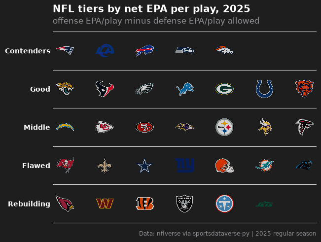
10. Team tiers
A tier list from net EPA per play (offense minus defense), drawn by team_tiers on sdvplotR's Tiermaker theme.
tier_no and team are the only columns it needs; the order within each tier comes from the data.
from sdvplot.matplotlib import team_tiers

sizes = [5, 7, 7, 7, 6]  # teams per tier, top to bottom
tier_of_rank = [tier for tier, n in enumerate(sizes, start=1) for _ in range(n)]
tiers = (
    teams.with_columns(net=pl.col("off_epa") - pl.col("def_epa"))
    .sort("net", descending=True)
    .with_columns(tier_no=pl.Series(tier_of_rank))
    .select("tier_no", "team")
)

fig = team_tiers(
    tiers,
    "nfl",
    title=f"NFL tiers by net EPA per play, {SEASON}",
    subtitle="offense EPA/play minus defense EPA/play allowed",
    caption=CAPTION,
    tier_desc={1: "Contenders", 2: "Good", 3: "Middle", 4: "Flawed", 5: "Rebuilding"},
)
plt.show()
Run it yourself
Download the notebook (outputs cleared) or open it on GitHub.