Women's college basketball
Division I women's basketball has 364 teams, and each shares its ESPN id with the school's men's team. These ten examples chart the 2025-26 season: names and ids, the efficiency landscape, a conference table, game margins in team colors, a headshot leaderboard, a shot chart on a college court, an interactive top 25, seed-line tiers, the champion's tournament run and the AP poll. The data are wehoop's ESPN box scores, schedules, standings and shots and the SportsDataverse adjusted ratings, read from GitHub release files by sportsdataverse-py.
import warnings

import matplotlib.pyplot as plt
import polars as pl
import sportsdataverse.wbb as wbb

import sdvplot

SEASON = 2026  # the 2025-26 season: college seasons are named by the year they end
CAPTION = "Data: wehoop / ESPN via sportsdataverse-py"

ratings = wbb.load_wbb_ratings(SEASON)  # adjusted efficiency, one row per team
box = wbb.load_wbb_team_boxscore(SEASON)  # one row per team per game
standings = wbb.load_wbb_standings(SEASON)  # one row per team, conference and stat
schedule = wbb.load_wbb_schedule(SEASON)  # one row per game
ratings.height, box.height, standings.height, schedule.height
(663, 12058, 30492, 6054)
1. One school id, two programs
ESPN gives a school one team id for its men's and women's teams, and sdvplot keeps them as separate leagues,
so the league key picks the program: 2633 is the Tennessee Volunteers in "mbb" and the Lady Volunteers in
"wbb", each with its own name and mark.
fig, axes = plt.subplots(1, 2, figsize=(6, 3))
for ax, league in zip(axes, ("mbb", "wbb"), strict=True):
    name = sdvplot.teams(league).filter(pl.col("team_id") == "2633")["name"][0]
    ax.imshow(sdvplot.logo_image(2633, league, size=200))
    ax.set_title(f'"{league}": {name}', fontsize=10)
    ax.axis("off")
plt.show()

Names resolve through the index, nicknames do not: "Lady Vols" gives None and one SdvplotWarning. The box
scores also hold games against 300 non-Division I opponents, which resolve the same way, with one warning for
the whole column. The ratings get the same treatment, and each team's 2025-26 conference comes from that
season's standings.
with warnings.catch_warnings(record=True) as caught:
    warnings.simplefilter("always")
    print(sdvplot.resolve(["UConn", "TENN", "Lady Vols", 2579], "wbb"))
    opponents = sdvplot.resolve(box["opponent_team_id"].cast(pl.Utf8).unique(), "wbb")
    ids = sdvplot.resolve(ratings["team_id"], "wbb")
for w in caught:
    print(str(w.message)[:100], "...")

conference = standings.select(pl.col("team_id").cast(pl.Utf8), conference=pl.col("group_name")).unique()
d1 = (
    ratings.with_columns(team_id=ids)
    .drop_nulls("team_id")
    .join(conference, on="team_id", how="left")
    .join(sdvplot.teams("wbb").select("team_id", "short_name"), on="team_id")
    .with_columns(d1_rank=pl.col("adj_em").rank("ordinal", descending=True))
    .sort("d1_rank")
)
d1_ids = d1["team_id"].to_list()
d1.select("d1_rank", "team_id", "short_name", "conference", "adj_o", "adj_d", "adj_em").head(5)
['41', '2633', None, '2579']
1 value(s) did not resolve to a wbb team: 'Lady Vols' (unknown). Use sdvplot.suggest() for candidate ...
300 value(s) did not resolve to a wbb team: '100277' (unknown), '2863' (unknown), '502' (unknown), ' ...
300 value(s) did not resolve to a wbb team: '3163' (unknown), '2606' (unknown), '2778' (unknown), '2 ...
| d1_rank | team_id | short_name | conference | adj_o | adj_d | adj_em |
|---|---|---|---|---|---|---|
| 1 | 41 | UConn | Big East Conference | 129.347367 | 58.12808 | 71.219287 |
| 2 | 26 | UCLA | Big Ten Conference | 135.068331 | 63.937368 | 71.130963 |
| 3 | 2579 | South Carolina | Southeastern Conference | 130.53392 | 63.444662 | 67.089258 |
| 4 | 251 | Texas | Southeastern Conference | 127.303289 | 61.289125 | 66.014163 |
| 5 | 99 | LSU | Southeastern Conference | 130.648378 | 68.354108 | 62.29427 |
2. The efficiency landscape of the top 36
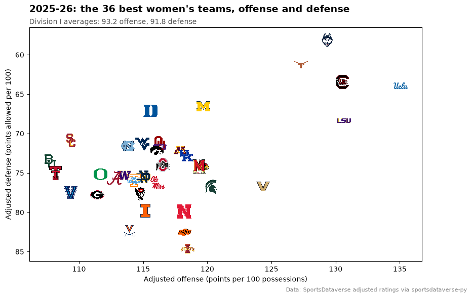
Another way to keep logos legible: zoom to the teams you care about. Here the axes hold only the 36 best teams by adjusted efficiency margin, so every logo gets room; the subtitle gives the Division I averages, far below and left of every logo here. Defense is points allowed, so its axis runs downward to put good defenses on top.
top = d1.head(36)

fig, ax = plt.subplots(figsize=(10, 6))
ax.scatter(top["adj_o"], top["adj_d"], s=0)  # sets the axis limits for the logos
sdvplot.add_logos(ax, top["adj_o"], top["adj_d"], top["team_id"], league="wbb", height=0.065)
ax.invert_yaxis()
ax.margins(0.06)
ax.set_xlabel("Adjusted offense (points per 100 possessions)")
ax.set_ylabel("Adjusted defense (points allowed per 100)")
ax.set_title(
    "2025-26: the 36 best women's teams, offense and defense", loc="left", fontsize=14, fontweight="bold", pad=22
)
ax.text(
    0,
    1.015,
    f"Division I averages: {d1['adj_o'].mean():.1f} offense, {d1['adj_d'].mean():.1f} defense",
    transform=ax.transAxes,
    fontsize=10,
    color="#555555",
)
fig.text(
    0.99, 0.01, "Data: SportsDataverse adjusted ratings via sportsdataverse-py", ha="right", fontsize=8, color="grey"
)
plt.show()
3. A conference table in The Athletic's style
The SEC's 2025-26 standings, with home and road records and the record against ranked teams. The standings
frame is long (one row per team and stat), so pivot the numbers and the record strings separately.
gt_color_pills with a fixed domain keeps the margin colors comparable from one table to the next.
from great_tables import GT

from sdvplot.great_tables import gt_color_pills, gt_merge_stack_team_color, gt_sdv_logos, gt_theme_athletic

sec = standings.filter(pl.col("group_name") == "Southeastern Conference").with_columns(pl.col("team_id").cast(pl.Utf8))
numbers = sec.filter(pl.col("stat_type").is_in(["playoffseed", "pointdifferential", "wins", "losses"])).pivot(
    on="stat_type", index="team_id", values="value"
)
records = sec.filter(pl.col("stat_type").is_in(["total", "vsconf", "home", "road", "vsusarankedteams"])).pivot(
    on="stat_type", index="team_id", values="display_value"
)
table = (
    numbers.join(records, on="team_id")
    .join(d1.select("team_id", "short_name"), on="team_id")
    .select(
        seed=pl.col("playoffseed").cast(pl.Int64),
        team_id="team_id",
        short_name="short_name",
        conf=pl.col("vsconf") + " SEC",
        overall="total",
        home="home",
        road="road",
        ranked="vsusarankedteams",
        margin=pl.col("pointdifferential") / (pl.col("wins") + pl.col("losses")),
    )
    .sort("seed")
)

(
    GT(table)
    .pipe(gt_merge_stack_team_color, "short_name", "conf", "team_id", league="wbb")
    .pipe(gt_sdv_logos, "team_id", league="wbb", height=28)
    .pipe(gt_color_pills, "margin", digits=1, domain=[-35, 35])
    .cols_label(
        seed="Seed",
        team_id="",
        short_name="Team",
        overall="Overall",
        home="Home",
        road="Road",
        ranked="vs. ranked",
        margin="Margin",
    )
    .tab_header("SEC women's standings, 2025-26", "Seeded for the SEC tournament; margin is points per game")
    .tab_source_note(CAPTION)
    .pipe(gt_theme_athletic)
)
4. Every game's margin, in team colors (plotnine)
A box plot shows a season's spread; the points on top are the games, in each team's color from
scale_color_sdv. The Big Ten's 18 teams are ordered by their median margin against Division I opponents, and
axis_logos labels the axis.
from plotnine import (
    aes,
    element_text,
    geom_boxplot,
    geom_hline,
    geom_jitter,
    ggplot,
    labs,
    scale_x_discrete,
    theme,
    theme_minimal,
)

from sdvplot.plotnine import axis_logos, scale_color_sdv

big_ten = d1.filter(pl.col("conference") == "Big Ten Conference")["team_id"].to_list()
margins = (
    box.with_columns(pl.col("team_id", "opponent_team_id").cast(pl.Utf8))
    .filter(pl.col("team_id").is_in(big_ten) & pl.col("opponent_team_id").is_in(d1_ids))
    .with_columns(margin=pl.col("team_score") - pl.col("opponent_team_score"))
)
order = margins.group_by("team_id").agg(pl.col("margin").median()).sort("margin", descending=True)

p = (
    ggplot(margins.to_pandas(), aes("team_id", "margin"))
    + geom_hline(yintercept=0, color="#555555")
    + geom_boxplot(outlier_shape="", width=0.6, color="#444444", fill="white")
    + geom_jitter(aes(color="team_id"), width=0.15, height=0, size=1.6, alpha=0.85, show_legend=False)
    + scale_x_discrete(limits=order["team_id"].to_list())
    + scale_color_sdv("wbb")
    + labs(
        x="",
        y="Final margin (points)",
        title="Big Ten women: every game against a Division I team, 2025-26",
        caption=CAPTION,
    )
    + theme_minimal()
    + theme(figure_size=(10, 5.5), plot_title=element_text(weight="bold", size=13))
)
axis_logos(p, "x", league="wbb", height=0.06)

5. A scoring leaderboard with headshots
Player box scores carry ESPN athlete ids: gt_sdv_headshots turns them into headshots and gt_sdv_logos the
team ids into logos. A light theme keeps dark logos readable. Leaders need at least 20 games.
from sdvplot.great_tables import gt_sdv_headshots, gt_theme_broadsheet

players = wbb.load_wbb_player_boxscore(SEASON)
leaders = (
    players.filter(~pl.col("did_not_play"))
    .group_by("athlete_id", "athlete_display_name", "team_id")
    .agg(
        games=pl.len(),
        ppg=pl.col("points").mean(),
        fg=pl.col("field_goals_made").sum() / pl.col("field_goals_attempted").sum(),
        three=pl.col("three_point_field_goals_made").sum() / pl.col("three_point_field_goals_attempted").sum(),
        ft=pl.col("free_throws_made").sum() / pl.col("free_throws_attempted").sum(),
    )
    .filter(pl.col("games") >= 20)
    .sort("ppg", descending=True)
    .head(10)
)

(
    GT(leaders)
    .pipe(gt_sdv_headshots, "athlete_id", league="wbb", height=40)
    .pipe(gt_sdv_logos, "team_id", league="wbb", height=28)
    .fmt_number("ppg", decimals=1)
    .fmt_percent(["fg", "three", "ft"], decimals=1)
    .cols_label(
        athlete_id="",
        athlete_display_name="Player",
        team_id="Team",
        games="G",
        ppg="PPG",
        fg="FG%",
        three="3P%",
        ft="FT%",
    )
    .tab_header("The 2025-26 Division I scoring leaders", "Points per game, minimum 20 games")
    .tab_source_note(CAPTION)
    .pipe(gt_theme_broadsheet)
)
6. A shot chart on a college court
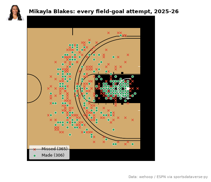
ESPN's shot coordinates are feet from center court, the frame sportypy draws, so surface("wbb", team) takes
them as they are once both halves are folded onto one basket. Two cleanups first: free throws are placed at
the rim, and a shot with no location carries a placeholder of about 215 million. The court wears the
team's colors and the headshot sits beside the title.
from sdvplot.matplotlib import title_image

star = leaders.row(0, named=True)
shots = wbb.load_wbb_shots(SEASON)
mine = shots.filter(
    (pl.col("athlete_id_1") == star["athlete_id"])
    & (pl.col("type_text") != "MadeFreeThrow")  # placed at the rim, not where they were taken
    & (pl.col("coordinate_x").abs() <= 47)  # drops the no-location sentinel
    & (pl.col("coordinate_y").abs() <= 25)
).with_columns(  # fold the left half onto the right-hand basket
    x=pl.col("coordinate_x").abs(),
    y=pl.when(pl.col("coordinate_x") < 0).then(-pl.col("coordinate_y")).otherwise(pl.col("coordinate_y")),
)
made, missed = mine.filter(pl.col("scoring_play")), mine.filter(~pl.col("scoring_play"))

fig, ax = plt.subplots(figsize=(8, 6))
sdvplot.surface("wbb", star["team_id"], ax=ax, display_range="offense")
ax.scatter(
    missed["x"], missed["y"], marker="x", s=22, lw=1.2, color="#e34a33", zorder=20, label=f"Missed ({missed.height})"
)
ax.scatter(
    made["x"], made["y"], s=28, color="#2ca25f", edgecolor="white", lw=0.6, zorder=21, label=f"Made ({made.height})"
)
ax.legend(loc="lower left", fontsize=9)
title_image(
    ax,
    sdvplot.headshot_url(star["athlete_id"], "wbb"),
    f"{star['athlete_display_name']}: every field-goal attempt, 2025-26",
    height=40,
    fontsize=12,
    fontweight="bold",
)
fig.text(0.98, 0.02, CAPTION, ha="right", fontsize=8, color="grey")
plt.show()
7. An interactive top 25 (Plotly)
Hover a bar for the team, its conference and its rating. axis_logos puts the logos beside a Plotly category
axis; the bars use team_colors.
import plotly.graph_objects as go

top25 = d1.head(25).reverse()  # Plotly draws horizontal bars from the bottom up
fig = go.Figure(
    go.Bar(
        x=top25["adj_em"],
        y=top25["team_id"],
        orientation="h",
        marker_color=sdvplot.team_colors(top25["team_id"].to_list(), "wbb"),
        customdata=top25.select("short_name", "conference").rows(),
        hovertemplate="%{customdata[0]} (%{customdata[1]})<br>Adj. EM %{x:+.1f}<extra></extra>",
    )
)
fig.update_layout(
    title="2025-26 women's top 25 by adjusted efficiency margin",
    xaxis_title="Points per 100 possessions better than an average Division I team",
    yaxis_type="category",
    template="plotly_white",
    width=760,
    height=640,
    margin={"l": 70, "t": 60, "b": 60},
)
sdvplot.axis_logos(fig, "y", league="wbb", height=0.03)
8. Tiers as seed lines (plotnine)
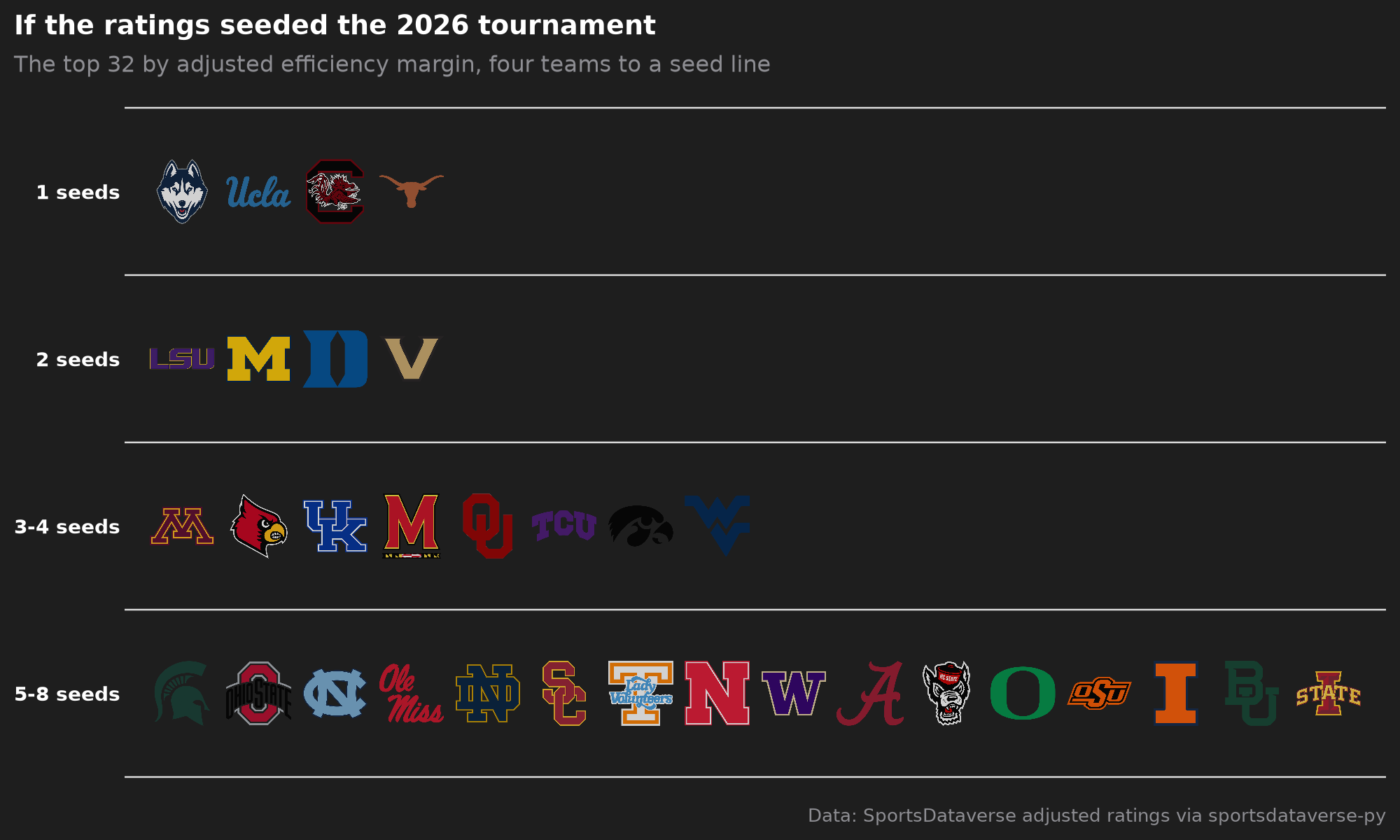
The NCAA tournament seeds four teams to a line, so seed lines make natural tiers: the top four by adjusted
efficiency margin on the 1 line, the next four on the 2 line, then 3-4 and 5-8. The plotnine team_tiers
returns a ggplot.
from sdvplot.plotnine import team_tiers

lines = d1.head(32).select(
    team="team_id",
    tier_no=pl.when(pl.col("d1_rank") <= 4)
    .then(1)
    .when(pl.col("d1_rank") <= 8)
    .then(2)
    .when(pl.col("d1_rank") <= 16)
    .then(3)
    .otherwise(4),
)
team_tiers(
    lines.to_pandas(),
    "wbb",
    title="If the ratings seeded the 2026 tournament",
    subtitle="The top 32 by adjusted efficiency margin, four teams to a seed line",
    caption="Data: SportsDataverse adjusted ratings via sportsdataverse-py",
    tier_desc={1: "1 seeds", 2: "2 seeds", 3: "3-4 seeds", 4: "5-8 seeds"},
) + theme(figure_size=(10, 6))
9. March: the champion's run
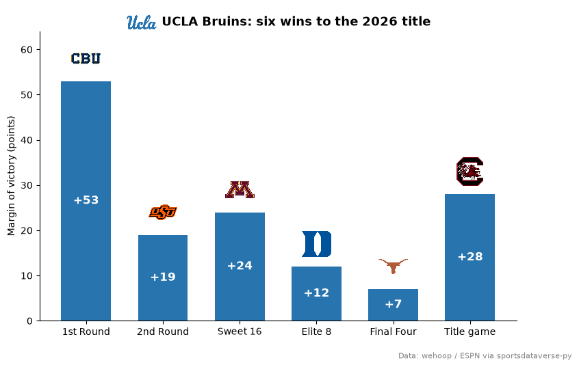
The schedule's notes_headline names each NCAA tournament game. Find the title game's winner, then chart its
six wins: the margin of each, the opponent's logo on top, the champion's logo beside the title.
ncaa = schedule.filter(pl.col("notes_headline").str.starts_with("NCAA Women's Basketball Championship"))
title_game = ncaa.filter(pl.col("notes_headline").str.ends_with("National Championship")).row(0, named=True)
champ = title_game["home_id"] if title_game["home_winner"] else title_game["away_id"]
run = (
    ncaa.filter((pl.col("home_id") == champ) | (pl.col("away_id") == champ))
    .sort("game_date")
    .with_columns(home=pl.col("home_id") == champ)
    .select(
        round=pl.col("notes_headline").str.split(" - ").list.last().str.replace("National Championship", "Title game"),
        opponent=pl.when("home").then("away_id").otherwise("home_id"),
        margin=pl.when("home")
        .then(pl.col("home_score") - pl.col("away_score"))
        .otherwise(pl.col("away_score") - pl.col("home_score")),
    )
)
champ_name = sdvplot.teams("wbb").filter(pl.col("team_id") == str(champ))["name"][0]

fig, ax = plt.subplots(figsize=(9, 5.5))
x = list(range(run.height))
ax.bar(x, run["margin"], color=sdvplot.team_colors(champ, "wbb"), width=0.65)
sdvplot.add_logos(ax, x, run["margin"] + 5, run["opponent"], league="wbb", height=0.11)
for xi, m in zip(x, run["margin"], strict=True):
    ax.text(xi, m / 2, f"+{m}", ha="center", va="center", color="white", fontsize=12, fontweight="bold")
ax.set_xticks(x, run["round"].to_list())
ax.set_ylim(0, run["margin"].max() + 11)
ax.set_ylabel("Margin of victory (points)")
ax.spines[["top", "right"]].set_visible(False)
title_image(
    ax, champ, f"{champ_name}: six wins to the 2026 title", league="wbb", height=34, fontsize=13, fontweight="bold"
)
fig.text(0.99, 0.01, CAPTION, ha="right", fontsize=8, color="grey")
plt.show()
10. The AP poll, week by week
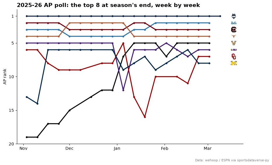
Each game row carries both teams' AP ranks that week (99 means unranked), so the schedule holds the whole poll. Take each ranked team's rank per week, keep the top 8 of the last regular-season poll, and draw a bump chart in team colors with the logos at the finish.
import matplotlib.dates as mdates

polls = (
    pl.concat(
        schedule.select(
            "game_date", "season_type", team_id=pl.col(f"{side}_id").cast(pl.Utf8), rank=f"{side}_current_rank"
        )
        for side in ("home", "away")
    )
    .filter((pl.col("rank") < 99) & (pl.col("season_type") == 2))  # ranked, regular season
    .group_by("team_id", week=pl.col("game_date").dt.truncate("1w"))
    .agg(pl.col("rank").min().cast(pl.Int64))
    .sort("week")
)
final = polls.group_by("team_id").agg(pl.col("rank").last(), pl.col("week").last()).sort("rank").head(8)
colors = sdvplot.palette("wbb", teams=final["team_id"])

fig, ax = plt.subplots(figsize=(10, 6))
for team in final["team_id"]:
    weeks = polls.filter(pl.col("team_id") == team)
    ax.plot(weeks["week"], weeks["rank"], color=colors[team], lw=2.4, marker="o", ms=3.5)
finish = mdates.date2num(polls["week"].max()) + 9  # one x for every logo, just past the last poll
sdvplot.add_logos(ax, [finish] * final.height, final["rank"], final["team_id"], league="wbb", height=0.045)
ax.invert_yaxis()
ax.set_yticks([1, 5, 10, 15, 20])
ax.set_ylim(polls.filter(pl.col("team_id").is_in(final["team_id"].to_list()))["rank"].max() + 1, 0)
ax.set_xlim(right=finish + 6)  # images do not widen the axes, so make room
ax.xaxis.set_major_locator(mdates.MonthLocator())
ax.xaxis.set_major_formatter(mdates.DateFormatter("%b"))
ax.set_ylabel("AP rank")
ax.spines[["top", "right"]].set_visible(False)
ax.set_title("2025-26 AP poll: the top 8 at season's end, week by week", loc="left", fontsize=14, fontweight="bold")
fig.text(0.99, 0.01, CAPTION, ha="right", fontsize=8, color="grey")
plt.show()
Run it yourself
Download the notebook (outputs cleared) or open it on GitHub.