WNBA
Nine charts and tables from the 2026 WNBA regular season, the league's first with 15 teams, built on wehoop's ESPN data that sportsdataverse-py loads from release files on GitHub (no stats.wnba.com calls). You'll follow the three newest franchises, rank teams in tiers, chart the scoring leaders with headshots, draw a shot chart, and build a standings table and an interactive Altair chart.
import warnings

import matplotlib.pyplot as plt
import polars as pl
import sportsdataverse.wnba as wnba

import sdvplot

SEASON = 2026
SOURCE = "Data: wehoop (ESPN) via sportsdataverse-py"
Everything below uses the regular season (season_type 2), which is final; 2025 is loaded too for Golden State's
first season. ESPN files each All-Star Game as a regular-season game (Team Collier vs Team Clark in 2025, Team Coop vs
Team Spoon in 2026), so resolve warns about those four teams, and dropping the rows it could not resolve removes the
games. The Commissioner's Cup final is filed the same way, which is why Las Vegas and New York show 45 games; it
stays in the box scores but does not count in the standings.
box = wnba.load_wnba_team_boxscore(seasons=[SEASON - 1, SEASON]).filter(pl.col("season_type") == 2)

with warnings.catch_warnings(record=True) as caught:
    warnings.simplefilter("always")
    team_ids = sdvplot.resolve(box["team_abbreviation"].to_list(), "wnba")
for w in caught:
    print(w.message)

box = box.with_columns(team=pl.Series(team_ids, dtype=pl.String)).filter(pl.col("team").is_not_null())
current = box.filter(pl.col("season") == SEASON)
current.group_by("team_abbreviation").agg(games=pl.len()).sort("games", descending=True).head(3)
4 value(s) did not resolve to a wnba team: 'COL' (unknown), 'CLA' (unknown), 'SPO' (unknown), 'COOP' (unknown). Use sdvplot.suggest() for candidates, or strict=True to raise.
| team_abbreviation | games |
|---|---|
| NY | 45 |
| LV | 45 |
| SEA | 44 |
1. The expansion teams, game by game
Golden State joined in 2025, Portland and Toronto in 2026. Cumulative wins by game number put all four seasons on one chart; the grey line is a .500 pace. Portland's primary color is a pale ice blue, so every line gets a dark outline to stay visible on white.
import matplotlib.patheffects as pe

expansion = (pl.col("team_abbreviation") == "GS") | (
    (pl.col("season") == SEASON) & pl.col("team_abbreviation").is_in(["POR", "TOR"])
)
runs = (
    box.filter(expansion)
    .sort("game_date")
    .with_columns(
        game_no=pl.int_range(1, pl.len() + 1).over("team", "season"),
        wins=pl.col("team_winner").cast(pl.Int32).cum_sum().over("team", "season"),
    )
)

fig, ax = plt.subplots(figsize=(9, 6))
ax.plot([0, 44], [0, 22], color="grey", linewidth=1, linestyle="--")
for (team, season), run in runs.group_by("team", "season"):
    color = sdvplot.team_colors([team], "wnba", season=season)[0]
    ax.plot(
        run["game_no"],
        run["wins"],
        color=color,
        linewidth=3,
        linestyle="--" if season == 2025 else "-",
        path_effects=[pe.Stroke(linewidth=4.5, foreground="#333333"), pe.Normal()],
    )
ends = runs.group_by("team", "season").agg(pl.all().last())
sdvplot.add_logos(
    ax, ends["game_no"] + 1.8, ends["wins"], ends["team"], league="wnba", season=ends["season"], height=0.08
)
for row in ends.iter_rows(named=True):
    ax.annotate(
        f"{row['season']}: {row['wins']}-{row['game_no'] - row['wins']}",
        (row["game_no"] + 3.4, row["wins"]),
        va="center",
        fontsize=9,
    )
ax.set_xlim(0, 52)
ax.set_xlabel("Game number")
ax.set_ylabel("Regular-season wins")
ax.set_title(
    "The WNBA's newest teams: Golden State's first two seasons, Portland and Toronto's first",
    loc="left",
    fontsize=11,
    fontweight="bold",
)
ax.spines[["top", "right"]].set_visible(False)
fig.text(0.99, 0.01, SOURCE, ha="right", va="bottom", fontsize=8, color="grey")
plt.show()

2. Offense vs defense, interactive with Altair
Points per 100 possessions (FGA - OREB + TOV + 0.44 x FTA, averaged with the opponent's), as an Altair chart: hover a
logo for the numbers. add_logos returns a new layered chart, so add the reference lines after it.
import altair as alt

poss = (
    pl.col("field_goals_attempted")
    - pl.col("offensive_rebounds")
    + pl.col("total_turnovers")
    + 0.44 * pl.col("free_throws_attempted")
)
games = current.with_columns(poss=poss)
opponent = games.select("game_id", pl.col("team_id").alias("opponent_team_id"), pl.col("poss").alias("opp_poss"))
assert games.schema["opponent_team_id"] == opponent.schema["opponent_team_id"]
ratings = (
    games.join(opponent, on=["game_id", "opponent_team_id"])
    .with_columns(game_poss=(pl.col("poss") + pl.col("opp_poss")) / 2)
    .group_by("team", "team_abbreviation", "team_display_name")
    .agg(
        ortg=100 * pl.col("team_score").sum() / pl.col("game_poss").sum(),
        drtg=100 * pl.col("opponent_team_score").sum() / pl.col("game_poss").sum(),
    )
    .with_columns(net=pl.col("ortg") - pl.col("drtg"))
    .sort("net", descending=True)
)

points = (
    alt.Chart(ratings.to_pandas())
    .mark_circle(size=900, opacity=0)
    .encode(
        x=alt.X("ortg:Q", scale=alt.Scale(zero=False, padding=30), title="Offensive rating (per 100 possessions)"),
        y=alt.Y(
            "drtg:Q",
            scale=alt.Scale(zero=False, reverse=True, padding=30),
            title="Defensive rating (allowed per 100, better is up)",
        ),
        tooltip=[
            "team_display_name",
            alt.Tooltip("ortg:Q", format=".1f"),
            alt.Tooltip("drtg:Q", format=".1f"),
            alt.Tooltip("net:Q", format="+.1f"),
        ],
    )
    .properties(
        width=600,
        height=420,
        title=alt.TitleParams(f"WNBA offense vs defense, {SEASON} regular season", subtitle=SOURCE),
    )
)
chart = sdvplot.add_logos(points, ratings["ortg"], ratings["drtg"], ratings["team"], league="wnba", height=0.1)
means = alt.Chart().mark_rule(strokeDash=[4, 4], color="grey")
chart + means.encode(x=alt.datum(ratings["ortg"].mean())) + means.encode(y=alt.datum(ratings["drtg"].mean()))
3. Team tiers
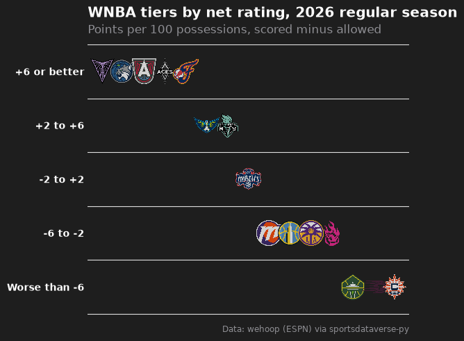
team_tiers draws a tier list from a frame with tier_no and team. Here the tiers are cut from net rating, best
first within each tier.
from sdvplot.matplotlib import team_tiers

tiers = ratings.with_columns(
    tier_no=pl.col("net").cut([-6, -2, 2, 6], labels=["5", "4", "3", "2", "1"]).cast(pl.String).cast(pl.Int32),
    tier_rank=pl.col("net").rank("ordinal", descending=True),
)
fig = team_tiers(
    tiers.select("tier_no", "team", "tier_rank"),
    "wnba",
    title=f"WNBA tiers by net rating, {SEASON} regular season",
    subtitle="Points per 100 possessions, scored minus allowed",
    caption=SOURCE,
    tier_desc={1: "+6 or better", 2: "+2 to +6", 3: "-2 to +2", 4: "-6 to -2", 5: "Worse than -6"},
)
plt.show()
4. Scoring leaders with headshots, in plotnine
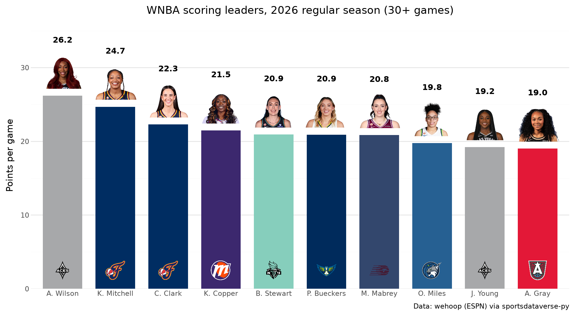
geom_sdv_headshots takes ESPN athlete ids, which the player box score carries, and scale_fill_sdv colors each bar
by team. Players need 30 games to qualify.
from plotnine import (
    aes,
    element_blank,
    geom_col,
    geom_text,
    ggplot,
    labs,
    scale_x_discrete,
    scale_y_continuous,
    theme,
    theme_minimal,
)

from sdvplot.plotnine import geom_sdv_headshots, geom_sdv_logos, scale_fill_sdv

players = wnba.load_wnba_player_boxscore(seasons=[SEASON]).join(
    current.select("game_id").unique(), on="game_id", how="semi"
)
leaders = (
    players.filter(~pl.col("did_not_play"))
    .group_by("athlete_id", "athlete_short_name")
    .agg(
        games=pl.len(),
        ppg=pl.col("points").mean(),
        team=pl.col("team_abbreviation").sort_by("game_date").last(),
    )
    .filter(pl.col("games") >= 30)
    .sort("ppg", descending=True)
    .head(10)
    .with_columns(label=pl.col("ppg").round(1).cast(pl.String), logo_y=pl.lit(2.5))
)
(
    ggplot(leaders.to_pandas(), aes("athlete_short_name", "ppg"))
    + geom_col(aes(fill="team"), width=0.75)
    + geom_sdv_logos(aes(y="logo_y", team="team"), league="wnba", height=0.08)
    + geom_sdv_headshots(aes(y="ppg + 3.3", player_id="athlete_id"), league="wnba", height=0.13)
    + geom_text(aes(y="ppg + 7.6", label="label"), fontweight="bold", size=10)
    + scale_fill_sdv("wnba", guide=None)
    + scale_x_discrete(limits=leaders["athlete_short_name"].to_list())  # keep the ppg order
    + scale_y_continuous(limits=(0, leaders["ppg"].max() + 10), expand=(0, 0))
    + labs(
        x="", y="Points per game", title=f"WNBA scoring leaders, {SEASON} regular season (30+ games)", caption=SOURCE
    )
    + theme_minimal()
    + theme(figure_size=(10, 5.5), panel_grid_major_x=element_blank())
)
5. A shot chart on a team-colored court
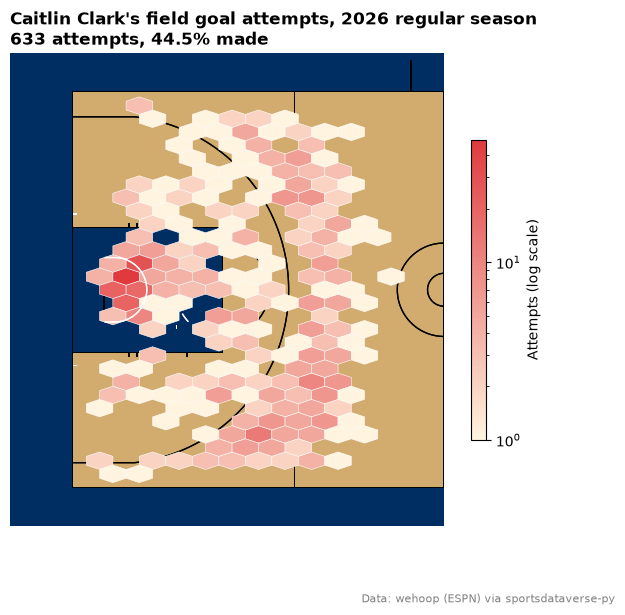
load_wnba_shots holds ESPN's shot locations, already in feet on a center-court frame, the same frame as sportypy's
court, so sdvplot.court_coords (for the stats.wnba.com legacy frame) is not needed. Fold the right-basket shots onto
the left one, then bin them: where Caitlin Clark shot from, on Indiana's court.
from matplotlib.colors import LinearSegmentedColormap

shots = wnba.load_wnba_shots(seasons=[SEASON]).join(current.select("game_id").unique(), on="game_id", how="semi")
right = pl.col("coordinate_x") > 0
clark = shots.filter(
    (pl.col("athlete_name_1") == "Caitlin Clark") & ~pl.col("type_text").str.contains("Free Throw")
).with_columns(
    x=pl.when(right).then(-pl.col("coordinate_x")).otherwise(pl.col("coordinate_x")),
    y=pl.when(right).then(-pl.col("coordinate_y")).otherwise(pl.col("coordinate_y")),
)
made = clark.filter(pl.col("scoring_play")).height

fig, ax = plt.subplots(figsize=(7, 6.5))
sdvplot.surface("wnba", "IND", display_range="defense", ax=ax)
red = sdvplot.team_colors(["IND"], "wnba", which="secondary")[0]
cmap = LinearSegmentedColormap.from_list("indiana", ["#fff4e0", red])
hexes = ax.hexbin(
    clark["x"],
    clark["y"],
    gridsize=(14, 15),
    extent=(-47, 0, -25, 25),
    mincnt=1,
    bins="log",
    cmap=cmap,
    edgecolors="white",
    linewidths=0.4,
    zorder=20,
)
fig.colorbar(hexes, ax=ax, shrink=0.6, label="Attempts (log scale)")
ax.set_title(
    f"Caitlin Clark's field goal attempts, {SEASON} regular season\n"
    f"{clark.height} attempts, {made / clark.height:.1%} made",
    loc="left",
    fontweight="bold",
)
fig.text(0.99, 0.01, SOURCE, ha="right", va="bottom", fontsize=8, color="grey")
plt.show()
6. A standings table with logos
ESPN's standings come long (one row per team and stat); pivot them wide. The top eight records make the playoffs whatever the conference, so one league-wide table with a cut line after eighth tells the story.
from great_tables import GT

from sdvplot.great_tables import gt_cutline, gt_sdv_logos, gt_theme_sdv

standings = (
    wnba.load_wnba_standings(seasons=[SEASON])
    .pivot(on="stat_name", index=["group_name", "team_abbreviation", "team_display_name"], values="display_value")
    .with_columns(
        logo=pl.col("team_abbreviation"),
        conf=pl.col("group_name").str.replace(" Conference", ""),
        wins_n=pl.col("wins").cast(pl.Int32),
    )
    .sort("wins_n", descending=True)
    .select(
        "logo",
        "team_display_name",
        "conf",
        "wins",
        "losses",
        "winPercent",
        "Home",
        "Road",
        "Last Ten Games",
        "streak",
        "differential",
    )
)
table = (
    GT(standings)
    .tab_header(title=f"WNBA standings, {SEASON} regular season", subtitle="The top eight records make the playoffs")
    .cols_label(
        logo="",
        team_display_name="Team",
        conf="Conf",
        wins="W",
        losses="L",
        winPercent="Pct",
        **{"Last Ten Games": "L10"},
        streak="Strk",
        differential="Diff",
    )
    .cols_align("left", columns="team_display_name")
    .tab_source_note(SOURCE)
)
table = gt_theme_sdv(gt_sdv_logos(table, "logo", league="wnba", height=26))
gt_cutline(table, after=8, label="Playoff line")
7. A team palette for seaborn
palette maps the data's own abbreviations to colors for seaborn. Every game's final margin, one strip per team,
sorted by average margin; a thin black edge keeps the pale colors (Portland, New York) visible.
import seaborn as sns

margins = current.with_columns(margin=pl.col("team_score") - pl.col("opponent_team_score"))
order = margins.group_by("team_abbreviation").agg(pl.col("margin").mean()).sort("margin", descending=True)

fig, ax = plt.subplots(figsize=(10, 5))
ax.axhline(0, color="grey", linewidth=0.8)
sns.stripplot(
    margins.to_pandas(),
    x="team_abbreviation",
    y="margin",
    order=order["team_abbreviation"].to_list(),
    hue="team_abbreviation",
    palette=sdvplot.palette("wnba", teams=margins["team_abbreviation"]),
    legend=False,
    jitter=0.25,
    size=5,
    edgecolor="black",
    linewidth=0.4,
    ax=ax,
)
ax.set_xlabel("")
ax.set_ylabel("Final margin (points)")
ax.set_title(f"Every WNBA game's margin, {SEASON} regular season, best average first", loc="left", fontweight="bold")
sdvplot.axis_logos(ax, "x", league="wnba", height=0.08)
fig.text(0.99, 0.01, SOURCE, ha="right", va="bottom", fontsize=8, color="grey")
plt.show()

8. plotnine: the season as a running point differential, by conference
Running point differential through the season, one line per team in its color (scale_color_sdv), faceted by
conference, with geom_sdv_logos marking where each team finished.
from plotnine import facet_wrap, geom_hline, geom_line, theme_bw

from sdvplot.plotnine import scale_color_sdv

conferences = sdvplot.teams("wnba").select("team_id", "conference")
running = (
    current.join(conferences, left_on="team", right_on="team_id")
    .sort("game_date")
    .with_columns(
        game_no=pl.int_range(1, pl.len() + 1).over("team"),
        diff=(pl.col("team_score") - pl.col("opponent_team_score")).cum_sum().over("team"),
    )
)
finish = running.group_by("team").agg(pl.all().last())

(
    ggplot(running.to_pandas(), aes("game_no", "diff", color="team_abbreviation"))
    + geom_hline(yintercept=0, color="grey")
    + geom_line(size=1)
    + geom_sdv_logos(aes(team="team"), data=finish.to_pandas(), league="wnba", height=0.075)
    + facet_wrap("conference")
    + scale_color_sdv("wnba", guide=None)
    + labs(
        x="Game number",
        y="Running point differential",
        title=f"The {SEASON} WNBA regular season, game by game",
        caption=SOURCE,
    )
    + theme_bw()
    + theme(figure_size=(10, 5))
)

9. Home and road, as a dumbbell with logos on the axis
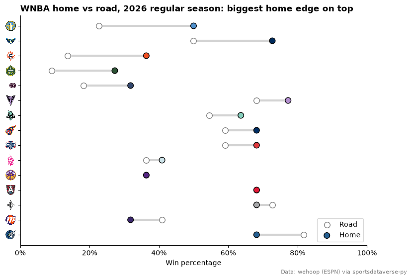
Home and road win percentages from the standings, one row per team, sorted by the home edge. axis_logos reads the
y tick labels, so set them to the teams' abbreviations first.
record = lambda col: pl.col(col).str.split("-").list.eval(pl.element().cast(pl.Int32))  # noqa: E731
split = (
    wnba.load_wnba_standings(seasons=[SEASON])
    .pivot(on="stat_name", index="team_abbreviation", values="display_value")
    .with_columns(
        home=record("Home").list.first() / record("Home").list.sum(),
        road=record("Road").list.first() / record("Road").list.sum(),
    )
    .with_columns(edge=pl.col("home") - pl.col("road"))
    .sort("edge")
)

fig, ax = plt.subplots(figsize=(9, 6))
y = list(range(split.height))
ax.hlines(y, split["road"], split["home"], color="lightgrey", linewidth=3, zorder=1)
ax.scatter(split["road"], y, color="white", edgecolors="grey", s=70, zorder=2, label="Road")
ax.scatter(
    split["home"],
    y,
    color=sdvplot.team_colors(split["team_abbreviation"], "wnba"),
    edgecolors="black",
    s=70,
    zorder=3,
    label="Home",
)
ax.set_yticks(y, split["team_abbreviation"])
ax.set_xlim(0, 1)
ax.xaxis.set_major_formatter(lambda v, _: f"{v:.0%}")
ax.legend(loc="lower right")
ax.set_xlabel("Win percentage")
ax.set_title(f"WNBA home vs road, {SEASON} regular season: biggest home edge on top", loc="left", fontweight="bold")
ax.spines[["top", "right"]].set_visible(False)
sdvplot.axis_logos(ax, "y", league="wnba", height=0.05)
fig.text(0.99, 0.01, SOURCE, ha="right", va="bottom", fontsize=8, color="grey")
plt.show()
Run it yourself
Download the notebook (outputs cleared) or open it on GitHub.